How to Send Pro Forma Invoice to Your Customers in Odoo 17
Analysing front page student
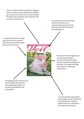
1. There isa strapline atthe verytopof thismagazine
whichhas provenunconventionalforthe wedding
genre butseemstowork here as itfitswell despite
the brightcolourusedwhichI personallydon’tlike
and isalsounconventional.
The mastheadhas conventionaltext
fontand size buthas a very
unconventional colourjustlike the
strapline whichdoesn’tworkwith
the weddinggenre.
In myopinionthere aren’tenough
coverlinesbutthe onesthatare
there have a stylisticfontvariation
and size aswell ascolour.
PersonallyIlove the image because
it isconventional beingina
naturisticsettingwiththe bride
dressedintraditional weddingattire
withprops.The image isalso edgy
because there isa pastel pink
colouredchair.
The language usedinthe coverlines
usesalliterationwhichmakesit
more appealingtoreaders.For
example ‘definingdetails’and
‘gownsgalore’.
To me,the barcode looksplonked
ontothe page insteadof craftedinto
it connotingthatitis actuallya
studentswork,thisissomethingI
don’twant mine tolooklike.
2. The imagesusedonthiscontents
page are individuallycutoutwithout
theirbackgroundandlayered
together.PersonallyIthinkthis
looksunprofessionalandmessy
whereasactual collagedimageslook
neatand are muchmore
conventional.
The mini mastheadforthe page hasa
sharperedge thanthe elegantfontsthat
mostmastheadsare althoughthere is
somethingpleasantaboutthis,the one
thingI don’tlike isthe suchboldcolouras
it isso unconventional anddoesnotfitthe
genre inmy eyes.
I like the waythat the page numbersandcontentisIn line witheachother
and neatlysotoo.There is a pastel colourbehindone partof the contents
whichI like asit almostshowsthe highlightsof the magazine.Alongwiththis
there isan image amongstthe textto breakit upfittinginwell.The range of
coloursalsokeepsthe readerinterested.
3. These imagesare conventionaland
elegantbeingcollagedtogetherwith
a pastel tonedcolourtheme.Ireally
like thisandwill be takingideasfrom
this.
These imagesare fragmentedand
cut out like the contentspage,Ifind
thisunprofessional lookingand
unconventional althoughitworks
slightlybetterinthiscontextIdon’t
actuallylike it.
There isn’tmuchtexton thisdouble
pge whichcan be a goodthingbut I
thinkthere isverylimitedtextinthis
one.I like the wayithas a back
groundcolourto highlightsome of
the textand that itvariesinfontsize
and style.
The mastheadfor thispage isneat and
conventional althoughnotina pastel
colour,itstill fitsinwiththe genre and
the page makingitfitwell.
4. Althoughthisisn’tawedding
website,itisone todo withfashion
and I have pickeditas ithas a pastel
colouredtheme.The subheadings
are inpastel pinkwhichIreallylike
and wouldbe conventional forthe
weddinggenre.Ilike howneatitis.
The mastheadiselegantand
professionallookingbeingthe centre
of the website allowingbrandingto
take the centre mark. Althoughthisis
inblack because of the separate
genre,Ireallylike itsstyle.
The image is veryconventionalto
the fashionandweddinggenre,
beingthe centre of the pagesfocus.
It issimple andeye catchingas the
image isstriking.Like magazines,
thistakesup mostof the page.
The informationbox isstylisticto
the genre and I reallylike the ideaof
them, itdraws focusto the website
and completesthe image.
5. Thisimage isvibrantand colourful
fittingtothe conventionsof its
genre.Itis edgyanddifferentto
otherregional magazinesimages.
Havinghyperlinkedbuttonsonthe
side of the page makesthe readers
feel like theyare involvedinthe
website andthatiscateredfor the
readerso hitsmore of a target
audience.
Havinga free bee onthe page makes
it more appealingtothe target
audience aseveryone lovesa
competitiontowinsomething.
6. Thisimage isnicelycraftedin
amongstthe magazine toremindthe
viewersof itsregional aspect.Its
coloursare alsoconventional toits
genre.
Havinghyperlinkstootherpageson
the site makesthe companyfeel like
theyare cateringforthe readers.
Thisis because there issomething
for everyone someetsawiderrange
of targetaudience.
Havinga contact section
makesthe website
interactive somakingita
web2.0website.Thismakes
the readersfeel connected.
An informationsectionmakesthe
website lookmore professional and
involved.Itadvertisesthe other
mediaplatformstheyuse too
withoutreadersknowingit.
Havinga free giveawayalways
attracts readersinas its notone to
miss,the holidaysettingalsodraw
readersin.
7. The mastheadof the companyname
beingreplicatedandonthe billboard
givesthe 360 degree brandingeffect
meaningthe name isknown
everywhere.
The fact there are multiple examples
of the magazine shownonthe
billboardshowshow professional
the companyand the studentiswith
theirwork.The way we can see
these all linkingisamazingto,being
consistentandconventional toits
genre.
The social medialinksona billboard
I thinkare the mostcrucial part
because evenif the viewerdidn’t
see all of the advertisement,they
can follow the social mediaaccounts
to gainmore knowledge ata
constantrate. I will be doingthison
my billboardbutmaybe slightly
biggersoit ismore readable.
The range of colourson this
sectiondrawsattentiontoit
and withitbeingbolderthan
the rest itmakesthe words
catchierand more readable.