This document reviews the design elements of a wedding magazine cover. It notes that while the strapline and masthead use unconventional colors, the bright pink works for the strapline but not the masthead. The image of the bride is considered conventional but made edgy by a pastel pink chair. The use of alliteration in the cover lines like "defining details" makes the text more appealing. However, the placement of the barcode looks amateurish and like a student project rather than a polished cover.
UChicago CMSC 23320 - The Best Commit Messages of 2024
Analysing front page student
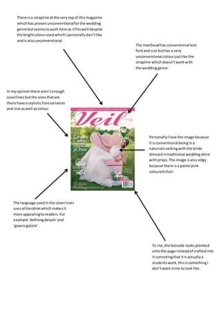
1. There isa strapline atthe verytopof thismagazine
whichhas provenunconventionalforthe wedding
genre butseemstowork here as itfitswell despite
the brightcolourused whichI personallydon’tlike
and isalsounconventional.
The mastheadhas conventionaltext
fontand size buthas a very
unconventional colourjustlike the
strapline whichdoesn’tworkwith
the weddinggenre.
In myopinionthere aren’tenough
coverlinesbutthe onesthatare
there have a stylisticfontvariation
and size aswell ascolour.
PersonallyIlove the image because
it isconventional beingina
naturisticsettingwiththe bride
dressedintraditional weddingattire
withprops.The image isalso edgy
because there isa pastel pink
colouredchair.
The language usedinthe cover lines
usesalliterationwhichmakesit
more appealingtoreaders.For
example ‘definingdetails’and
‘gownsgalore’.
To me,the barcode looksplonked
ontothe page insteadof craftedinto
it connotingthatitis actuallya
studentswork,thisissomethingI
don’twant mine tolooklike.