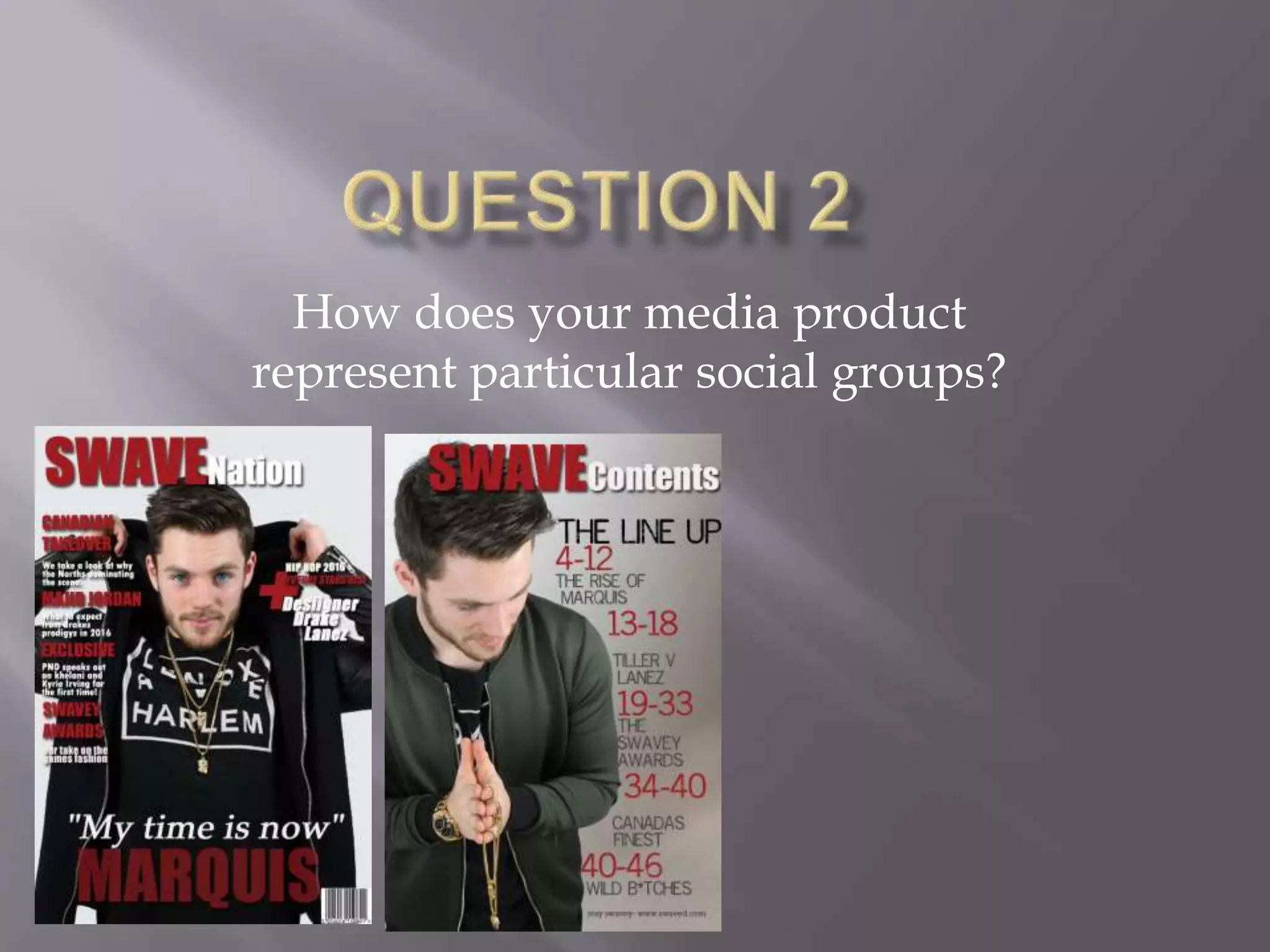
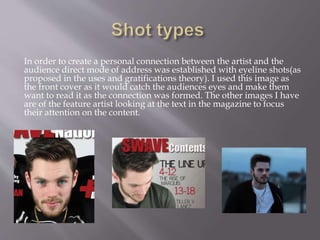
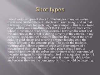
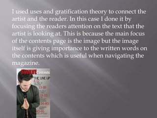
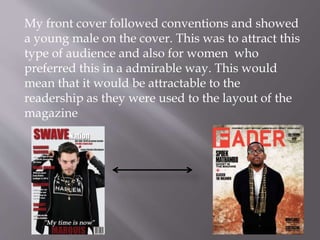
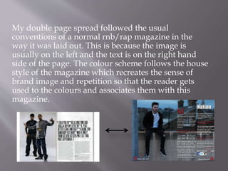
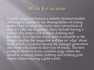
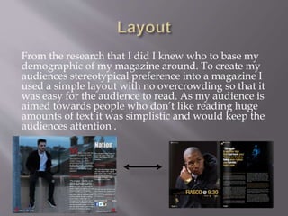
Chandigarh Call Girls 👙 7001035870 👙 Genuine WhatsApp Number for Real Meet
Question 2
1. How does your media product
represent particular social groups?
2. In order to create a personal connection between the artist and the
audience direct mode of address was established with eyeline shots(as
proposed in the uses and gratifications theory). I used this image as
the front cover as it would catch the audiences eyes and make them
want to read it as the connection was formed. The other images I have
are of the feature artist looking at the text in the magazine to focus
their attention on the content.
3. I used various types of shots for the images in my magazine
this was to create different effects with each image and so that
it was appropriate for each page. An example of this is my front
cover which was a medium shot that I used for my front cover
where direct mode of address is formed between the artist and
the audience as the artist is staring directly at the camera. In my
contents I used another medium shot bur this time of the artist
holding gold chains and wearing a watch looking onto the
words written in the contents page. The outfit the model is
wearing also follows common codes and conventions of a
magazine of this type. In my double page spread I used a
longshot to show off the urban environment which surrounded
the artist to again fit with the urban feel my magazine has to it. I
used a young male model this makes it more relatable to the
audience as they are the demographic that I would be targeting.
4. I used uses and gratification theory to connect the
artist and the reader. In this case I done it by
focusing the readers attention on the text that the
artist is looking at. This is because the main focus
of the contents page is the image but the image
itself is giving importance to the written words on
the contents which is useful when navigating the
magazine.
5. My front cover followed conventions and showed
a young male on the cover. This was to attract this
type of audience and also for women who
preferred this in a admirable way. This would
mean that it would be attractable to the
readership as they were used to the layout of the
magazine
6. My double page spread followed the usual
conventions of a normal rnb/rap magazine in the
way it was laid out. This is because the image is
usually on the left and the text is on the right hand
side of the page. The colour scheme follows the house
style of the magazine which recreates the sense of
brand image and repetition so that the reader gets
used to the colours and associates them with this
magazine.
7. Usually magazine feature a smartly dressed models.
Although to appeal to my demographics of young
males I had to adopt the codes and conventions of
that of a rnb/rap magazine, these include having a
model who wears a lot of black clothing and
jewellery. It is vital the cover artist is relatable to the
people reading the magazine and has an ‘edge’ about
them which is popular among the younger generation
and those who listen to that type of music. The best
example of this is in my contents page where the
model is wearing urban clothing and holding gold
chains whilst wearing a gold watch.
8. From the research that I did I knew who to base my
demographic of my magazine around. To create my
audiences stereotypical preference into a magazine I
used a simple layout with no overcrowding so that it
was easy for the audience to read. As my audience is
aimed towards people who don’t like reading huge
amounts of text it was simplistic and would keep the
audiences attention .
9. The basis of my magazine is to feed the needs and
wants of the readership/audience of the
magazine. I have done this by reinforcing
common stereotypes for this kind of magazine
related to rnb and rap music. The gold chains
urban clothing and style of writing is all attractive
to the demographics of the listeners of that music.