Analysing front page student
•Download as DOCX, PDF•
0 likes•16 views
This document provides a review and critique of a wedding magazine cover. It notes that while the strapline and masthead use unconventional colors, the bright colors do not work well for the wedding genre. The image of the bride is described as both conventional, showing her in a natural setting in traditional attire, yet also edgy due to a pastel pink chair. The use of alliteration in the cover lines is praised for making them more appealing to readers. However, the placement of the barcode is critiqued as looking hastily added rather than carefully incorporated into the design.
Report
Share
Report
Share
Recommended
Analysing front page student
This document provides a critique of various design elements across multiple publications and websites. It discusses conventions in areas like layout, images, colors, fonts and content. Elements are evaluated as either conventional and fitting the genre or unconventional. The critique often notes personal preferences and things that will or won't be incorporated into the author's own work. Critiqued aspects include magazine covers, contents pages, images, mastheads, fonts, colors and overall professionalism.
Don't put off until tomorrow
The author reflects on losing their last living aunt after taking their mother to the emergency room. They recall how their aunt advocated for them to purchase a piano to further their music education, which allowed the author to become a concert pianist. The author regrets not making more time to visit their mother and aunt in recent years, and hopes others will prioritize spending time with their loved ones today rather than putting it off until tomorrow.
Lady gaga albm poster
The poster uses Lady Gaga's image and distinctive style to draw in audiences for an electronic music album. Her dramatic look with thick eyeliner and tattoos matches fans' expectations of her bold, attention-grabbing persona. The dark background and jagged font also fit the electronic theme and stand out visually to attract attention. By emphasizing Lady Gaga's name over the unknown album title, the poster leverages her fame to promote the new album to her established fan base.
Attracting target audience
This document provides tips for designing a magazine to appeal to a target audience. It recommends using conventions from real magazines of the same genre, such as putting "real life" stories on the cover along with photos of clothes, accessories, and models. Color schemes and fonts should also match the target age and genre to seem professional while appealing to readers. Images throughout should be framed and consistent to create visual interest.
Planning 2
The document summarizes the planning for a music magazine, including choosing a color scheme of purple, grey, and black; fonts like "Coolvetica" and "A Love of Thunder"; photographs with models centered or to the side; and using some slang and exclamation points in the text to appeal to the target audience of young women aged 15-21.
Planning: mood board and flat plan
This part of the planning includes the mood board (colour scheme, mast head designs, flashes, camera shots, mode of address and images used). It also includes the flat plan of my magazine.
Digital graphics evaluation pro forma
The document provides a template for evaluating a graphic narrative project. It prompts the creator to summarize their work, provide examples from their project to explain it, identify areas that went well and could be improved, and reflect on how well their final product achieved their original intentions. It includes questions about the construction of images, use of text, suitability for the intended audience, and techniques used. The creator provides detailed responses analyzing various aspects of their graphic narrative book project for a young audience.
Evaluation of Children's book pro forma - personal reflection
The document provides a template for evaluating a graphic narrative project. It prompts the user to summarize their original intentions, compare their planning documents to the final product, evaluate how well they constructed images and used text to anchor the images, and assess whether the product is suitable for the intended audience. The user provides responses analyzing the development of their 9-page graphic narrative for boys aged 4-6. They discuss aligning with their original plans, using consistent colors and styles, room for improving text-image alignment, and similarities to other books for their audience.
Powerpoint
The document provides tips for designing a magazine cover, contents page, and double page spread to appeal to a target audience. Some key recommendations include using attractive models and real-life stories on the cover; employing magazine conventions like an editor's letter and section headings on the contents page; and incorporating photos, quotes, and minimal text on the double page spread in a visually appealing layout. The goal is to mimic established magazine styles and formats while tailoring the design elements, color scheme, language, and complexity of content to the intended younger readership.
Planning 2
The document summarizes the planning for a music magazine, including choosing a color scheme of purple, grey, and black; selecting the font "Coolvetica" ; using casual photography of models from the waist up or centered; and addressing readers using some slang to appeal to the target audience of young women aged 15-21.
Music Magazine Evaluation
This document evaluates the author's music magazine. The author believes the cover fits conventions of music magazines through its alternative photograph and logo. The cover's minimal design is uncommon but enhances the photo. The editorial follows conventions but may take up too much space. Photographs are appropriate and article titles realistic. Feedback suggested changing a double-page color but the author thinks variety is good. The logo adds brand identity. Articles would appeal to readers but typography color could improve. Overall, the magazine suits its target mid-teen audience interested in alternative music through its informal tone, younger themes, and eye-catching design.
Question 1 - In what ways does your media product use, develop or challenge f...
The document compares the media product's use of forms and conventions to several real magazines. It summarizes how elements like mastheads, backgrounds, photos, and text are implemented on its cover and contents pages compared to examples. Key differences noted are its use of brighter colors, less text, and a single model rather than fashion spreads or illustrations seen in the examples. The goal was to appeal to teenagers while relating to styles of Japanese and Korean pop music magazines.
Question 1 - In what ways does your media product use, develop or challenge f...
The document compares and contrasts the media product's front cover design with the conventions of several real teen magazines. It discusses design elements like mastheads, backgrounds, images, text styling and placement. Key differences noted are the smaller masthead, less busy background, and single model used on the media product cover compared to references. Color choices and overall brightness aim to attract both male and female readers.
Textual analysis 2 website
The document provides an analysis of the layout, design, and content of various pages on a wedding planning website. It notes that:
1) The homepage lacks color and images that are conventionally found on other wedding websites, but subsequent pages include more colors, photos, and a cleaner layout.
2) Interior pages contain pastel colors, multiple wedding photos with captions, and limited textual content as is typical for websites in the wedding genre.
3) The images depict various wedding scenes and angles, as well as diverse representations of race, in a light and happy atmosphere that reflects wedding themes and is inspirational.
Professional comparison
This document compares and contrasts the styles and techniques used in Rock Sound and Kerrang magazines to the student's own magazine. It analyzes aspects like shots, poses, layouts, locations, costumes, lighting, colors, language, and fonts used across the covers, contents pages, and double page spreads. The student notes several ways their magazine could be improved, such as adding more images, varying fonts, incorporating more colors, and making the layouts busier overall, to better emulate the professional qualities of the two established magazines.
7. Looking back at your preliminary task, what do you feel you have learnt in...
The document compares and contrasts the author's school magazine with their music magazine, highlighting key differences and improvements. The music magazine masthead is clearer and bolder. The stories are more packed with content. The text is more professional and stands out better against backgrounds. For the cover story, experimenting with different fonts, sizes and colors made it more effective. The modeling shot is a more flattering mid-shot with a more interesting background. The contents page is better laid out with clearer, easier to read text and sensible background colors. Images are better edited and laid out professionally. The double page spread uses bold text and a large quote effectively.
Stylesheet 123
The document discusses font and color scheme choices for different elements of a music magazine, including the cover, contents page, and double-page spread. For the cover, the font Segoe Print was chosen to give a classic yet fun style that appeals to the target market of older, higher-class readers. On the contents page and flowing throughout, the font Niagara Solid is used because it is bold, clear, and grabs attention. The color scheme aims to be subtly eye-catching rather than bright like other pop magazines, using lighter pinks and purples to seem less tacky and appeal more to older females. Examples are provided of color schemes that could be used.
As media studies evaluation 1
The document discusses how the media product, a magazine called MAG ROCK, uses and challenges conventions of real rock magazines.
It uses a bold, simple title font that draws attention and matches rock magazine conventions. The front cover features a female model, challenging expectations but broadening the audience. Inside, legible fonts make the text accessible to older readers, and images cross pages to look professional.
While sticking to standards like pull quotes and page numbers, it challenges norms by featuring atypical band members and keeping a "cold weather, hot music" theme throughout with colors and fonts. The contents page highlights enticing words to draw in readers, with a formal, high quality appearance to justify the cost.
Magazine pre-production stage.pptx
This document provides planning details for Nina Lima's fashion magazine titled "Modealisation". It includes research on existing magazine layouts, covers, and content pages to inspire Nina's own magazine design. Sample magazine names are presented to audiences and "Modealisation" is selected as the top choice. Font and image research is also included to inform the magazine's visual design. Draft cover, content page, and double-page spread layouts are presented with descriptions. The double-page spread will feature an interview with Nina as an up-and-coming fashion designer.
Progresssion presentation
The document compares the author's preliminary magazine task to their final product. In the preliminary task, the author lacked knowledge of typical magazine conventions. However, through research, the author learned about stereotypical conventions and incorporated them into their final product. This included using more conventional photography, layout, fonts, colors, and addressing the intended audience appropriately. As a result, the final magazine cover and contents page better represented the target demographic and included many elements that would appeal to readers.
Planning
Natasha plans to create a local music magazine focused on the music scene in Reading, UK. The magazine will be called "Ding!" and feature content like upcoming local gigs and profiles of up-and-coming bands in the area. Natasha will take photos for the magazine's cover and inside feature using her friend Robin as a model with an electric guitar as the main prop. She will shoot the photos in her summer house to resemble a studio setting. The magazine's cover will use red as the primary color and include one main image along with headlines to advertise inside articles.
Stylesheet
The document discusses font and color scheme choices for different elements of a music magazine, including the cover, contents page, and double-page spread. For the cover, the font Segoe Print was chosen to give a classic, fun style that appeals to the target market of older, higher-class readers. The contents page and double-page spread use consistent fonts and color schemes to provide uniformity throughout the magazine. The color scheme aims to be subtly eye-catching rather than bright like other pop magazines, using lighter pinks and purples to appeal to an older female audience.
Evaluation Question 7
The document discusses the evolution of the student's school magazine project from its early stages to the final version. In the beginning, the student knew very little about publishing software and their magazine layout used simple boxes, making it look basic. The magazine cover and contents page went through multiple changes as the student refined the design and layout to better represent their target music audience and fit genre conventions. The double page spread remained mostly the same except for manipulating the image to make the star of the photo stand out more boldly.
Pitch 2
This document provides details on the proposed magazine "Replay" including:
- The magazine will focus on chart music to appeal to a younger audience.
- It will be published monthly to satisfy reader preferences and control costs.
- Name ideas like "Replay" emphasize replaying music.
- The target audience is 17-28 year olds who listen to chart music while driving.
- Photo shoots will include contrasting outfits and a studio setting to look professional.
- Sample covers and layouts emphasize simplicity and focus on images and headlines.
- Prices will be £2.20-4.20 for issues and £7 monthly for online subscriptions.
Digital graphics evaluation pro forma
The document provides an evaluation of a graphic narrative project. The creator feels their final product largely reflects their original intentions, including keeping a cartoon style, simple script, clear page layout, and 9-page length. They compare their project to the book "The Gingerbread Man" as a model with a similar cartoon style and short length. The creator believes their images are well-constructed using skills like shape manipulation. They have used text to complement rather than replace images. The project is suitable for its young audience through use of cartoon style, bright colors, minimal text, and simple language.
Deconstruction
This document provides examples and analysis of magazine design conventions from various magazines. It deconstructs elements like front covers, contents pages, and double page spreads. The author notes conventions like using a single dominant image, color schemes, fonts, and layout of text and images. The goal is to understand how different magazines appeal to their target audiences and apply useful conventions to their own punk magazine. Key lessons include using images that represent the genre, bold colors and fonts, and featuring content clearly for the target readership.
Contents page production
The document describes the process of designing a contents page for a magazine. It discusses choosing fonts, colors, and layouts to match the magazine's style. It also describes adding elements like headers, page numbers, and a "cover story" logo. The designer gets feedback from the target audience and makes changes based on their suggestions, such as modifying the size and color of the "subscribe" box to better fit the style. In the end, the designer is pleased with the final contents page and feels it will appeal to the target readership.
Digital graphics evaluation pro forma
The document provides an evaluation of a graphic narrative project. It summarizes the creator's process, including intentions for each page, construction of images, use of text, suitability for the target audience, and representation and style. The creator reflects on what they liked and disliked about techniques used, the final product's appearance, and strengths and weaknesses of pre-production planning. Context around the narrative's cultural influences and similarities to other stories is also discussed.
Resources and equipment
The document outlines several resources and equipment that will be used for production work including a camera, iPhone, Photoshop, Paint.net, and Wix.com. Photos will be taken with the camera and iPhone, uploaded to a computer, and edited in Photoshop to remove backgrounds and add filters before being manipulated in Paint.net to create layered images for a billboard and magazine. Finally, Wix.com will be used to design and publish an interactive website by following the step-by-step guide to insert colors, text, images, and designs.
Regulations
This document outlines rules for content creation including prohibiting extreme porn, child abuse, using other's property without permission, intimidation, doxing, and false allegations. The document concludes by stating that the content creator will review their work against these rules and laws to ensure compliance.
More Related Content
Similar to Analysing front page student
Powerpoint
The document provides tips for designing a magazine cover, contents page, and double page spread to appeal to a target audience. Some key recommendations include using attractive models and real-life stories on the cover; employing magazine conventions like an editor's letter and section headings on the contents page; and incorporating photos, quotes, and minimal text on the double page spread in a visually appealing layout. The goal is to mimic established magazine styles and formats while tailoring the design elements, color scheme, language, and complexity of content to the intended younger readership.
Planning 2
The document summarizes the planning for a music magazine, including choosing a color scheme of purple, grey, and black; selecting the font "Coolvetica" ; using casual photography of models from the waist up or centered; and addressing readers using some slang to appeal to the target audience of young women aged 15-21.
Music Magazine Evaluation
This document evaluates the author's music magazine. The author believes the cover fits conventions of music magazines through its alternative photograph and logo. The cover's minimal design is uncommon but enhances the photo. The editorial follows conventions but may take up too much space. Photographs are appropriate and article titles realistic. Feedback suggested changing a double-page color but the author thinks variety is good. The logo adds brand identity. Articles would appeal to readers but typography color could improve. Overall, the magazine suits its target mid-teen audience interested in alternative music through its informal tone, younger themes, and eye-catching design.
Question 1 - In what ways does your media product use, develop or challenge f...
The document compares the media product's use of forms and conventions to several real magazines. It summarizes how elements like mastheads, backgrounds, photos, and text are implemented on its cover and contents pages compared to examples. Key differences noted are its use of brighter colors, less text, and a single model rather than fashion spreads or illustrations seen in the examples. The goal was to appeal to teenagers while relating to styles of Japanese and Korean pop music magazines.
Question 1 - In what ways does your media product use, develop or challenge f...
The document compares and contrasts the media product's front cover design with the conventions of several real teen magazines. It discusses design elements like mastheads, backgrounds, images, text styling and placement. Key differences noted are the smaller masthead, less busy background, and single model used on the media product cover compared to references. Color choices and overall brightness aim to attract both male and female readers.
Textual analysis 2 website
The document provides an analysis of the layout, design, and content of various pages on a wedding planning website. It notes that:
1) The homepage lacks color and images that are conventionally found on other wedding websites, but subsequent pages include more colors, photos, and a cleaner layout.
2) Interior pages contain pastel colors, multiple wedding photos with captions, and limited textual content as is typical for websites in the wedding genre.
3) The images depict various wedding scenes and angles, as well as diverse representations of race, in a light and happy atmosphere that reflects wedding themes and is inspirational.
Professional comparison
This document compares and contrasts the styles and techniques used in Rock Sound and Kerrang magazines to the student's own magazine. It analyzes aspects like shots, poses, layouts, locations, costumes, lighting, colors, language, and fonts used across the covers, contents pages, and double page spreads. The student notes several ways their magazine could be improved, such as adding more images, varying fonts, incorporating more colors, and making the layouts busier overall, to better emulate the professional qualities of the two established magazines.
7. Looking back at your preliminary task, what do you feel you have learnt in...
The document compares and contrasts the author's school magazine with their music magazine, highlighting key differences and improvements. The music magazine masthead is clearer and bolder. The stories are more packed with content. The text is more professional and stands out better against backgrounds. For the cover story, experimenting with different fonts, sizes and colors made it more effective. The modeling shot is a more flattering mid-shot with a more interesting background. The contents page is better laid out with clearer, easier to read text and sensible background colors. Images are better edited and laid out professionally. The double page spread uses bold text and a large quote effectively.
Stylesheet 123
The document discusses font and color scheme choices for different elements of a music magazine, including the cover, contents page, and double-page spread. For the cover, the font Segoe Print was chosen to give a classic yet fun style that appeals to the target market of older, higher-class readers. On the contents page and flowing throughout, the font Niagara Solid is used because it is bold, clear, and grabs attention. The color scheme aims to be subtly eye-catching rather than bright like other pop magazines, using lighter pinks and purples to seem less tacky and appeal more to older females. Examples are provided of color schemes that could be used.
As media studies evaluation 1
The document discusses how the media product, a magazine called MAG ROCK, uses and challenges conventions of real rock magazines.
It uses a bold, simple title font that draws attention and matches rock magazine conventions. The front cover features a female model, challenging expectations but broadening the audience. Inside, legible fonts make the text accessible to older readers, and images cross pages to look professional.
While sticking to standards like pull quotes and page numbers, it challenges norms by featuring atypical band members and keeping a "cold weather, hot music" theme throughout with colors and fonts. The contents page highlights enticing words to draw in readers, with a formal, high quality appearance to justify the cost.
Magazine pre-production stage.pptx
This document provides planning details for Nina Lima's fashion magazine titled "Modealisation". It includes research on existing magazine layouts, covers, and content pages to inspire Nina's own magazine design. Sample magazine names are presented to audiences and "Modealisation" is selected as the top choice. Font and image research is also included to inform the magazine's visual design. Draft cover, content page, and double-page spread layouts are presented with descriptions. The double-page spread will feature an interview with Nina as an up-and-coming fashion designer.
Progresssion presentation
The document compares the author's preliminary magazine task to their final product. In the preliminary task, the author lacked knowledge of typical magazine conventions. However, through research, the author learned about stereotypical conventions and incorporated them into their final product. This included using more conventional photography, layout, fonts, colors, and addressing the intended audience appropriately. As a result, the final magazine cover and contents page better represented the target demographic and included many elements that would appeal to readers.
Planning
Natasha plans to create a local music magazine focused on the music scene in Reading, UK. The magazine will be called "Ding!" and feature content like upcoming local gigs and profiles of up-and-coming bands in the area. Natasha will take photos for the magazine's cover and inside feature using her friend Robin as a model with an electric guitar as the main prop. She will shoot the photos in her summer house to resemble a studio setting. The magazine's cover will use red as the primary color and include one main image along with headlines to advertise inside articles.
Stylesheet
The document discusses font and color scheme choices for different elements of a music magazine, including the cover, contents page, and double-page spread. For the cover, the font Segoe Print was chosen to give a classic, fun style that appeals to the target market of older, higher-class readers. The contents page and double-page spread use consistent fonts and color schemes to provide uniformity throughout the magazine. The color scheme aims to be subtly eye-catching rather than bright like other pop magazines, using lighter pinks and purples to appeal to an older female audience.
Evaluation Question 7
The document discusses the evolution of the student's school magazine project from its early stages to the final version. In the beginning, the student knew very little about publishing software and their magazine layout used simple boxes, making it look basic. The magazine cover and contents page went through multiple changes as the student refined the design and layout to better represent their target music audience and fit genre conventions. The double page spread remained mostly the same except for manipulating the image to make the star of the photo stand out more boldly.
Pitch 2
This document provides details on the proposed magazine "Replay" including:
- The magazine will focus on chart music to appeal to a younger audience.
- It will be published monthly to satisfy reader preferences and control costs.
- Name ideas like "Replay" emphasize replaying music.
- The target audience is 17-28 year olds who listen to chart music while driving.
- Photo shoots will include contrasting outfits and a studio setting to look professional.
- Sample covers and layouts emphasize simplicity and focus on images and headlines.
- Prices will be £2.20-4.20 for issues and £7 monthly for online subscriptions.
Digital graphics evaluation pro forma
The document provides an evaluation of a graphic narrative project. The creator feels their final product largely reflects their original intentions, including keeping a cartoon style, simple script, clear page layout, and 9-page length. They compare their project to the book "The Gingerbread Man" as a model with a similar cartoon style and short length. The creator believes their images are well-constructed using skills like shape manipulation. They have used text to complement rather than replace images. The project is suitable for its young audience through use of cartoon style, bright colors, minimal text, and simple language.
Deconstruction
This document provides examples and analysis of magazine design conventions from various magazines. It deconstructs elements like front covers, contents pages, and double page spreads. The author notes conventions like using a single dominant image, color schemes, fonts, and layout of text and images. The goal is to understand how different magazines appeal to their target audiences and apply useful conventions to their own punk magazine. Key lessons include using images that represent the genre, bold colors and fonts, and featuring content clearly for the target readership.
Contents page production
The document describes the process of designing a contents page for a magazine. It discusses choosing fonts, colors, and layouts to match the magazine's style. It also describes adding elements like headers, page numbers, and a "cover story" logo. The designer gets feedback from the target audience and makes changes based on their suggestions, such as modifying the size and color of the "subscribe" box to better fit the style. In the end, the designer is pleased with the final contents page and feels it will appeal to the target readership.
Digital graphics evaluation pro forma
The document provides an evaluation of a graphic narrative project. It summarizes the creator's process, including intentions for each page, construction of images, use of text, suitability for the target audience, and representation and style. The creator reflects on what they liked and disliked about techniques used, the final product's appearance, and strengths and weaknesses of pre-production planning. Context around the narrative's cultural influences and similarities to other stories is also discussed.
Similar to Analysing front page student (20)
Question 1 - In what ways does your media product use, develop or challenge f...
Question 1 - In what ways does your media product use, develop or challenge f...
Question 1 - In what ways does your media product use, develop or challenge f...
Question 1 - In what ways does your media product use, develop or challenge f...
7. Looking back at your preliminary task, what do you feel you have learnt in...
7. Looking back at your preliminary task, what do you feel you have learnt in...
More from _kyramai
Resources and equipment
The document outlines several resources and equipment that will be used for production work including a camera, iPhone, Photoshop, Paint.net, and Wix.com. Photos will be taken with the camera and iPhone, uploaded to a computer, and edited in Photoshop to remove backgrounds and add filters before being manipulated in Paint.net to create layered images for a billboard and magazine. Finally, Wix.com will be used to design and publish an interactive website by following the step-by-step guide to insert colors, text, images, and designs.
Regulations
This document outlines rules for content creation including prohibiting extreme porn, child abuse, using other's property without permission, intimidation, doxing, and false allegations. The document concludes by stating that the content creator will review their work against these rules and laws to ensure compliance.
Theoretical research
The document discusses various media theories that are relevant to magazine production, including auteur theory, genre theory, and audience theories. It examines how these theories can be applied when creating an original magazine. The creator plans to include their own distinctive style through color palette and visual motifs to demonstrate their influence as an auteur. Genre conventions will be followed with some variations to make the magazine unique. Audience theories like uses and gratification will be used to attract readers through diversion, social solidarity, personal identity, and information gathering. Representation of diverse models will also help make the magazine distinctive.
Form topic
This document discusses typical formats and conventions used in wedding magazines and websites. It analyzes the layouts of magazine covers, spreads, and content pages. Common elements include calligraphy text, pastel colors, traditional wedding attire and settings, and layered designs with many images. Website homepages typically feature many photos and videos with navigation bars and ads. Interior pages provide detailed information and additional advertising. Billboards usually have a large central image taking up 40-50% of the space with branding and social media links below in brighter colors for visibility from a distance. The document examines examples to identify consistent formatting across publications and genres.
Student website page 2
The image uses colors and stylistic elements conventional to its genre to depict how slight changes can alter a genre. A featured box highlights selected content to attract audiences, using a pastel background consistent with wedding conventions. Subheadings organize the page and keep target readers engaged by signaling what they will read next. A caption employs persuasive language to intrigue readers about the image, drawing in target audiences as intended. Mentioning a free giveaway catches readers' eyes, which is a good technique for generating interest.
Student website page 1
This document discusses the design elements of a website that is not explicitly for weddings but has a pastel color theme similar to wedding websites. The headings and masthead are in a light pink color that fits well with the wedding genre. The masthead is elegantly designed and allows for branding. The center image focuses on fashion and weddings, drawing the eye with its simplicity. Information boxes help complete the look and draw focus to the website in line with the genre.
Billboard student
The document discusses the branding elements used in an advertisement displayed on a billboard. It notes that replicating a company's masthead and showing multiple examples of its magazine provides 360-degree branding and shows the professionalism of the company. It also states that including social media links on the billboard is crucial as it allows viewers to learn more about the company even if they don't see the whole ad, and that bolder colors and text make those elements catchier and more readable.
Analysing double page student
The document discusses the design of several images and pages. It notes that the first images are conventional and elegant with a pastel color theme. While fragmented cut-out images on another page are considered unconventional and unprofessional, limited text on a double page is acceptable but could include more text. The masthead fits well with the genre and page despite not being in a pastel color.
Analysing contents student
The images on the page are cut out individually without backgrounds and layered together, which the author thinks looks unprofessional and messy compared to actual collages. The mini masthead has a sharper edge than elegant fonts typically used, though its bold color is unconventional and does not fit the genre. The page numbers and content are neatly aligned, and a pastel color highlights part of the contents while an image breaks up the text fitting in well. The range of colors keeps the reader interested.
Analysing front page student
This document reviews the design elements of a wedding magazine cover. It notes that while the strapline and masthead use unconventional colors, the bright pink works for the strapline but not the masthead. The image of the bride is considered conventional but made edgy by a pastel pink chair. The use of alliteration in the cover lines like "defining details" makes the text more appealing. However, the placement of the barcode looks amateurish and like a student project rather than a polished cover.
Analysing double page student
The document discusses the design of several images and pages. It notes that the first images are conventional and elegant with a pastel color theme. While fragmented cut-out images on another page are considered unconventional and unprofessional, limited text on a double page is acceptable but could include more text. The masthead fits well with the genre and page despite not being in a pastel color.
Textual analysis of ‘i do’ wedding page
The document analyzes the layout, design, and content of the home page and first two hyperlinked pages of a wedding website. It finds that the website follows conventions similar to magazines, with a rule-of-thirds layout, consistent colors and fonts, and persuasive language. Images are bright to draw readers in. Representation is sophisticated and classy. The hyperlinked pages maintain continuity with the home page in structure while focusing more on specific wedding content through additional images and descriptions.
Technology analysis
1) The document discusses the author's experience using various software programs like PowerPoint, Prezi, Voki, Fireworks, and Evernote to create elements of their coursework project, which was a magazine.
2) Prezi was found to be the most useful and enjoyable to use, though it took some time to learn how to customize the presentation pathways. Fireworks also produced professional-looking pages but required adjusting settings to match print sizes.
3) Some programs like Voki and Evernote had limitations that prevented the author from using them effectively - Voki had time limits and Evernote couldn't be embedded on the author's blog. Overall, creating the project significantly expanded the author's knowledge of available
Evaluating forms and conventions
The document discusses the conventions of R&B genre magazines and how the author of the magazine sought to both conform to and subvert some of those conventions in their own magazine. Some key conventions included using red, black, and white colors; featuring mostly male subjects presented for a male gaze; and having a prominent masthead and cover image. The author covered their female model more to present women in a more empowered way. They also used a white female model as the cover subject rather than the typical black or mixed-race male. Overall, the author aimed to produce a magazine that stuck to the R&B style but presented women and the genre in a more progressive manner.
Annotating mock ups
This document outlines the key design elements and conventions that will be included in a music magazine called "UNVEIL" to attract its target audience. It will have a large masthead logo on the cover to emphasize the brand. Each group member will create their own distinct edition. Standard magazine features like the barcode, price, and contents pages will be included to lend authenticity. The actual articles and content inside will be styled interestingly so readers are engaged. Images and pull quotes within articles will also match conventions of music magazines.
More from _kyramai (15)
Recently uploaded
Executive Directors Chat Leveraging AI for Diversity, Equity, and Inclusion
Let’s explore the intersection of technology and equity in the final session of our DEI series. Discover how AI tools, like ChatGPT, can be used to support and enhance your nonprofit's DEI initiatives. Participants will gain insights into practical AI applications and get tips for leveraging technology to advance their DEI goals.
The Diamonds of 2023-2024 in the IGRA collection
A review of the growth of the Israel Genealogy Research Association Database Collection for the last 12 months. Our collection is now passed the 3 million mark and still growing. See which archives have contributed the most. See the different types of records we have, and which years have had records added. You can also see what we have for the future.
A Strategic Approach: GenAI in Education
Artificial Intelligence (AI) technologies such as Generative AI, Image Generators and Large Language Models have had a dramatic impact on teaching, learning and assessment over the past 18 months. The most immediate threat AI posed was to Academic Integrity with Higher Education Institutes (HEIs) focusing their efforts on combating the use of GenAI in assessment. Guidelines were developed for staff and students, policies put in place too. Innovative educators have forged paths in the use of Generative AI for teaching, learning and assessments leading to pockets of transformation springing up across HEIs, often with little or no top-down guidance, support or direction.
This Gasta posits a strategic approach to integrating AI into HEIs to prepare staff, students and the curriculum for an evolving world and workplace. We will highlight the advantages of working with these technologies beyond the realm of teaching, learning and assessment by considering prompt engineering skills, industry impact, curriculum changes, and the need for staff upskilling. In contrast, not engaging strategically with Generative AI poses risks, including falling behind peers, missed opportunities and failing to ensure our graduates remain employable. The rapid evolution of AI technologies necessitates a proactive and strategic approach if we are to remain relevant.
Your Skill Boost Masterclass: Strategies for Effective Upskilling
Your Skill Boost Masterclass: Strategies for Effective UpskillingExcellence Foundation for South Sudan
Strategies for Effective Upskilling is a presentation by Chinwendu Peace in a Your Skill Boost Masterclass organisation by the Excellence Foundation for South Sudan on 08th and 09th June 2024 from 1 PM to 3 PM on each day.Pollock and Snow "DEIA in the Scholarly Landscape, Session One: Setting Expec...
Pollock and Snow "DEIA in the Scholarly Landscape, Session One: Setting Expec...National Information Standards Organization (NISO)
This presentation was provided by Steph Pollock of The American Psychological Association’s Journals Program, and Damita Snow, of The American Society of Civil Engineers (ASCE), for the initial session of NISO's 2024 Training Series "DEIA in the Scholarly Landscape." Session One: 'Setting Expectations: a DEIA Primer,' was held June 6, 2024.clinical examination of hip joint (1).pdf
described clinical examination all orthopeadic conditions .
A Survey of Techniques for Maximizing LLM Performance.pptx
A Survey of Techniques for Maximizing LLM Performance
Exploiting Artificial Intelligence for Empowering Researchers and Faculty, In...
Exploiting Artificial Intelligence for Empowering Researchers and Faculty, In...Dr. Vinod Kumar Kanvaria
Exploiting Artificial Intelligence for Empowering Researchers and Faculty,
International FDP on Fundamentals of Research in Social Sciences
at Integral University, Lucknow, 06.06.2024
By Dr. Vinod Kumar KanvariaPCOS corelations and management through Ayurveda.
This presentation includes basic of PCOS their pathology and treatment and also Ayurveda correlation of PCOS and Ayurvedic line of treatment mentioned in classics.
How to Build a Module in Odoo 17 Using the Scaffold Method
Odoo provides an option for creating a module by using a single line command. By using this command the user can make a whole structure of a module. It is very easy for a beginner to make a module. There is no need to make each file manually. This slide will show how to create a module using the scaffold method.
CACJapan - GROUP Presentation 1- Wk 4.pdf
Macroeconomics- Movie Location
This will be used as part of your Personal Professional Portfolio once graded.
Objective:
Prepare a presentation or a paper using research, basic comparative analysis, data organization and application of economic information. You will make an informed assessment of an economic climate outside of the United States to accomplish an entertainment industry objective.
Top five deadliest dog breeds in America
Thinking of getting a dog? Be aware that breeds like Pit Bulls, Rottweilers, and German Shepherds can be loyal and dangerous. Proper training and socialization are crucial to preventing aggressive behaviors. Ensure safety by understanding their needs and always supervising interactions. Stay safe, and enjoy your furry friends!
The simplified electron and muon model, Oscillating Spacetime: The Foundation...
Discover the Simplified Electron and Muon Model: A New Wave-Based Approach to Understanding Particles delves into a groundbreaking theory that presents electrons and muons as rotating soliton waves within oscillating spacetime. Geared towards students, researchers, and science buffs, this book breaks down complex ideas into simple explanations. It covers topics such as electron waves, temporal dynamics, and the implications of this model on particle physics. With clear illustrations and easy-to-follow explanations, readers will gain a new outlook on the universe's fundamental nature.
Chapter 4 - Islamic Financial Institutions in Malaysia.pptx
Chapter 4 - Islamic Financial Institutions in Malaysia.pptxMohd Adib Abd Muin, Senior Lecturer at Universiti Utara Malaysia
This slide is special for master students (MIBS & MIFB) in UUM. Also useful for readers who are interested in the topic of contemporary Islamic banking.
Types of Herbal Cosmetics its standardization.
Physiology and chemistry of skin and pigmentation, hairs, scalp, lips and nail, Cleansing cream, Lotions, Face powders, Face packs, Lipsticks, Bath products, soaps and baby product,
Preparation and standardization of the following : Tonic, Bleaches, Dentifrices and Mouth washes & Tooth Pastes, Cosmetics for Nails.
Recently uploaded (20)
Executive Directors Chat Leveraging AI for Diversity, Equity, and Inclusion
Executive Directors Chat Leveraging AI for Diversity, Equity, and Inclusion
Your Skill Boost Masterclass: Strategies for Effective Upskilling
Your Skill Boost Masterclass: Strategies for Effective Upskilling
Pollock and Snow "DEIA in the Scholarly Landscape, Session One: Setting Expec...
Pollock and Snow "DEIA in the Scholarly Landscape, Session One: Setting Expec...
A Survey of Techniques for Maximizing LLM Performance.pptx
A Survey of Techniques for Maximizing LLM Performance.pptx
Liberal Approach to the Study of Indian Politics.pdf
Liberal Approach to the Study of Indian Politics.pdf
Exploiting Artificial Intelligence for Empowering Researchers and Faculty, In...
Exploiting Artificial Intelligence for Empowering Researchers and Faculty, In...
How to Build a Module in Odoo 17 Using the Scaffold Method
How to Build a Module in Odoo 17 Using the Scaffold Method
The simplified electron and muon model, Oscillating Spacetime: The Foundation...
The simplified electron and muon model, Oscillating Spacetime: The Foundation...
Chapter 4 - Islamic Financial Institutions in Malaysia.pptx
Chapter 4 - Islamic Financial Institutions in Malaysia.pptx
Analysing front page student
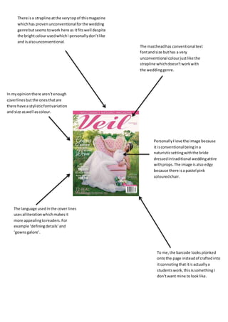
- 1. There isa strapline atthe verytopof thismagazine whichhas provenunconventionalforthe wedding genre butseemstowork here as itfitswell despite the brightcolourused whichI personallydon’tlike and isalsounconventional. The mastheadhas conventionaltext fontand size buthas a very unconventional colourjustlike the strapline whichdoesn’tworkwith the weddinggenre. In myopinionthere aren’tenough coverlinesbutthe onesthatare there have a stylisticfontvariation and size aswell ascolour. PersonallyIlove the image because it isconventional beingina naturisticsettingwiththe bride dressedintraditional weddingattire withprops.The image isalso edgy because there isa pastel pink colouredchair. The language usedinthe cover lines usesalliterationwhichmakesit more appealingtoreaders.For example ‘definingdetails’and ‘gownsgalore’. To me,the barcode looksplonked ontothe page insteadof craftedinto it connotingthatitis actuallya studentswork,thisissomethingI don’twant mine tolooklike.