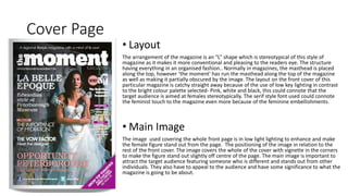
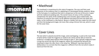
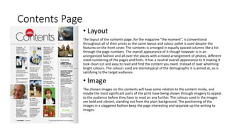
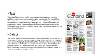
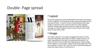
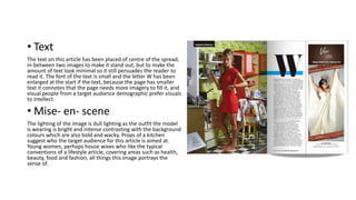
The document provides an analysis of the layout, images, and text used in different sections of a magazine called "the moment". It summarizes the key design elements in the cover page, contents page, and a double-page article spread. The cover page uses bright colors, low lighting, and a centered female image. The contents page has a neutral color scheme and images/text arranged in columns. The double-page spread follows conventions with one page of image and the other of text arranged in a column between two large images.