
Recommended
More Related Content
More from _kyramai
Recently uploaded
Recently uploaded (20)
Analysing contents student
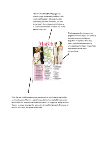
- 1. The imagesusedonthiscontents page are individuallycutoutwithout theirbackgroundandlayered together.PersonallyIthinkthis looksunprofessionalandmessy whereasactual collagedimageslook neatand are muchmore conventional. The mini mastheadforthe page hasa sharperedge thanthe elegantfontsthat mostmastheadsare althoughthere is somethingpleasantaboutthis,the one thingI don’tlike isthe suchboldcolouras it isso unconventional anddoesnotfitthe genre inmy eyes. I like the waythat the page numbersandcontentisIn line witheachother and neatlysotoo.There is a pastel colourbehindone partof the contents whichI like asit almostshowsthe highlightsof the magazine.Along withthis there isan image amongstthe textto breakit upfittinginwell.The range of coloursalsokeepsthe readerinterested.