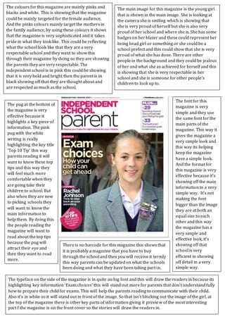
1. The colours for this magazine are mainly pinks and
blacks and white. This is showing that the magazine
could be mainly targeted for the female audience.
And the pinks colours mainly target the mothers in
the family audience, by using these colours it shows
that the magazine is very sophisticated and it takes
pride in what they look like. This could be reflecting
what the school look like that they are a very
respectable school and they want to show this
through their magazine by doing so they are showing
the parents they are very respectable. The
independent school is in pink this could be showing
that it is very bold and bright then the parent is in
black showing off that they are thought about and
are respected as much as the school.
The main image for this magazine is the young girl
that is shown in the main image. She is looking at
the camera she is smiling which is showing that
she is very proud of herself but she is also very
proud of her school and where she is. She has some
badges on her blazer and these could represent her
being head girl or something or she could be a
school prefect and this could show that she is very
proud of what she has done. There are other
people in the background and they could be jealous
of her and what she as achieved for herself and this
is showing that she is very respectable in her
school and she is someone for other people’s
children to look up to.
The typeface on the side of the magazine is in quite an big font and this will draw the readers in because its
highlighting key information ‘Exam choices’ this will stand out more for parents that don’t understand fully
how to prepare their child for exams. This will help the parents reading to communicate with their child.
Also it’s in white so it will stand out in front of the image. So that isn’t blocking out the image of the girl, at
the top of the magazine there is other key parts of information giving it preview of the most interesting
part f the magazine is on the front cover so the stories will draw the readers in.
The pug at the bottom of
the magazine is very
effective because it
highlights a key piece of
information. The pink
pug with the white
writing is really
highlighting the key title
‘Top 10 Tip’ this way
parents reading it will
want to know these top
tips and this way they
will feel much more
comfortable when they
are going take their
children to school. But
also when they are new
to picking schools they
will want to know the
main information to
help them. By doing this
the people reading the
magazine will want to
read about the top tips
because the pug will
attract their eye and
then they want to read
more.
The font for this
magazine is very
simple and they use
the same font for the
main parts of the
magazine. This way it
gives the magazine a
very simple look and
this way its helping
keep the magazine
have a simple look.
And the format for
this magazine is very
effective because it’s
showing off the main
information in a very
simple way. It’s not
making the font
bigger than the image
they are at both an
equal size to each
other and this way
the magazine has a
very simple and
effective look, it’s
showing off that
school is very
efficient in showing
off detail in a very
simple way.
There is no barcode for this magazine this shows that
it is probably a magazine that you have to buy
through the school and then you will receive it termly
this way parents can be updated on what the schools
been doing and what they have been taking part in.