Beyond the EU: DORA and NIS 2 Directive's Global Impact
Alexandra burke double spread page analysis
1. Zara Iqbal Double Spread Page Analysis
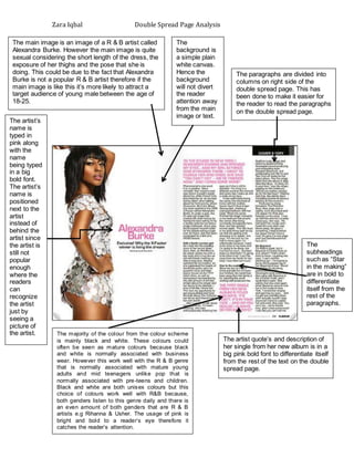
The main image is an image of a R & B artist called
Alexandra Burke. However the main image is quite
sexual considering the short length of the dress, the
exposure of her thighs and the pose that she is
doing. This could be due to the fact that Alexandra
Burke is not a popular R & B artist therefore if the
main image is like this it’s more likely to attract a
target audience of young male between the age of
18-25.
The
background is
a simple plain
white canvas.
Hence the
background
will not divert
the reader
attention away
from the main
image or text.
The artist quote’s and description of
her single from her new album is in a
big pink bold font to differentiate itself
from the rest of the text on the double
spread page.
The
subheadings
such as “Star
in the making”
are in bold to
differentiate
itself from the
rest of the
paragraphs.
The majority of the colour from the colour scheme
is mainly black and white. These colours could
often be seen as mature colours because black
and white is normally associated with business
wear. However this work well with the R & B genre
that is normally associated with mature young
adults and mid teenagers unlike pop that is
normally associated with pre-teens and children.
Black and white are both unisex colours but this
choice of colours work well with R&B because,
both genders listen to this genre daily and there is
an even amount of both genders that are R & B
artists e.g Rihanna & Usher. The usage of pink is
bright and bold to a reader’s eye therefore it
catches the reader’s attention.
The artist’s
name is
typed in
pink along
with the
name
being typed
in a big
bold font.
The artist’s
name is
positioned
next to the
artist
instead of
behind the
artist since
the artist is
still not
popular
enough
where the
readers
can
recognize
the artist
just by
seeing a
picture of
the artist.
The paragraphs are divided into
columns on right side of the
double spread page. This has
been done to make it easier for
the reader to read the paragraphs
on the double spread page.