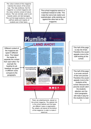
1. The colour scheme of this magazine
matches the colours of the school
logo. This help reinforces that the
magazine is a school magazine and
the colour scheme consist of mature
colours. That are normally used to aim
towards adults and late teenagers.
This suit the target audience since the
staff are adults and majority of
students are in their teens.
There are advertisements placed on
the school magazine. The website link
is the school website and the logos
are different types or organisation.
The adverts are placed at the bottom
of the magazine in order to make it
stand out.
Different content of
the magazine are
typed in different
sizes. This helped
the reader to
separate the context
from each other. For
example the
heading & sub
headings are typed
in different sizes
compare to the
paragraphs.
The school magazine name is a
masthead instead of a title. This
make the name look stylish and
sophisticated, while standing out
against the other text on the
magazine.
This half of the page
is only full of text.
Therefore this would
appeals more to the
staff working at the
school.
This half of the page
is an even amount
of text and pictures
Therefore this would
appeals more to the
students at the
school. Because the
pictures would catch
the students
attention and the
short paragraphs
will make it easy for
the students to read
it.