
Recommended
More Related Content
What's hot
What's hot (19)
Similar to Drakes Progress and wealth in the R&B industry
Similar to Drakes Progress and wealth in the R&B industry (20)
More from denizaysolmazz
More from denizaysolmazz (6)
Recently uploaded
Recently uploaded (20)
Drakes Progress and wealth in the R&B industry
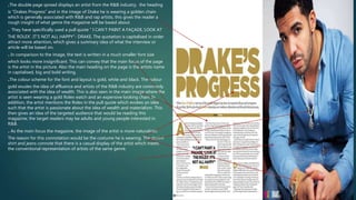
- 1. .The double page spread displays an artist from the R&B industry, the heading is “Drakes Progress” and in the image of Drake he is wearing a golden chain which is generally associated with R&B and rap artists, this gives the reader a rough insight of what genre the magazine will be based about. . They have specifically used a pull quote “ I CAN’T PAINT A FAÇADE,’LOOK AT THE ROLEX’. IT’S NOT ALL HAPPY”- DRAKE. The quotation is capitalised in order attract more attention, which gives a summary idea of what the interview or article will be based on. . In comparison to the image, the text is written in a much smaller font size which looks more insignificant. This can convey that the main focus of the page is the artist in the picture. Also the main heading on the page is the artists name in capitalised, big and bold writing. .The colour scheme for the font and layout is gold, white and black. The colour gold exudes the idea of affluence and artists of the R&B industry are commonly associated with the idea of wealth. This is also seen in the main image where the artist is seen wearing a gold Rolex watch and an expensive looking chain. In addition, the artist mentions the Rolex in the pull quote which evokes an idea such that the artist is passionate about the idea of wealth and materialism. This then gives an idea of the targeted audience that would be reading this magazine; the target readers may be adults and young people interested in R&B. . As the main focus the magazine, the image of the artist is more naturalistic. The reason for this connotation would be the costume he is wearing. The denim shirt and jeans connote that there is a casual display of the artist which meets the conventional representation of artists of the same genre.
- 2. The main focus of the double page spread is the main image of the artist, the portrayal of the artist meets the conventional representation of artists of the same genre as herself. The genre the magazine is based on is Rock. The costume of the artist is made up of a black leather jacket and a black leather choker which connotes an idea of a gothic presentation, similar to most rock artists. The artists make up is presented as a pale face and a very dark smoked eye make up, this makeup style is very common for artists of the rock genre. The colour black again implies a gothic. The costume the artist is wearing is quite minimalistic suggesting a casual and relaxed portrayal. The typography used within the text is aesthetically pleasing as the colours that is used relate to the genre of the magazine, the colour red resembles danger and mayhem which the target audience can identify with. Similarly, the colour black symbolises a gothic and melancholic portrayal. the word “WILD” in the main heading is coloured red and uses a different font style compared to the whole text meaning that it is highly significant as it is highly recognisable, often in this genre of music “wild” is common language within the Rock genre due to the connotations of the word being rebellious. The text is very small in size which again connotes an idea that it is more insignificant compared to the main image. The main image takes up most of the space so that the readers can see what the magazine will be based on.
- 3. The main image of the artist uses up majority of the space for the double page, this resembles that she is significant for this page and that the page will be based on her. The colour scheme is black and white which relates to her genre of pop/R&B, as they are very neutral colours which relate to R&B more as it creates a naturalistic view of the artist. The camera shot for the main image is a close up, this camera shot brings more attention to the artist and emphasises more emotion. Adele is known to be an emotional singer and sings songs based on emotions as well. In addition, the emotional portrayal of the artist continues, the subheading involves language like “passion” which highlights an idea of emotion. The make up used for the artist is naturalistic however the main focus is her eyes which have more of an dramatic display. The dramatic eye look indicates that the singer is compassionate. The text is again relatively small compared to the big main image and the big font sizes of the heading and subheading. This is because the text is insignificant compared to the main image of the artist.