Transparency, Recognition and the role of eSealing - Ildiko Mazar and Koen No...
Font research
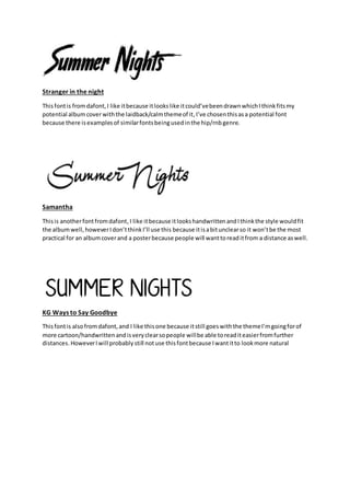
1. Stranger in the night
Thisfontis fromdafont,I like itbecause itlookslike itcould’vebeendrawnwhichIthinkfitsmy
potential albumcoverwiththe laidback/calmthemeof it,I’ve chosenthisasa potential font
because there isexamplesof similarfontsbeingusedinthe hip/rnbgenre.
Samantha
Thisis anotherfontfromdafont,I like itbecause itlookshandwrittenandIthinkthe style wouldfit
the albumwell,howeverIdon’tthinkI’ll use this because itisabitunclearso it won’tbe the most
practical for an albumcoverand a posterbecause people will wanttoreaditfrom a distance aswell.
KG Ways to Say Goodbye
Thisfontis alsofromdafont,and I like thisone because itstill goeswiththe themeI’mgoingforof
more cartoon/handwrittenandisveryclearsopeople willbe able toreaditeasierfromfurther
distances. HoweverIwill probablystill notuse thisfontbecause Iwantitto lookmore natural
2. Sweetly broken
This is a font from dafont, and this would be a good font because it’s the type of style I want
for my album cover however I feel it could be slightly unclear if I want it to be eye catching
because I will want people to be able to read the text from a distance.
Hashtag
This final font is also from dafont, and I think this is perfect for the style I’m going for where
the font looks handwritten. This font is also very clear so it will be easily accessible to read
so if the cover grabs attention then customers will be able read the text.
I’m going to use the font: ‘Stranger in the night’, because it will fit very well with my album
cover because it stands out well because it’s bold and well contrast with the dark wall that it
will be covering therefore it’s noticeable for anyone reading it from a distance which means
the chance of having bigger audience would increase.