1. FONT RESEARCH
EXAMPLES OF FONTS FOR MY BAND
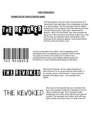
This font caught my eye as it looks very punk/rocky as if
these letters have been taken from a newspaper and stuck
on a piece of paper. This font was taken from the ‘dafont’
website and it can be likened to the font that the punk band
The Sex Pistols used on their album ‘Nevermind the
Bollocks, Here’s the Sex Pistols’; they were renowned for
being one of the most iconic punk bands of their time. I also
like this font as it looks like it took minimal effort, which
obviously fits the punk/rock attitude. I will use this font for
the front cover of my album cover.
I like this font however, and it is quite simple yet it is
quite boring as it is not as eye-catching as the others. It
is a simpler, version of the first font. I could use this for
the back of the album cover. This was taken from
‘dafont’.
This font is also taken from ‘dafont’ and it is appealing to the
demographic that I am targeting as it is abstract, which is what
I am going for in terms of my band as it is meant to be a
punk/rock bad that show a very laidback attitude towards life
and this too, is a very simple but good design for that genre.
This is one of my favourite fonts as it is similar to the
first, in the way that it looks like it has taken no time or
effort to create this logo. This is because it looks
handwritten and scruffy, which suits the punk genre of
no effort. This was taken from ‘dafont’ and I will most
likely use this on the back cover, or inside of the CD.