
Recommended
More Related Content
What's hot
What's hot (20)
Similar to Film posters
Similar to Film posters (20)
More from Tannaaa
More from Tannaaa (20)
Recently uploaded
Recently uploaded (20)
Film posters
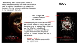
- 1. oooo Title in red- tells the audience this is a horror movie Black background- a sense of mystery and loneliness Spotlight lighting on the doll- shows they are the main subject of the film and tells the audience to be aware of them. Also the fact that dolls have a traditional connotation to being lovely and sweet suggest there will be an unexpected surprise as a sweet, innocent doll is in a horror movie The half crop of the face suggests themes of being possessed as they are only showing half the face. A doll as connotations of being sweet and innocent. The half crop contradicts it and suggests it may play a dark character
- 2. poster under lighting- suggests to the audience this is the antagonist/ mischievous character Title in red- tells the audience this is a horror movie Slogan entices the audience. It helps to persuade the audience to go and watch the filmThe featured character in on the poster is the antagonist. This suggests that for my work, i should also use the antagonist as the prominent feature in my poster In both posters for annabelle and chucky, the dolls have been the main focus. This means my poster that i will make for my trailer will use the antagonist character, the doll, as the main focus Black background This keeps the poster simple and makes the doll stand out. It creates a terrifying atmosphere as if the audience is home alone, in a dark house with the doll.
- 3. Poster protagonist takes up most of the frame Antagonist is in the background Another idea for my poster is to feaster the protagonist with a frightened expression and have the doll, or a shadow of the doll behind the protagonist This half faced composition seems to be recurring trend in many horror film posters. It suggests that i should try this composition to make my film fit in better with this genre
- 4. posterActors names attracts fans of the actor as they have seen their previous work Title in red- tells the audience this is a horror movie Location shot Merging three images together I could put the actors, for the main protagonist and antagonist, name on the poster however it would not be effective and the actors in my trailer are not well know and have not done any previous work which has been significantly successful. There is a lot of information on this poster
- 5. simplistic Only text. No characters. Reviews and star ratings. 4 and 5 star reviews from film critics persuade the audience into watching the movie The poster features the antagonist wearing the mask. The mask appears to have blood on it which tells the audience that this is the antagonist. “You’re next” is the title of the film but it is speaking to the audience directly which creates a connection and a relationship. The poster speaks directly to the audience which makes them feel vulnerable and scared and creates a sense of them being watched High lighting which creates a spotlight on the character and creates shadows around the border of the poster and underneath the snout of the animal mask
- 6. The character is not in the center of the poster. It is off to the side. There is heavy shadow on the right side of the character’s face. This helps convey the character to the audience. This character is sly and creepy and lurks in the shadows. Furthermore, the text and mast head is on top of the image which makes it appear as if they are lurking, hiding, spying. Name of the director. This attracts fans of his work which will attract a wider audience. Light source coming from one side, the left advertising other similar films that this specific target audience may enjoy. They are promoting other films which share the same target audience. The language on the poster helps to encourage readers to go an watch the film. This language is targeted to horror movie fans. The word ‘horror’ is written in red. Red has connotations to danger and evil.
- 7. The head of the actress covers the middle of the title of the magazine There are no other advertisement for other films, or film reviews, ‘what's inside’ advertisement Very clean cover, not a lot of advertisement to tell the reader what is inside the magazine Mid shot of the antagonist - this is a composition i can try for my magazine cover Her head is tilted down which makes her seem mischievous and sinister as it deepens her eyes and makes them appear darker There is blood dripped over the model on the cover indicating that this is issue of the magazine is covering a horror film.
- 8. ... The protagonist of the film is featured on the cover of the magazine- this does tend to be a recurring trend which suggest i should also use the antagonist character for my magazine cover Reviews of the film tell the audience what other people thought of the film. Reviews from celebrities or professionals make the film more credible. Reviews from well liked people make the film more enticing as the audience will trust their views and will want to go and see the film. The actor’s name who plays the character on the cover- unfortunately, as my film will be a small budget film, i will not be able to hire well-known actors which means i may not be adding this element into my magazine cover. However, if i were to add the actor’s name, they would have to be an ambitious up and coming actor which will be featured in many up and coming films. This will only apply to a magazine cover and not a film poster as informations about the actor and their work can be spoken about inside the magazine whereas there is no opportunity for that on a film poster. Advertising other similar films the reader may enjoy