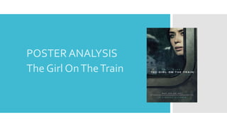
2. THEVISUAL GRAPHICS
Starting with the visual graphics of this film poster, the
dominating feature is the main character of the film.This is a
very common thing to do, advertising the main character and
making them known to potential audiences.They’ve allowed
this image to take up the entire poster, filling the background
completely. I believe this a very successful technique,
especially in aim to draw people in. By making the picture
quite close up to the characters facial expression clearly, we
can see she is glancing, looking sad towards something in the
near distance.This connects the audience to the character
and makes them want to know what they are feeling and why.
Also weaved into the visual of the poster, are elements of
mise en scene. Using settings and props, the train and the
reflection of the house that Emily Blunt’s character obsesses
over in the film, are shown in the visuals.This cleverly
connects the poster to the film and its narrative in a subtle
way, giving detail about the film which isn’t just focused on
the main character. In this instance it gives them an idea of
setting and a glance into the narrative.
3. THE COLOUR PALETTE
Alongside the visuals, the colour choices used in the poster
are very important.These are something that connect the
poster to the film’s aesthetic. In the poster they have kept
the tones and colours quite dull.This matches the overall
mood of the film, and therefore is mirrored effectively in
the poster through the colours.The poster has used colours
such as grey, turquoise, black and various different shades
of blue.This altogether creates quite a sad and scared
mood for the poster, which corresponds perfectly with the
actual film.Additionally, they’ve made the characters skin
complexion very pale.This has a dramatic effect, linking
into to the personality of the main character and interesting
the audience into why she looks this way. Her eyes also
incorporate the themed colours of grey and green. Even
through the most simplistic editing, they have ensured her
eye make up is smudged to a grey colour which is very
similar to that of the outside of the train. Her eye colour is a
muted green, which ties in perfectly with all the tones used
in the poster.
4. THETEXT CHOICE
A very simplistic, yet effective text choice has been made for
this poster. Starting with the colour choice, they’ve used a
combination of a muted green and white for the text.
Keeping it consistent, they’ve shared the colours by
alternating them between every other piece of writing.The
writing is extremely basic, a slim font with every word
written in capitals to just draw in the right amount of
attention. I think they’ve chosen to keep the writing minimal
in order to focus everyone's attention onto the visual part of
the poster. Placing the text across the middle of the poster in
order to not block the main image, attracts the audiences
attention to the picture first and then to read the details
below. One part which I believe was extremely successful,
although very subtle, is the effect they’ve put on the main
title.The have used a sweeping effect to making it look as if
the title is moving with the train.This is effective in keeping
cohesion between the all promotional materials. Lastly, they
have used the tag line which is used across all of the film
posters and in advertisement of the film “what did she see?”.
6. THEVISUAL GRAPHICS
The visual graphics for Gone Girl are quite complex, but give
off a minimalistic look.They include several components, and
show off both of the main characters.The basis of the visual is
the female main characters face.This has been put on a very
low opacity so only her eyes are subtly visible. Her face has
been blended onto the background of a sky, river image.
Although this setting doesn’t relate to the film, it contains
colours which are suitable for the poster.Another element of
the visual is the male main character. He is placed at the
bottom of the poster, and made to look as if he is part of the
landscape picture. He is of a small size compared to the female
character (although her face is barely visable), this could have
some significance in regards to character importance. Some
other details of the visual graphics include the floating cloud,
and the low opacity overlaid graphics from a news reel
included throughout the film.The cloud is mixed in with the
title, emphasising the essence of the missing girl. Lastly, the
layout of the poster, contains a white border.This gives the
visual an almost polaroid picture look, possibly implying use of
pictures within the narrative of the film.
7. THE COLOUR PALETTE
The colour choices for the Gone Girl film poster are very
minimalistic. Including mainly shades of purple and blue, it has a
very gentle effect on the poster. As a sky is incorporated within
the visual graphics of the poster, a blue gradient is used that fades
into a light lilac colour as it flows down the page.These choices of
background colours create a very mysterious atmosphere for the
audience.The colour of the main title text and the subtitles is a
dark shade of purple and blends nicely into the colour palette.
They have also used a soft white to create a range in the colours
used.The names of the main actors of the movie at the top are in
a very light lilac/white colour.This doesn’t make them stand out
obviously to the audience, but I believe that was done purposely
in order to draw attention to the visual graphics instead.The
white colour used in the cloud separates the colour of the main
title from the background colours, allowing it to stand out to an
extend.The light lilac colour is again used for all of the credit
information at the bottom of the poster.This has been done in
order to not draw attention to it, as it is not the most significant
part of the poster.
8. THETEXT CHOICE
The text used in this poster isn’t very bold or bright and eye
capturing. However, it’s subtle look captivates the audience
with a minimalistic approach.The main title ‘Gone Girl’, is the
largest piece of text on the poster. It is a deep mauve colour,
and matches the aesthetics of the background of the poster.
Although it has been purposely faded into a cloud, it is still
visible and can be clearly read.All of the other text on the
poster is very small and in faint colours. For example, the two
main actors names are written at the top of the poster, in a
very light lilac colour. Even though we can see these titles, they
don’t stand out.This means it isn’t completely clear to the
audience who is starring in the film.They’ve also used small
text to present the tag line for the film which is situated just
underneath the main title.This is again in a very faint colour,
and thin font, blurring into the background of the poster. In
regards to the names of companies, those involved and release
dates, they are at the bottom and in a light grey colour. All of
the choices may have been purposely chosen in order to make
the visual graphics stand out, instead of making the text bring
the attention in.
10. THEVISUAL GRAPHICS
The poster for South Paws is absolutely my favourite, in terms
of visual graphics. It’s tones, colours and visual appearance
perfectly correspond with the genre and mood of the film.The
main actor takes up the entire visual. A side profile of him
looking down has been enlarged and covers the entire
background on top of the black basis. His character, a boxer
fighting to gain his daughter back, is the key part of the poster.
The colour of the image has been tinted to be slightly more
grey toned, in order to relate to the harsh mood. It shows the
main character in his most bruised and punched up state, which
is effective in drawing the audience in to find out why he looks
like this. Including an image where blood is used also really
influences audience interaction, getting them to question why
that blood is there. Putting the main actors image on a black
background instantly draws attention to the main image,
making sure there is no other visual distractions.The outside
edges of the poster are frayed with white, to almost look like
they have been burnt or ruined.This relates to the theme of
loss within the film.
11. THE COLOUR PALETTE
The colours used in the South Paw poster are very dramatic
and dark, fitting to the heavy thriller genre of the film.A
harsh black colour has been used for the background.This
could relate to the main character feeling that nothing is real,
and that he has a black cloud following him around.The block
colour may have been used to also draw the visual of the
main character to the attention of the readers.They’ve also
used the corresponding colour of red throughout the
advertising campaign.The main title, tag line and ‘written by’
are all in this colour.This brings a pop of colour to the poster,
and also could be significant to blood which is present a lot
during the film and on the poster.White has also been used in
various places throughout the poster, to interject the dark
colour palette. Mainly we see it through speckles over the
graphics, which I think is meant to give a edgy, old and used
effected. Lastly, to fit in with the dark tones of the visual,
they have made the photograph of the main character very
grey toned.This adds to the theme of pain and hurt.
12. THETEXT CHOICE
Just like the whole aesthetics of this poster, the text is very
minimal and kept in the bottom right hand corner of the
poster.The title of the film is written in a bold red colour,
using capital letters.This makes it stand out, yet it isn’t too
overwhelming. Both the main title and the names of the
main actors are positioned facing down.This has been done
to create an effect with matches the visual graphics, making
it seem as if the main actor on the poster is looking down on
the titles.This could relate to him looking down on and being
ashamed of his own life.The size of the titles of the main
actors names, directors, writers etc are quite small.They are
still readable, and have been written in a white text to ensure
this; they clearly wanted to make the visual the main
attraction of the poster.The tag line used on the poster
states: “believe in hope”.This relates extremely well with the
film, as the main characters surname in the film is Hope.
They’ve only included only a year for the release date and
again it is small writing in order to not draw attention away
from the visuals.