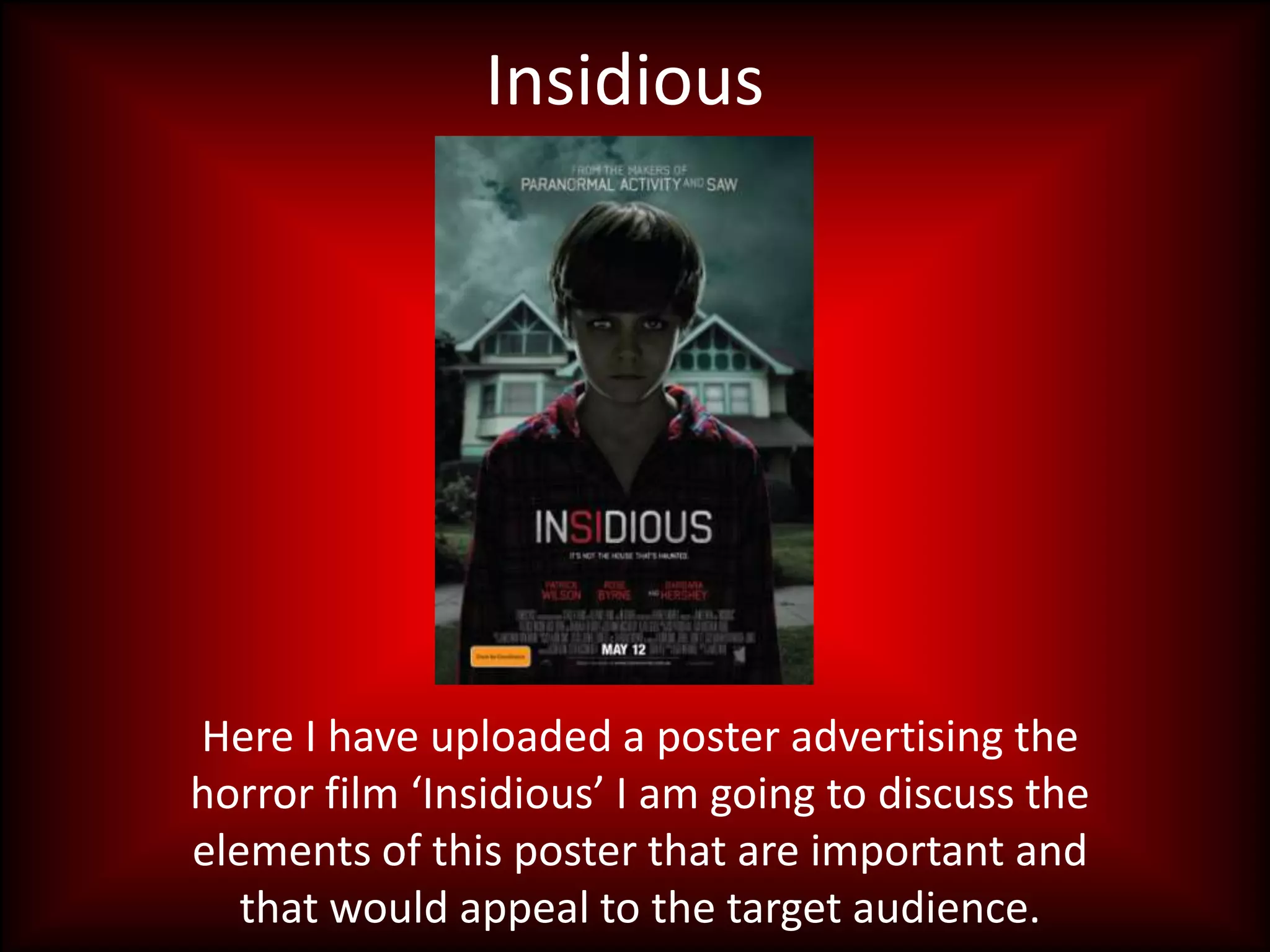
1. Insidious
Here I have uploaded a poster advertising the
horror film âInsidiousâ I am going to discuss the
elements of this poster that are important and
that would appeal to the target audience.
2. Film title
This film title is written in a bold font, using red writing on two of the letters, the
colour red representing blood and horror, generally used to signify horror films. The
writing looks as though it has been scratched, giving it a more scary feel. The title
doesnât give much away to the audience about the film and doesnât suggest what
the storyline is going to be, so the audience therefore want to find out more. The
writing is in the middle of the page on the poster, showing itâs importance and as it is
just below the eye line of the boy in the image it is very noticeable as the first thing
the audience would notice when looking at the poster would be the facial expression
of the boy in the image.
3. Image
This image is very effective as the character looks very dominant and is looking into the
viewers eyes as if to intimidate them and show them his status. His eyes look very scary
and his posture is very unsettling as he has got his arms by his side and looks scary. The
image is very dark and dull which is a feature that is often used in images for horror
films as it gives them a more worrying and âhorrorâ feel. In the background of the
image the weather looks very dismal, suiting the theme of the film and fitting in well
with the genre. Also, the house in the background is very effective and is a very
stereotypical setting for the genre.
4. Tag lines
This tag line is made to be clear as it is just under the film title so after reading the title
the audience will see this. It is very alarming for the audience as it creates a question in
their head that can only be answered by watching the film and finding out what
happens. Stereotypically horror films include a haunted house but this tag line
contradicts the stereotype which would make the audience want to find out more.
This part of the poster at the bottom of the page includes all the information that is
less important and not vital for the audience to read. This one section saying âMAY
12â is telling the audience what date the film comes out so it is in bigger, more clear
writing for them to see.
5. To tempt the audience
At the top of the poster it states that the
producers of the film also made If the audience see that actors they
âParanormal activityâ and âSawâ this would are interested in star in the film they
appeal to the audience as they are two are more likely to be interested in
famous films of the same genre and if they watching it knowing an acting style or
enjoyed those films then it would make actor they like are starring in the film.
them want to see insidious. This is written The names are written in a bold, red
in a bold, clear font using a colour that font using capitalization to make them
contrasts the background, using stand out.
capitalization so it stands out.