SlideShare a Scribd company logo
1 of 4
Content’s Page Analysis
This specific contents page from We Love Pop follows conventions as conventionally contents pages
are a combination of both text and images, around 50% each, and this convention is followed. Each
image has a small caption relating to the article as well as the number of the page it is placed on. The
images, headlines and colours used are all a reflection of the target audience as well as the style of the
magazine. The fonts used help to keep brand identity as does the use of the logo in the top right hand
corner of the page. The editors letter from “Emily x” adds an extra, personal touch, making her seem
like a friend to the audience! Editor’s letters feature in a lot of pop magazine’s and is a very common
feature. This is because it allows the editor connect with the audience of the magazine. It also allows
the audience to have a summary of the magazine which can help to build their excitement to read the
magazine.
The title is “We Love This…” maintaining the theme of the name of the whole magazine We Love
Pop, interlinking the two together. The ellipses at the end of the title builds anticipation and
excitement. It is also written in a similar bold, bulky font. The font used is a signature font used in We
Love Pop helping to cement its brand identity and trigger recognition in the target audience. As
mention before the font is bold and bulky, this gives it the power to stand out majorly from the rest of
the text, which is why important text such as “Inside this month” is written in this font as it brings the
attention straight to that section, which is the main piece of text on a contents page. All other text is
written in a different font: however, the headlines are all written in a blue/green colour, and the
information about the article is written just below, in a different font, and in the colour black. The
colour’s blue and green are bright, upbeat and natural colours. The colour green can be represented as
sanctuary away from stress, which is what a magazine does - it distracts the reader and takes them into
another word. The colour blue is one of trust, honesty and loyalty. This can highlight some of We
Love Pops aims, in the sense that their content aims to be all of these things.
The main image on the contents page is of The Saturdays. All five girls are, from what we can see
wearing bright coloured costumes, reflecting the genre. They are also all posing in different ways,
giving them their individuality. The caption reads "FRANKIE gets sick of call waiting" which is
appropriate as she is holding a phone in her hand, sticking her tongue out in a silly manner,
highlighting her lack of interest in the matter. Rochelle is placed at the back, next to Mollie. We can’t
see much of their costume, but Rochelle seems to have her hair styled straight, with bold eye makeup
to make her eyes stand out to comply with her shocked facial expression. Mollie looks to have her
hair curled, from the little part of it we can see, and she looks to be wearing a baby blue costume, her
make-up looks nice and “doll like” which many young girls will idolise. Vanessa’s hair looks natural
and wavy, her make-up looks dark like Rochelle’s with the dark, misty eyed look. Costume wise,
Vanessa is wearing a baby blue skirt, which is similar to the colour of Mollie’s, wjocj a black orange
and blue top. The orange on Vanessa’s top links with Frankie’s orange dress, which is a round neck,
short sleeve top, which is smart and not revealing to the audience. Frankie’s hair is styled straight as
usual, but her make-up looks to be smudged on her eyes, as if she has been crying which could tie in
with the headline “Frankie gets tired of call waiting”. Similar to Rochelle it is hard to see Una’s
costume, however, from what we can see it looks to be red. She also hair hair rollers in her hair, just
like she was preparing to go out somewhere, this matches her facial expression as her mouth is
opened shocked, highlight that perhaps she was unexpecting the photo as she was not ready yet. Her
makeup is nice and natural giving her a role model aura about her as she looks respectable. The
overall positioning of the image represents that they are in a band, due to their positioning, three at the
front and two at the back. It does not suggest in anyway who the main singer of the band is, however
Frankie is positioned in the centre as the article is about her. However, all girls are posing in different
ways. Rochelle, has her hands over her mouth with wide eyes, giving of the idea that she is shocked.
Mollie looks cheeky as she has her head titled and has her hand up to her face, as has a mysterious
pink spray on her face - which could be lipstick. Vanessa has her finger in her mouth and is biting on
it making her look sexy. Frankie, as mentioned before has a phone in her hand and is sticking her
tongue out giving of the impression that she doesn’t care. Lastly, Una’s mouth is slightly parted
looking shocked as if she wasn’t expecting anyone to see her with rollers in her hair half ready.
Other images include a smaller image of The Saturdays, in the top left hand corner just above the
editor's letter which is captioned "snuggled up with the sats" in a puff, the image itself looks to be a
sleepover, which the target audience can relate to as it is familiar to them! The use of the word "sats"
is an abbreviation of the girlband, which the target audience would use themselves, making the
magazine sound more like a friend. It also sounds like a nickname, it sounds like the magazine knows
the band well. This colour relate to the caption “snuggled up with the sats” as it sounds like the
magazine is doing that also, presenting that those working for the magazine are up close and personal
with the Saturday’s. This will make the audience admire the magazine even more if they think that
they are close with the celebrities and can have a good time and a friendly chat with them. It would be
more likely that they would therefore rely on the magazine to get the latest gossip for them. The text
regarding being “snuggled up with the Sat’s” itself is written within a fun shaped puff, making the
contents page more fun and bubbly, reflecting the personality of those who read it!
Other images include one of Justin Bieber sticking his tongue out is placed on the right hand side of
the contents page. He is wearing a white t-shirt which is a usually wardrobe choice from him. He also
looks like he is in an interview, which will make the audience believe that the article regarding Justin
Bieber has actually taken place.
There is an image of the Wanted boy’s standing in a picture frame, similar to one you would see a
painting placed in. Nathan at the back looks to be quite confused which you can tell buy his facial
expression, his hair is styled in the style all the girls love, not the long sweep hair but the freshly cut
and quiffed hair. He is wearing a striped polo. Siva’s outfit is not clear to us, all we can see is that he
is wearing some kind of black top on his upper body. He is bending down and his mouth looks open
and that his tongue is out and to the side. Tom is also bending down and to the side to fit into the
frame, who is giving of a ‘cool’ pose to comply with his outfit of a white t-shirt and a nice, smart grey
jacket which is half zipped up. Jay is crouched down on the floor, he is wearing a light blue t-shirt,
with a navy parker on and it looks like he is wearing a white bandage on his head, hiding his brown
locks! He is also placed his hands to make a “peace” sign. Max is crouched down next to Jay, he has
his mouth open and face scrunched up, looking like he is shouting.
A small image of One Direction and Katy Perry and many other artists are placed in a strip along the
bottom of the magazine in the section of “Hot Posters”. These images will be used to draw the
audience in as they are all there favourite artists, so they will want to read about every single one of
them. By having loads of images, the audience can see straight away who features in the magazine
rather than reading through it to find out. Most of the images are placed vertically down the right hand
side, so that they audience can look down through all of them, rather than them being scattered all
over the page.
It is important to make the contents page visually heavy, as it is a fun page regarding the contents of
the magazine. If it was word based the audience wouldn’t bother reading it. However, because it is
image heavy they can see other images and articles that aren’t on the front cover that they also want to
read!
The main content is linked to the feature article photo’s, which comes to a total of four. The title is
written below the image in blue, with a snippet of the article written in black, the page number is
written in the bottom left hand corner of the image in white on a yellow background. The rest of the
magazine content is written in a small text box towards the bottom of the page. It is titled “Inside this
month” with ten different headlines. The page numbers are written largely at the beginning of the
sentence, with the sell line following it. Each headline is alternatively written in black or in pink.
The editors letter takes up a fair part of the contents page. It is placed in the top hand corner of the
contents page, which will be the first thing the audience will read. The mode of address used in the
editor’s letter, is terminology that the audience are familiar with such as “wowmazing” and “goss”.
Which could help the audience establish the magazine as a friend. It can also be used to interact with
the reader on a more personal level, it also includes all the information they need about the issue as
mentions what the edition includes such as “12 pages of 1D in our special mini mag”. The editor signs
the letter of with a signature “Emily” and signed off with a “x” (kiss). This makes the magazine seem
even more like a friend and even more personal to the reader.
The contents page is very similar in layout across many editions/issues, this maintains brand identity
as well as benefits those reading it as they are used to the set up and can gather the information they
need quickly without having to search for it. The choice of layout is very clear, the editors letter on
the left, the main story in the middle, featured articles on the right, the rest of the content further down
towards the middle and small images of the posters available down the bottom. This is a nice and
clear layout and does not make the contents page difficult to reader or for it to look over crowded. It is
helpful that the contents page is evenly split between images and text, as otherwise it could look plain,
boring and would be more difficult for the audience to digest all the information.
The colours pink, yellow, blue and black dominate the contents page. These colours represent the
upbeat and bubbly girls who will be reading the magazine as the colours themselves are bright and
vibrant. The colours also are used to maintain brand identity as they are used in almost every edition,
varying slightly.
The colour pink helps to establish the magazine as one that is directed towards a female audience. The
colour yellow represents knowledge, this relates to the contents page as it includes the pages whereby
all the articles are written on which is the overall “content” (knowledge) of the edition of the
magazine. The colour black is a strong and bold colour and therefore helps the text itself to stand out
even more. It also makes the contents page look more professional.

More Related Content

What's hot

Powerpoint on deconstructions
Powerpoint on deconstructionsPowerpoint on deconstructions
Powerpoint on deconstructionsellie_kershaw
 
Analysing music magazines
Analysing music magazinesAnalysing music magazines
Analysing music magazinesLaurenMenage
 
Powerpoint on deconstructions finnished
Powerpoint on deconstructions finnishedPowerpoint on deconstructions finnished
Powerpoint on deconstructions finnishedellie_kershaw
 
Contents Page Analysis of 'We Love Pop'
Contents Page Analysis of 'We Love Pop'Contents Page Analysis of 'We Love Pop'
Contents Page Analysis of 'We Love Pop'Antonia-Montefusco
 
Music Magazine Evaluation
Music Magazine EvaluationMusic Magazine Evaluation
Music Magazine EvaluationLaurenTaylor8
 
Analysis of three double page spreads from music magazines
Analysis of three double page spreads from music magazinesAnalysis of three double page spreads from music magazines
Analysis of three double page spreads from music magazineszoewarwood
 
Music Magazine Analysis
Music Magazine AnalysisMusic Magazine Analysis
Music Magazine Analysisrachelmullenx
 
Magazine resarch powerp 2
Magazine resarch powerp 2Magazine resarch powerp 2
Magazine resarch powerp 2Jessica Smith
 
Analysing music magazines edit
Analysing music magazines editAnalysing music magazines edit
Analysing music magazines editasmediag13
 
Task 3 - Music Magazine Analysis
Task 3 - Music Magazine AnalysisTask 3 - Music Magazine Analysis
Task 3 - Music Magazine Analysiselliemoore17
 
Magazine resarch powerp 2 final
Magazine resarch powerp 2 finalMagazine resarch powerp 2 final
Magazine resarch powerp 2 finalJessica Smith
 
Media coursework 9 analysis'
Media coursework 9 analysis'Media coursework 9 analysis'
Media coursework 9 analysis'Mcyuzuzo
 
Media coursework 9 analysis'
Media coursework 9 analysis'Media coursework 9 analysis'
Media coursework 9 analysis'Mcyuzuzo
 
Double page spread research
Double page spread researchDouble page spread research
Double page spread researchchloehiorns1
 

What's hot (18)

Powerpoint on deconstructions
Powerpoint on deconstructionsPowerpoint on deconstructions
Powerpoint on deconstructions
 
Analysing music magazines
Analysing music magazinesAnalysing music magazines
Analysing music magazines
 
Powerpoint on deconstructions finnished
Powerpoint on deconstructions finnishedPowerpoint on deconstructions finnished
Powerpoint on deconstructions finnished
 
Textual analysis
Textual analysis Textual analysis
Textual analysis
 
Media deconstructions
Media deconstructionsMedia deconstructions
Media deconstructions
 
Contents pageanalysis wlp
Contents pageanalysis  wlpContents pageanalysis  wlp
Contents pageanalysis wlp
 
Contents Page Analysis of 'We Love Pop'
Contents Page Analysis of 'We Love Pop'Contents Page Analysis of 'We Love Pop'
Contents Page Analysis of 'We Love Pop'
 
Music Magazine Evaluation
Music Magazine EvaluationMusic Magazine Evaluation
Music Magazine Evaluation
 
Analysis of three double page spreads from music magazines
Analysis of three double page spreads from music magazinesAnalysis of three double page spreads from music magazines
Analysis of three double page spreads from music magazines
 
Music Magazine Analysis
Music Magazine AnalysisMusic Magazine Analysis
Music Magazine Analysis
 
Magazine resarch powerp 2
Magazine resarch powerp 2Magazine resarch powerp 2
Magazine resarch powerp 2
 
Analysing music magazines edit
Analysing music magazines editAnalysing music magazines edit
Analysing music magazines edit
 
Task 3 - Music Magazine Analysis
Task 3 - Music Magazine AnalysisTask 3 - Music Magazine Analysis
Task 3 - Music Magazine Analysis
 
Magazine resarch powerp 2 final
Magazine resarch powerp 2 finalMagazine resarch powerp 2 final
Magazine resarch powerp 2 final
 
Media coursework 9 analysis'
Media coursework 9 analysis'Media coursework 9 analysis'
Media coursework 9 analysis'
 
Media coursework 9 analysis'
Media coursework 9 analysis'Media coursework 9 analysis'
Media coursework 9 analysis'
 
Textual Analysis
Textual AnalysisTextual Analysis
Textual Analysis
 
Double page spread research
Double page spread researchDouble page spread research
Double page spread research
 

Viewers also liked

Viewers also liked (16)

poster analysis texas chainsaw 3D
poster analysis texas chainsaw 3Dposter analysis texas chainsaw 3D
poster analysis texas chainsaw 3D
 
Practical Peices
Practical PeicesPractical Peices
Practical Peices
 
Camera idea's
Camera idea's Camera idea's
Camera idea's
 
Trailer analysis 2
Trailer analysis 2Trailer analysis 2
Trailer analysis 2
 
Trailer analysis
Trailer analysis Trailer analysis
Trailer analysis
 
the history of horror
the history of horrorthe history of horror
the history of horror
 
Front cover overview
Front cover overviewFront cover overview
Front cover overview
 
Evaluation Question 3
Evaluation Question 3Evaluation Question 3
Evaluation Question 3
 
Costume Analysis
Costume Analysis Costume Analysis
Costume Analysis
 
Location ideas
Location ideasLocation ideas
Location ideas
 
Poster analysis 3
Poster analysis 3Poster analysis 3
Poster analysis 3
 
Trailer analysis 2
Trailer analysis 2Trailer analysis 2
Trailer analysis 2
 
Evaluation: Question Four
Evaluation: Question Four Evaluation: Question Four
Evaluation: Question Four
 
Mise en-scene Analysis
Mise en-scene AnalysisMise en-scene Analysis
Mise en-scene Analysis
 
Reconnaissance
ReconnaissanceReconnaissance
Reconnaissance
 
Poster analysis friday the 13th
Poster analysis friday the 13thPoster analysis friday the 13th
Poster analysis friday the 13th
 

Similar to Contents Page Analysis

Contents Page Analysis
Contents Page AnalysisContents Page Analysis
Contents Page AnalysisShauna-Mullen
 
Front Cover Analysis 'We Love Pop'.
Front Cover Analysis 'We Love Pop'.Front Cover Analysis 'We Love Pop'.
Front Cover Analysis 'We Love Pop'.Antonia-Montefusco
 
Front Cover Analysis - 'We Love Pop'
Front Cover Analysis - 'We Love Pop'Front Cover Analysis - 'We Love Pop'
Front Cover Analysis - 'We Love Pop'Antonia-Montefusco
 
Analysis of similar style magazine cover
Analysis of similar style magazine coverAnalysis of similar style magazine cover
Analysis of similar style magazine coverMegan Whitehead
 
Magazine analysis
Magazine analysisMagazine analysis
Magazine analysisdenirose17
 
Magazine analysis of top of the pops
Magazine analysis of top of the popsMagazine analysis of top of the pops
Magazine analysis of top of the popsdenirose17
 
Contents page analysis
Contents page analysisContents page analysis
Contents page analysislilytaylor99
 
Task Four - Target Audience Appeal
Task Four - Target Audience AppealTask Four - Target Audience Appeal
Task Four - Target Audience Appeallouisangus
 
Task four - target audience appeal
Task four - target audience appealTask four - target audience appeal
Task four - target audience appealLoisSmith97
 
Double Page Spread Analysis One
Double Page Spread Analysis OneDouble Page Spread Analysis One
Double Page Spread Analysis OneKirstyMaeHarragan
 
Analysis of pop magazine contents pages
Analysis of pop magazine contents pagesAnalysis of pop magazine contents pages
Analysis of pop magazine contents pagesASMEDIADANIELLE
 
Front cover analysis
Front cover analysisFront cover analysis
Front cover analysisbhatty97
 
Front Cover Analysis
Front Cover AnalysisFront Cover Analysis
Front Cover Analysisrebeccadahl98
 
Magazine analysis totp 1
Magazine analysis   totp 1Magazine analysis   totp 1
Magazine analysis totp 1Deanna Harnden
 
Magazine analysis totp 1
Magazine analysis   totp 1Magazine analysis   totp 1
Magazine analysis totp 1deannaharnden
 

Similar to Contents Page Analysis (20)

Contents Page Analysis
Contents Page AnalysisContents Page Analysis
Contents Page Analysis
 
Front Cover Analysis 'We Love Pop'.
Front Cover Analysis 'We Love Pop'.Front Cover Analysis 'We Love Pop'.
Front Cover Analysis 'We Love Pop'.
 
Front Cover Analysis - 'We Love Pop'
Front Cover Analysis - 'We Love Pop'Front Cover Analysis - 'We Love Pop'
Front Cover Analysis - 'We Love Pop'
 
Analysis of similar style magazine cover
Analysis of similar style magazine coverAnalysis of similar style magazine cover
Analysis of similar style magazine cover
 
Magazine analysis
Magazine analysisMagazine analysis
Magazine analysis
 
Magazine analysis of top of the pops
Magazine analysis of top of the popsMagazine analysis of top of the pops
Magazine analysis of top of the pops
 
Contents page analysis
Contents page analysisContents page analysis
Contents page analysis
 
Task Four - Target Audience Appeal
Task Four - Target Audience AppealTask Four - Target Audience Appeal
Task Four - Target Audience Appeal
 
Magazine conventions
Magazine conventions Magazine conventions
Magazine conventions
 
Class deconstructions 1
Class deconstructions 1Class deconstructions 1
Class deconstructions 1
 
Task four - target audience appeal
Task four - target audience appealTask four - target audience appeal
Task four - target audience appeal
 
Double Page Spread Analysis One
Double Page Spread Analysis OneDouble Page Spread Analysis One
Double Page Spread Analysis One
 
Analysis of pop magazine contents pages
Analysis of pop magazine contents pagesAnalysis of pop magazine contents pages
Analysis of pop magazine contents pages
 
magazine analysis
magazine analysismagazine analysis
magazine analysis
 
Front cover analysis
Front cover analysisFront cover analysis
Front cover analysis
 
Media studies
Media studiesMedia studies
Media studies
 
Front Cover Analysis
Front Cover AnalysisFront Cover Analysis
Front Cover Analysis
 
Textual analysis
Textual analysisTextual analysis
Textual analysis
 
Magazine analysis totp 1
Magazine analysis   totp 1Magazine analysis   totp 1
Magazine analysis totp 1
 
Magazine analysis totp 1
Magazine analysis   totp 1Magazine analysis   totp 1
Magazine analysis totp 1
 

More from Shauna-Mullen

More from Shauna-Mullen (20)

3
3 3
3
 
Question 2
Question 2Question 2
Question 2
 
Question 1
Question 1Question 1
Question 1
 
Storyboard
StoryboardStoryboard
Storyboard
 
Mock ups
Mock ups Mock ups
Mock ups
 
Introduction to characters
Introduction to charactersIntroduction to characters
Introduction to characters
 
ideas for Non diegetic sound
ideas for Non diegetic soundideas for Non diegetic sound
ideas for Non diegetic sound
 
Lighting ideas
Lighting ideasLighting ideas
Lighting ideas
 
Prop analysis
Prop analysisProp analysis
Prop analysis
 
Inspirational director
Inspirational director Inspirational director
Inspirational director
 
Magazine analysis 1
Magazine analysis 1Magazine analysis 1
Magazine analysis 1
 
Trailer overview
Trailer overviewTrailer overview
Trailer overview
 
Poster overview
Poster overview Poster overview
Poster overview
 
Slasher conventions
Slasher conventions Slasher conventions
Slasher conventions
 
Further ideas for narrative
Further ideas for narrativeFurther ideas for narrative
Further ideas for narrative
 
Case Study
Case Study Case Study
Case Study
 
Camera idea's and analysis
Camera idea's and analysisCamera idea's and analysis
Camera idea's and analysis
 
Call Sheets
Call SheetsCall Sheets
Call Sheets
 
sub genre explanation
sub genre explanation sub genre explanation
sub genre explanation
 
sub genre explanation
sub genre explanation sub genre explanation
sub genre explanation
 

Recently uploaded

SOCIAL AND HISTORICAL CONTEXT - LFTVD.pptx
SOCIAL AND HISTORICAL CONTEXT - LFTVD.pptxSOCIAL AND HISTORICAL CONTEXT - LFTVD.pptx
SOCIAL AND HISTORICAL CONTEXT - LFTVD.pptxiammrhaywood
 
Separation of Lanthanides/ Lanthanides and Actinides
Separation of Lanthanides/ Lanthanides and ActinidesSeparation of Lanthanides/ Lanthanides and Actinides
Separation of Lanthanides/ Lanthanides and ActinidesFatimaKhan178732
 
POINT- BIOCHEMISTRY SEM 2 ENZYMES UNIT 5.pptx
POINT- BIOCHEMISTRY SEM 2 ENZYMES UNIT 5.pptxPOINT- BIOCHEMISTRY SEM 2 ENZYMES UNIT 5.pptx
POINT- BIOCHEMISTRY SEM 2 ENZYMES UNIT 5.pptxSayali Powar
 
Advanced Views - Calendar View in Odoo 17
Advanced Views - Calendar View in Odoo 17Advanced Views - Calendar View in Odoo 17
Advanced Views - Calendar View in Odoo 17Celine George
 
URLs and Routing in the Odoo 17 Website App
URLs and Routing in the Odoo 17 Website AppURLs and Routing in the Odoo 17 Website App
URLs and Routing in the Odoo 17 Website AppCeline George
 
Organic Name Reactions for the students and aspirants of Chemistry12th.pptx
Organic Name Reactions  for the students and aspirants of Chemistry12th.pptxOrganic Name Reactions  for the students and aspirants of Chemistry12th.pptx
Organic Name Reactions for the students and aspirants of Chemistry12th.pptxVS Mahajan Coaching Centre
 
Paris 2024 Olympic Geographies - an activity
Paris 2024 Olympic Geographies - an activityParis 2024 Olympic Geographies - an activity
Paris 2024 Olympic Geographies - an activityGeoBlogs
 
Activity 01 - Artificial Culture (1).pdf
Activity 01 - Artificial Culture (1).pdfActivity 01 - Artificial Culture (1).pdf
Activity 01 - Artificial Culture (1).pdfciinovamais
 
18-04-UA_REPORT_MEDIALITERAСY_INDEX-DM_23-1-final-eng.pdf
18-04-UA_REPORT_MEDIALITERAСY_INDEX-DM_23-1-final-eng.pdf18-04-UA_REPORT_MEDIALITERAСY_INDEX-DM_23-1-final-eng.pdf
18-04-UA_REPORT_MEDIALITERAСY_INDEX-DM_23-1-final-eng.pdfssuser54595a
 
1029 - Danh muc Sach Giao Khoa 10 . pdf
1029 -  Danh muc Sach Giao Khoa 10 . pdf1029 -  Danh muc Sach Giao Khoa 10 . pdf
1029 - Danh muc Sach Giao Khoa 10 . pdfQucHHunhnh
 
Interactive Powerpoint_How to Master effective communication
Interactive Powerpoint_How to Master effective communicationInteractive Powerpoint_How to Master effective communication
Interactive Powerpoint_How to Master effective communicationnomboosow
 
Student login on Anyboli platform.helpin
Student login on Anyboli platform.helpinStudent login on Anyboli platform.helpin
Student login on Anyboli platform.helpinRaunakKeshri1
 
1029-Danh muc Sach Giao Khoa khoi 6.pdf
1029-Danh muc Sach Giao Khoa khoi  6.pdf1029-Danh muc Sach Giao Khoa khoi  6.pdf
1029-Danh muc Sach Giao Khoa khoi 6.pdfQucHHunhnh
 
Introduction to ArtificiaI Intelligence in Higher Education
Introduction to ArtificiaI Intelligence in Higher EducationIntroduction to ArtificiaI Intelligence in Higher Education
Introduction to ArtificiaI Intelligence in Higher Educationpboyjonauth
 
The Most Excellent Way | 1 Corinthians 13
The Most Excellent Way | 1 Corinthians 13The Most Excellent Way | 1 Corinthians 13
The Most Excellent Way | 1 Corinthians 13Steve Thomason
 
Z Score,T Score, Percential Rank and Box Plot Graph
Z Score,T Score, Percential Rank and Box Plot GraphZ Score,T Score, Percential Rank and Box Plot Graph
Z Score,T Score, Percential Rank and Box Plot GraphThiyagu K
 

Recently uploaded (20)

SOCIAL AND HISTORICAL CONTEXT - LFTVD.pptx
SOCIAL AND HISTORICAL CONTEXT - LFTVD.pptxSOCIAL AND HISTORICAL CONTEXT - LFTVD.pptx
SOCIAL AND HISTORICAL CONTEXT - LFTVD.pptx
 
Mattingly "AI & Prompt Design: The Basics of Prompt Design"
Mattingly "AI & Prompt Design: The Basics of Prompt Design"Mattingly "AI & Prompt Design: The Basics of Prompt Design"
Mattingly "AI & Prompt Design: The Basics of Prompt Design"
 
Separation of Lanthanides/ Lanthanides and Actinides
Separation of Lanthanides/ Lanthanides and ActinidesSeparation of Lanthanides/ Lanthanides and Actinides
Separation of Lanthanides/ Lanthanides and Actinides
 
POINT- BIOCHEMISTRY SEM 2 ENZYMES UNIT 5.pptx
POINT- BIOCHEMISTRY SEM 2 ENZYMES UNIT 5.pptxPOINT- BIOCHEMISTRY SEM 2 ENZYMES UNIT 5.pptx
POINT- BIOCHEMISTRY SEM 2 ENZYMES UNIT 5.pptx
 
Advanced Views - Calendar View in Odoo 17
Advanced Views - Calendar View in Odoo 17Advanced Views - Calendar View in Odoo 17
Advanced Views - Calendar View in Odoo 17
 
URLs and Routing in the Odoo 17 Website App
URLs and Routing in the Odoo 17 Website AppURLs and Routing in the Odoo 17 Website App
URLs and Routing in the Odoo 17 Website App
 
TataKelola dan KamSiber Kecerdasan Buatan v022.pdf
TataKelola dan KamSiber Kecerdasan Buatan v022.pdfTataKelola dan KamSiber Kecerdasan Buatan v022.pdf
TataKelola dan KamSiber Kecerdasan Buatan v022.pdf
 
Organic Name Reactions for the students and aspirants of Chemistry12th.pptx
Organic Name Reactions  for the students and aspirants of Chemistry12th.pptxOrganic Name Reactions  for the students and aspirants of Chemistry12th.pptx
Organic Name Reactions for the students and aspirants of Chemistry12th.pptx
 
Paris 2024 Olympic Geographies - an activity
Paris 2024 Olympic Geographies - an activityParis 2024 Olympic Geographies - an activity
Paris 2024 Olympic Geographies - an activity
 
Activity 01 - Artificial Culture (1).pdf
Activity 01 - Artificial Culture (1).pdfActivity 01 - Artificial Culture (1).pdf
Activity 01 - Artificial Culture (1).pdf
 
18-04-UA_REPORT_MEDIALITERAСY_INDEX-DM_23-1-final-eng.pdf
18-04-UA_REPORT_MEDIALITERAСY_INDEX-DM_23-1-final-eng.pdf18-04-UA_REPORT_MEDIALITERAСY_INDEX-DM_23-1-final-eng.pdf
18-04-UA_REPORT_MEDIALITERAСY_INDEX-DM_23-1-final-eng.pdf
 
1029 - Danh muc Sach Giao Khoa 10 . pdf
1029 -  Danh muc Sach Giao Khoa 10 . pdf1029 -  Danh muc Sach Giao Khoa 10 . pdf
1029 - Danh muc Sach Giao Khoa 10 . pdf
 
Interactive Powerpoint_How to Master effective communication
Interactive Powerpoint_How to Master effective communicationInteractive Powerpoint_How to Master effective communication
Interactive Powerpoint_How to Master effective communication
 
Student login on Anyboli platform.helpin
Student login on Anyboli platform.helpinStudent login on Anyboli platform.helpin
Student login on Anyboli platform.helpin
 
1029-Danh muc Sach Giao Khoa khoi 6.pdf
1029-Danh muc Sach Giao Khoa khoi  6.pdf1029-Danh muc Sach Giao Khoa khoi  6.pdf
1029-Danh muc Sach Giao Khoa khoi 6.pdf
 
Introduction to ArtificiaI Intelligence in Higher Education
Introduction to ArtificiaI Intelligence in Higher EducationIntroduction to ArtificiaI Intelligence in Higher Education
Introduction to ArtificiaI Intelligence in Higher Education
 
The Most Excellent Way | 1 Corinthians 13
The Most Excellent Way | 1 Corinthians 13The Most Excellent Way | 1 Corinthians 13
The Most Excellent Way | 1 Corinthians 13
 
Código Creativo y Arte de Software | Unidad 1
Código Creativo y Arte de Software | Unidad 1Código Creativo y Arte de Software | Unidad 1
Código Creativo y Arte de Software | Unidad 1
 
Z Score,T Score, Percential Rank and Box Plot Graph
Z Score,T Score, Percential Rank and Box Plot GraphZ Score,T Score, Percential Rank and Box Plot Graph
Z Score,T Score, Percential Rank and Box Plot Graph
 
Mattingly "AI & Prompt Design: Structured Data, Assistants, & RAG"
Mattingly "AI & Prompt Design: Structured Data, Assistants, & RAG"Mattingly "AI & Prompt Design: Structured Data, Assistants, & RAG"
Mattingly "AI & Prompt Design: Structured Data, Assistants, & RAG"
 

Contents Page Analysis

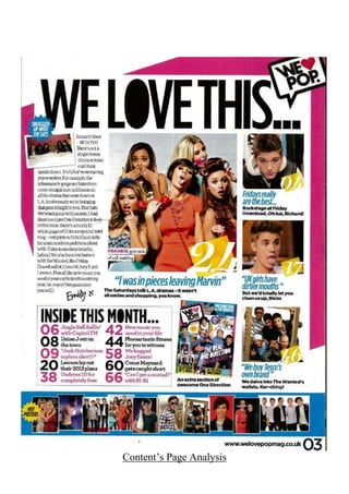
  • 2. This specific contents page from We Love Pop follows conventions as conventionally contents pages are a combination of both text and images, around 50% each, and this convention is followed. Each image has a small caption relating to the article as well as the number of the page it is placed on. The images, headlines and colours used are all a reflection of the target audience as well as the style of the magazine. The fonts used help to keep brand identity as does the use of the logo in the top right hand corner of the page. The editors letter from “Emily x” adds an extra, personal touch, making her seem like a friend to the audience! Editor’s letters feature in a lot of pop magazine’s and is a very common feature. This is because it allows the editor connect with the audience of the magazine. It also allows the audience to have a summary of the magazine which can help to build their excitement to read the magazine. The title is “We Love This…” maintaining the theme of the name of the whole magazine We Love Pop, interlinking the two together. The ellipses at the end of the title builds anticipation and excitement. It is also written in a similar bold, bulky font. The font used is a signature font used in We Love Pop helping to cement its brand identity and trigger recognition in the target audience. As mention before the font is bold and bulky, this gives it the power to stand out majorly from the rest of the text, which is why important text such as “Inside this month” is written in this font as it brings the attention straight to that section, which is the main piece of text on a contents page. All other text is written in a different font: however, the headlines are all written in a blue/green colour, and the information about the article is written just below, in a different font, and in the colour black. The colour’s blue and green are bright, upbeat and natural colours. The colour green can be represented as sanctuary away from stress, which is what a magazine does - it distracts the reader and takes them into another word. The colour blue is one of trust, honesty and loyalty. This can highlight some of We Love Pops aims, in the sense that their content aims to be all of these things. The main image on the contents page is of The Saturdays. All five girls are, from what we can see wearing bright coloured costumes, reflecting the genre. They are also all posing in different ways, giving them their individuality. The caption reads "FRANKIE gets sick of call waiting" which is appropriate as she is holding a phone in her hand, sticking her tongue out in a silly manner, highlighting her lack of interest in the matter. Rochelle is placed at the back, next to Mollie. We can’t see much of their costume, but Rochelle seems to have her hair styled straight, with bold eye makeup to make her eyes stand out to comply with her shocked facial expression. Mollie looks to have her hair curled, from the little part of it we can see, and she looks to be wearing a baby blue costume, her make-up looks nice and “doll like” which many young girls will idolise. Vanessa’s hair looks natural and wavy, her make-up looks dark like Rochelle’s with the dark, misty eyed look. Costume wise, Vanessa is wearing a baby blue skirt, which is similar to the colour of Mollie’s, wjocj a black orange and blue top. The orange on Vanessa’s top links with Frankie’s orange dress, which is a round neck, short sleeve top, which is smart and not revealing to the audience. Frankie’s hair is styled straight as usual, but her make-up looks to be smudged on her eyes, as if she has been crying which could tie in with the headline “Frankie gets tired of call waiting”. Similar to Rochelle it is hard to see Una’s costume, however, from what we can see it looks to be red. She also hair hair rollers in her hair, just like she was preparing to go out somewhere, this matches her facial expression as her mouth is opened shocked, highlight that perhaps she was unexpecting the photo as she was not ready yet. Her makeup is nice and natural giving her a role model aura about her as she looks respectable. The overall positioning of the image represents that they are in a band, due to their positioning, three at the front and two at the back. It does not suggest in anyway who the main singer of the band is, however Frankie is positioned in the centre as the article is about her. However, all girls are posing in different ways. Rochelle, has her hands over her mouth with wide eyes, giving of the idea that she is shocked. Mollie looks cheeky as she has her head titled and has her hand up to her face, as has a mysterious pink spray on her face - which could be lipstick. Vanessa has her finger in her mouth and is biting on
  • 3. it making her look sexy. Frankie, as mentioned before has a phone in her hand and is sticking her tongue out giving of the impression that she doesn’t care. Lastly, Una’s mouth is slightly parted looking shocked as if she wasn’t expecting anyone to see her with rollers in her hair half ready. Other images include a smaller image of The Saturdays, in the top left hand corner just above the editor's letter which is captioned "snuggled up with the sats" in a puff, the image itself looks to be a sleepover, which the target audience can relate to as it is familiar to them! The use of the word "sats" is an abbreviation of the girlband, which the target audience would use themselves, making the magazine sound more like a friend. It also sounds like a nickname, it sounds like the magazine knows the band well. This colour relate to the caption “snuggled up with the sats” as it sounds like the magazine is doing that also, presenting that those working for the magazine are up close and personal with the Saturday’s. This will make the audience admire the magazine even more if they think that they are close with the celebrities and can have a good time and a friendly chat with them. It would be more likely that they would therefore rely on the magazine to get the latest gossip for them. The text regarding being “snuggled up with the Sat’s” itself is written within a fun shaped puff, making the contents page more fun and bubbly, reflecting the personality of those who read it! Other images include one of Justin Bieber sticking his tongue out is placed on the right hand side of the contents page. He is wearing a white t-shirt which is a usually wardrobe choice from him. He also looks like he is in an interview, which will make the audience believe that the article regarding Justin Bieber has actually taken place. There is an image of the Wanted boy’s standing in a picture frame, similar to one you would see a painting placed in. Nathan at the back looks to be quite confused which you can tell buy his facial expression, his hair is styled in the style all the girls love, not the long sweep hair but the freshly cut and quiffed hair. He is wearing a striped polo. Siva’s outfit is not clear to us, all we can see is that he is wearing some kind of black top on his upper body. He is bending down and his mouth looks open and that his tongue is out and to the side. Tom is also bending down and to the side to fit into the frame, who is giving of a ‘cool’ pose to comply with his outfit of a white t-shirt and a nice, smart grey jacket which is half zipped up. Jay is crouched down on the floor, he is wearing a light blue t-shirt, with a navy parker on and it looks like he is wearing a white bandage on his head, hiding his brown locks! He is also placed his hands to make a “peace” sign. Max is crouched down next to Jay, he has his mouth open and face scrunched up, looking like he is shouting. A small image of One Direction and Katy Perry and many other artists are placed in a strip along the bottom of the magazine in the section of “Hot Posters”. These images will be used to draw the audience in as they are all there favourite artists, so they will want to read about every single one of them. By having loads of images, the audience can see straight away who features in the magazine rather than reading through it to find out. Most of the images are placed vertically down the right hand side, so that they audience can look down through all of them, rather than them being scattered all over the page. It is important to make the contents page visually heavy, as it is a fun page regarding the contents of the magazine. If it was word based the audience wouldn’t bother reading it. However, because it is image heavy they can see other images and articles that aren’t on the front cover that they also want to read! The main content is linked to the feature article photo’s, which comes to a total of four. The title is written below the image in blue, with a snippet of the article written in black, the page number is written in the bottom left hand corner of the image in white on a yellow background. The rest of the magazine content is written in a small text box towards the bottom of the page. It is titled “Inside this month” with ten different headlines. The page numbers are written largely at the beginning of the sentence, with the sell line following it. Each headline is alternatively written in black or in pink.
  • 4. The editors letter takes up a fair part of the contents page. It is placed in the top hand corner of the contents page, which will be the first thing the audience will read. The mode of address used in the editor’s letter, is terminology that the audience are familiar with such as “wowmazing” and “goss”. Which could help the audience establish the magazine as a friend. It can also be used to interact with the reader on a more personal level, it also includes all the information they need about the issue as mentions what the edition includes such as “12 pages of 1D in our special mini mag”. The editor signs the letter of with a signature “Emily” and signed off with a “x” (kiss). This makes the magazine seem even more like a friend and even more personal to the reader. The contents page is very similar in layout across many editions/issues, this maintains brand identity as well as benefits those reading it as they are used to the set up and can gather the information they need quickly without having to search for it. The choice of layout is very clear, the editors letter on the left, the main story in the middle, featured articles on the right, the rest of the content further down towards the middle and small images of the posters available down the bottom. This is a nice and clear layout and does not make the contents page difficult to reader or for it to look over crowded. It is helpful that the contents page is evenly split between images and text, as otherwise it could look plain, boring and would be more difficult for the audience to digest all the information. The colours pink, yellow, blue and black dominate the contents page. These colours represent the upbeat and bubbly girls who will be reading the magazine as the colours themselves are bright and vibrant. The colours also are used to maintain brand identity as they are used in almost every edition, varying slightly. The colour pink helps to establish the magazine as one that is directed towards a female audience. The colour yellow represents knowledge, this relates to the contents page as it includes the pages whereby all the articles are written on which is the overall “content” (knowledge) of the edition of the magazine. The colour black is a strong and bold colour and therefore helps the text itself to stand out even more. It also makes the contents page look more professional.