
Recommended
More Related Content
What's hot
What's hot (20)
Viewers also liked
Viewers also liked (13)
Similar to Contents Page Analysis of 'We Love Pop'
Similar to Contents Page Analysis of 'We Love Pop' (20)
Recently uploaded
Recently uploaded (20)
Contents Page Analysis of 'We Love Pop'
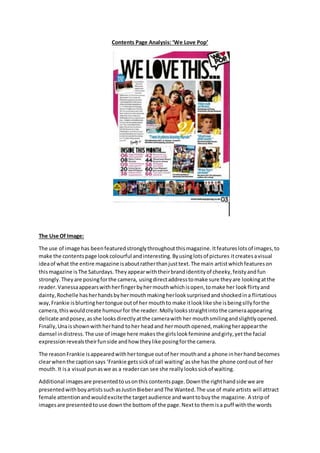
- 1. Contents Page Analysis: ‘We Love Pop’ The Use Of Image: The use of image has been featured strongly throughout this magazine. It features lots of images, to make the contents page look colourful and interesting. By using lots of pictures it creates a visual idea of what the entire magazine is about rather than just text. The main artist which features on this magazine is The Saturdays. They appear with their brand identity of cheeky, feisty and fun strongly. They are posing for the camera, using direct address to make sure they are looking at the reader. Vanessa appears with her finger by her mouth which is open, to make her look flirty and dainty, Rochelle has her hands by her mouth making her look surprised and shocked in a flirtatious way, Frankie is blurting her tongue out of her mouth to make it look like she is being silly for the camera, this would create humour for the reader. Molly looks straight into the camera appearing delicate and posey, as she looks directly at the camera with her mouth smiling and slightly opened. Finally, Una is shown with her hand to her head and her mouth opened, making her appear the damsel in distress. The use of image here makes the girls look feminine and girly, yet the facial expression reveals their fun side and how they like posing for the camera. The reason Frankie is appeared with her tongue out of her mouth and a phone in her hand becomes clear when the caption says ‘Frankie gets sick of call waiting’ as she has the phone cord out of her mouth. It is a visual pun as we as a reader can see she really looks sick of waiting. Additional images are presented to us on this contents page. Down the right hand side we are presented with boy artists such as Justin Bieber and The Wanted. The use of male artists will attract female attention and would excite the target audience and want to buy the magazine. A strip of images are presented to use down the bottom of the page. Next to them is a puff with the words
- 2. containing ‘Hot Posters’ therefore, these images show the reader all the posters contained in this magazine. This would create excitement as we are presented with what’s inside the magazine before we have even got to the first page. The Layout The layout follows conventions of contents pages as it includes a main image in the centre and additional images. Besides the images are page numbers so the reader can find easy access to what they want to read about. Also, besides images there is also a contents page containing text about what is inside the magazine. Appearance Of Text The mast head of the contents page uses the same font as the name of the magazine, in this case ‘We Love Pop’. This creates a symbiotic link, as we can see this is from the same magazine, making it look professional and tidy. The larger numbers have a hand written effect, making them appear script like and feminine, which would appeal to a teenage girl audience. They are flicked at the end to make them appear delicate and soft. The main headlines are written in bold to make them stand out and grab attention. Also, the variation of font size creates an interesting look to the magazine. Mode Of Address The mode of address used in this magazine is fairly chatty and informal. It tends to shorten many artists names calling The Saturdays ‘the sats’ and Justin Bieber ‘biebs’ this makes the reader feel as if they know the artist as it is a nick name they have called them. It also adds to the friendly tone as by calling them a shortened name makes them seem friendly and fun. We tend to nick name people we know, or call our friends by their first names like they have done here. It also uses direct address using words such as ‘We Love’ and ‘you’, this draws the reader in and makes them feel like they are speaking to the magazine and that they can relate to the magazine. Alliteration is commonly used to create a chatty and memorable feel. By using alliteration it makes the reader remember what is being said and makes it appear lighter hearted. In this case ‘snuggled up with the sats’ is used, making it appear friendly and more exciting. It makes us feel like we will be too. The Use Of Colour: Colours used in the contents page are similar to the colours which feature on the front of the magazine, to ensure there is a symbiotic link between the magazines. Yellows, blues, pinks and blacks are featured strongly, the brightness of the colours reminds us of the fun, upbeat tempo of the pop genre whilst the black makes it appear professional and makes the mast head stand out. Lots of the colour presented comes from the images on the contents page. This ensures us that there is lots of exciting information and gossip contained in the magazine. How Is Brand Identity Maintained The brand identity of this magazine is fun, full of gossip, excitement and youthfulne ss. It is important this glows throughout the magazine. One way this is maintained is through the use of colour. The block colours make the contents page look full of excitement and intrigue. It makes it stand out and really allows the pop genre to appear.
- 3. It is shown through the facial expression of the artists. By the facial expressions being silly and by them posing it gives a sense of excitement and light heartedness. Without this, the magazines brand identity would not be met and would not allow the personality of pop music to come through properly.
- 4. The Use Of Image: The use of image has been featured strongly throughout this magazine. It features lots of images, to make the contents page look colourful and interesting. By using lots of pictures it creates a visual idea of what the entire magazine is about rather than just text. The main artist which features on this magazine is The Saturdays. They appear with their brand identity of cheeky, feisty and fun strongly. They are posing for the camera, using direct address to make sure they are looking at the reader. Vanessa appears with her finger by her mouth which is open, to make her look flirty and dainty, Rochelle has her hands by her mouth making her look surprised and shocked in a flirtatious way, Frankie is blurting her tongue out of her mouth to make it look like she is being silly for the camera, this would create humour for the reader. Molly looks straight into the camera appearing delicate and posey, as she looks directly at the camera with her mouth smiling and slightly opened. Finally, Una is shown with her hand to her head and her mouth opened, making her appear the damsel in distress. The use of image here makes the girls look feminine and girly, yet the facial expression reveals their fun side and how they like posing for the camera. The reason Frankie is appeared with her tongue out of her mouth and a phone in her hand becomes clear when the caption says ‘Frankie gets sick of call waiting’ as she has the phone cord out of her mouth. It is a visual pun as we as a reader can see she really looks sick of waiting.