
Recommended
More Related Content
What's hot
What's hot (17)
Viewers also liked
Viewers also liked (16)
Similar to Magazine analysis
Similar to Magazine analysis (20)
Recently uploaded
Recently uploaded (20)
Magazine analysis
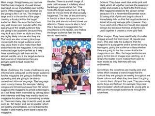
- 1. Colours: They have used blue,white,pink and black which all together connate the season of winter and create a icy feel to the front cover. The magazine relates to the season winter because it it’s a November/December issue. By using a lot of pink and bright colours it immediately tells us that the target audience is aimed at young teenage girls. However, they have used a lot of blue so it could also appeal to boys but because the blue and pinks are used together it creates a more girly feel. Header: There is a small image of pixie Lott because it is talking about backstage gossip about her. This hooks the target audience in as they want to find out more of what actually happened. The idea of the pink being in front of a black background is so that the pink stands out and draws our attention. Pixies name is also in bold this is because it exaggerates her importance to the reader, and makes the target audience feel like they should read inside. Main image: Straight away you can see that the main image is of a well known pop band, so we immediately can tell the genre of the magazine and whether we are going to like it or not. The image is large and is in the centre of the page creating a focal point for the target audience. Also, because the band are very well known and popular within the age group of the target audience they are going to be appealed because they may look up to them as idols and they are highly likely to know who they are. The band are also showing direct eye contact with the target audience which may draw them in and make them feel welcomed into the magazine. It may also make the target audience feel as if they have something to tell them and its almost real life, and if the target audience feel a sence of importance they are going to want to read inside the magazine. Other images: They have used loads of smaller images around the front cover; of popular pop stars. This also tells the audience that the magazine is a pop genre and is aimed at young teenagers, giving the audience a idea whether they are going to like the content inside the magazine or not. Also, the target audience are going to find lots of images eye catching, so it draws the reader in and makes them want to read inside as they feel they will stay entertained. Coverlines: the coverlines are mainly pink and white which creates a brand image that the colours they are going to be seeing throughout are these colours and when they see them it is going to remind them of top of the pops. They are mainly about boys and fashion, for example ‘boys real fears revealed’ which will appeal to young girls so tells us who the target audience is through the coverlines. Mode of address: the mode of address is very informal and colloquial, as the target audience for this magazine are going to find this more appealing and are going to be able to understand informal language. The language used is very cheesy, for example ‘ dating cringes and Christmas kisses from 1D’ which suggests the magazine is aimed at teenagers, as it will keep them interested by talking about their interests and they may want to read the magazine for advice or for something to relate to. There are many play on words used as well such as ‘ flirt factor’ and ‘set to sparkle’ which are catchy and simplistic, so it is drawing the reader in and making them want to read the magazine.
- 2. Images: they have used lots of images because they know that the institution want to see more images than loads of writing. The images are of fashionable clothing, perfume and pop artists which are things that the target audience of teenage girls will find appealing and because it is a pop magazine they have included things to do with pop. They have also used big page numbers with arrows to them so the target audience are clear where to look and it makes things easier and simple for the younger audience to read and follow. Sub headings: The subheadings are in bold because it draws the readers yes to the most important section of the page and the parts that show them what they should read. The font is san-serif and has lots of swirls in it, suggesting that the target audience are females as there is a stereotype of them being more creative. Colour: the colours are bright as they have used pink and yellow which connotes happiness, which creates a positive atmosphere for the reader. The colour pink is a key colour used throughout the magazine so they have kept this consistency as it is extremely feminine and therefore will appeal to the target audience. There is no top of the pops logo or ‘contents’ masthead on the page which doesn’t follow the conventions of a typical contents page but the heading ‘inside the mag’ makes it easier for the target audience to understand and the basic language will be more appealing and simplistic for them. Mode of address: they have carried on using cheesy language and informal language. For example , ‘Disco Diva’ , ‘We love boys’ ‘awww!’ , this show that the target audience are for teenagers as the langauge is simple and basic so they can understand and follow . Layout: they have kept a clear layout which is easy to follow, so the target audience don’t find it confusing and therefore give up reading the magazine. They have used the rule of thirds for the contents page as this is the page the audience want to make sure they follow and are able to find the information they are looking for quickely, so the page is divided into three columns so the page looks professional and organised.
- 3. Main image: the main image across one whole page is of a pop band which are very well known and hugely liked by teenagers, so straight away the target audience are going to be appealed to this page as they will have been previously. The image takes up one entire page which follows the conventions of a magazines double page spread so the target audience will hopefully know what they are looking for and how to follow the page without getting confused. The image of the boy band is very friendly as they are all smiling and are having direct eye contact with the readers making them feel invited and personal. The idea of the image being ‘friendly’ will make the target audience feel happy and could change their mood if they are feeling down. Colours: The background is light blue and the writing Is purple, with a few purple stars across the page. The use of these colours fits in with the seasonal theme of winter and connotes a cold and cosy feel to the magazine. This is mean the audience are prepared for the season and they feel like they are finding out what’s going on. Masthead: the masthead says ‘one direction unwrapped’. By using the word ‘unwrapped’ fits in with the idea of Christmas and wrapping presents which adds to the winter feel of the double page spread and may make the audience excited for Christmas making them happy and excited. The masthead is capitalised and is in purple which makes it stand out against the light blue background. ‘unwrapped’ is also in bold and is in dark purple highlighting the importance of the word and will make the audience excited as they will feel like they have loads to discover and also creates a focal point for the target audience as it is the biggest and boldest text on the page. Mode of address: the mode of address is still colloquial and informal as they use words like ‘ding dong’ and ‘uh-oh!’ The context of the interview is about kissing and crushes which is appealing to the target audience of girls as stereotypically this is what they are associated with and what girls would talk about. They have used pull quotes in the purple stars , they are in san serif font and bold which makes the readers go straight to them as it looks interesting and creative. The quotes could also be something that the target audience can get advice from, which they may find appealing as they may feel as if someone understands them or they can relate to the quotes well. There is a top of the pops logo at the bottom of the main image to inform the readers again of the name of the magazine so they don’t forget and they may see it and remember the name for next time.