
Recommended
More Related Content
What's hot
What's hot (20)
Viewers also liked
Similar to Contents Page Analysis
Similar to Contents Page Analysis (20)
More from Shauna-Mullen
More from Shauna-Mullen (20)
Recently uploaded
Recently uploaded (20)
Contents Page Analysis
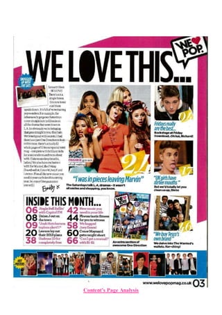
- 2. This specific contents page from ‘We Love Pop’ follows conventions as conventionally contents pages are a combination of both text and images, around 50% each, and this convention is followed. Each photo has a small caption relating to the article as well as the number of the page it is placed on. The photographs, headlines and colours used are all a reflection of the target audience as well as the style of the magazine. The fonts used help to keep brand identity as does the use of the logo in the top right hand corner of the page. The editors letter from “Emily x” adds an extra, personal touch, making her seem like a friend to the audience! The title is “We Love This…” maintaining the theme of the name of the whole magazine “We Love Pop”, interlinking the two together. It is written in a similar bold, bulky font. Text across the page such as "inside this month" and the information underneath is also written in a similar font. All other text is written in a different font: however, the headlines are all wri tten in a blue/green colour, and the information about the article is written just below, in a different font, and in the colour black. The main image on the contents page is of The Saturdays. All five girls are, from what we can see wearing bright coloured clothing, reflecting the genre. They are also all posing in different ways, giving them their individuality. The caption reads "FRANKIE gets sick of call waiting" which is appropriate as she is holding a phone in her hand, sticking her tongue out in a s illy manner, highlighting her lack of interest in the matter. Other images include a smaller image of The Saturdays, captioned "snuggled up with the sats", which looks to be a sleepover, which the target audience can relate to as it is familiar to them! The use of the word "sats" is an abbreviation of the girlband, which the target audience would use themselves, making the magazine sound more like a friend. The text itself is written within a fun shaped pug, making the contents page more fun and bubbly, reflecting the personality of those who read it! Other pictures include one of Justin Bieber sticking his tongue out and several other artists such as One Direction and Katy Perry who feature in “Hot Posters”. These images will be used to draw the audience in as they are all there favourite artists, so they will want to read about every single one of them. By having loads of pictures, the audience can see straight away who features in the magazine rather than reading through it to find out. Most of the images are placed vertically down the right hand side, so that they audience can look down through all of them, rather than them being scattered all over the page. The main content is linked to the feature article photo’s, which comes to a total of four. The headline is written below the image in blue, with a snippet of the article written in black, the page number is written in the bottom left hand corner of the image in white on a yellow background. The rest of the magazine content is written in a small text box towards the bottom of the page. It is titled “Inside this month” with ten different headlines. The page numbers are written largely at the beginning of the sentence, with the sell line following it. Each headline is alternatively written in black or in pink. The editors letter takes up a fair part of the contents page. The mode of address uses words that the audience will be familiar with such as “wowmazing” and “goss”, by using terminology like this the audience can relate to the magazine like a friend. It is used to interact with the reader, as well as the inform them on what the issue contains, drawing in the reader. It is placed in the top left hand corner - in western culture we read from left to right - therefore, the placing of the letter is clever as that is the first piece of text the audience will see and therefore read. The contents page is very similar in layout across many editions/issues, this maintains brand identity as well as benefits those reading it as they are used to the set up and can gather the information they need quickly without having to search for it. The choice of layout is very clear, the editors letter
- 3. on the left, the main story in the middle, featured articles on the right, the rest of the content further down towards the middle and small images of the posters available down the bottom. The colours pink, yellow, blue and black dominate the contents page. These colours represent the upbeat and bubbly girls who will be reading the magazine as the colours themselves are bright and vibrant. The colours also are used to maintain brand identity as they are used in almost every edition, varying slightly.