SlideShare a Scribd company logo
1 of 8
Front Cover Analysis
The Masthead
The magazine's masthead is written in bold display font to grab the reader’s attention and
making the magazine stand out. It replaces the word ‘love’ with a heart shape to make the
magazine title appear more fun and exciting rather than it all being in text. The heart is pink
and feminine, which reflects this quality in the target audience (TA) and the mag. It adds a
unique touch to the masthead as well. This is unusual for a magazine to do as it may be seen
as informal, however, in this case it makes the mast head stand out more and grab attention
as an audience would rather be presented with visual than pure text. The masthead also
clearly shows the genre of the magazine so the TA is straight away drawn in and can
understand this is a pop magazine.
It is written in black font to make it look demanding and to make it stand out from all the
other bright colours which surround the magazine so we can clearly see this is the
masthead. The ‘W’ is written in italics giving it an animated and cartoon look, reminding us
of a comic. This reminds us of the younger target audience who would like this touch of
fun/action packed decoration. It makes us feel excited for what the magazine will bring, and
like a comic, want to read more. The fact that all issues of ‘We Love Pop’ feature this font,
shows how each issue will bring the same amount of fun and gossip which their target
audience can’t get enough of.
This comic-like look is again portrayed through the masthead sitting inside a black, bold
speech bubble. This makes us think the magazine is speaking to it’s target audience,
reminding the reader that they are a friend to them, who they can relate and rely on. A
speech bubble is also used for a text message conversation, representing the chatty and
conversational approach of the magazine,
The Image
The image dominates the entire front cover and fills the page. It is centred so we can see
who the main artist is and what the main sell line is. On this particular magazine, the artist
featured is a popular girl pop group; The Saturdays, they are shown with their typical star
image. The Saturdays would appeal as a band due to their fun, young, bubbly personalities,
which would link to the similar youthful personalities of the target audience. Furthermore,
they are all female, emphasising female dominance and power, the TA would like this as
they are all young females aspiring to grow up to be like them. They are dressed in bright,
fun and vibrant colours such as oranges and pastel colours. This gives them an exciting look,
these colours are also typical pop colours.
Rochelle is shown wearing a pastel orange/pink collared blouse. The colour emphasises her
happy, bubbly and vibrant personality, it also complements her skin tone making her appear
healthy, young and beautiful. Mollie wears a light blue sleeveless blouse, which covers her
chest yet, the colour highlights her sweetness and girly-girl personality, yet the revealing of
her arms shows her confident side. Frankie is centered wearing a fiery orange dress with
flowered detail around the neck. The detail shows her attention for detail and style,
highlighting how she takes pride in her appearance. It also portrays her femininity as we
associate flowers with females.
Vanessa wears a low cut strappy top, with a colourful zig zag pattern and a light blue skater
skirt. As her top is low cut, tight and revealing, it highlights her confidence and how she is a
strong, independent female who can stand up for herself. The skater skirt however, shows
she has a girly, innocent side to her as the flare of it represents her femininity. It also makes
her look sweet and cute, highlighting her youth. Una wears an orange fitted dress, the fit of
the dress again highlights her confidence in her body image and how she can stand proudly
showing off her body.
Notice how all of the colours of the girls costume link and match. This portrays their
companionship and unity as a band and how they share similarities within the band.
However, the different styles of costume highlight their individuality and how each of them
bring a unique aspect to their music.
They are positioned carefully in the frame so that none of their faces are blocked by one
another. This highlights how none of the girls in the band fight for the spotlight and how
they all support each other. With Frankie centred and the other girls placed around her, it
gives an image of a flower, with Frankie being the middle of it and the other girls being the
petals. This is also shown through the use of colours in their costume and props. This
reminds us of their femininity and girly personality of them.
The use of props here gives even more excitement for the target audience of ‘We Love Pop’
as it adds more colour and more to look at. Frankie is shown holding a retro, orange
telephone with a shocked facial expression. Linking to the main sell line of it being a ‘soap
opera’ as it looks as if there will be lots of drama. The fact her mascara is running down her
face emphasises this further and makes the image look even more interesting, making the
reader want to read the article on this.
Mollie holds a candy pink lipstick to her mouth, she is shown drawing it all over her face
giving a humorous and light hearted feel. It also makes her appear dainty and stupid as she
does not apply the lipstick properly, linking to the common stereotype of the ‘dumb
blonde’.
Una wears several rollers in her hair and holds a glass of rose wine. Making her appear she is
going on a night out and ready to party. This highlights her fun personality and willingness
to go and have a good time with her friends.
Notice how each of the props used are typical feminine items which are usually associated
with females. Again, reminding us of the demanding female power running through the
image.
Use Of Colour:
Colour has been used throughout the front cover to ensure the bubbly, jam-packed fun
brand identity of ‘We Love Pop’ is represented thoroughly. Colours such as light orange and
turquoise are pastel like colours, yet give a fresh and eye catching view. Highlighting how
the magazine wants to make an impression on its target audience. It also gives a comic book
look to the magazine, which would appeal to the TA as it makes it appear jam-packed with
gossip and interest. Although these colours are used, they are balanced with neutral black
and white colours for some of the text, this is to create professionalismand make the
magazine appear professional and readable.
The fashion Section
There is a fashion section, (which is a convention of pop magazines) shown in the bottom
left corner with the headline ‘The Top Ten Trainers’ the use of alliteration gives it a chatty
and catchy tone. So the reader is able to look and remember this. Part of the sel line states;
‘Go on treat your feet!’ direct address is used to give the magazine a friendly feel as if it is
talking to them, intriguing the reader making them want to read more. It also rhymes,
making the slogan become catchy and slightly humorous. A young teenage audience would
like this as it creates a softer tone and makes it more memorable. Furthermore, the
presentation of the trainers gives a visual as to what they want them to treat themselves to,
giving the audience guidance as to what the perfect trainers are and which ones they should
‘treat’ themselves too.
The trainers are presented inside a luminous, star puff. This links to the animated theme as
the exaggerated star shape makes the trainers appear more dominant, eye catching and
exciting, the TA would want to buy these trainers. By presenting the trainers visually on the
front cover of the magazine, it gives hints as to the types of trainers which will feature
inside. Just from looking at the front cover the TA can look and talk about the trainers with
their friends, picking out which one there favourite is.
Unlike usual pop magazines there is no skyline. But, positioned along the top of the
magazine in a strip of bright colour states ‘Girls Fashion! Boys uncensored!’ some of this is
cut off by a puff saying ‘12 page 1D pull-out spesh’ . This shows how the magazine often
includes this and the target audience are able to understand what it says, highlighting their
loyal audience and the popularity of the magazine.
The mode of address used is chatty and conversational. It highlights the target audience and
its attention to ‘girls fashion’, showing how the magazine is able to understand their target
audiences interests. The fact it says ‘boys uncensored’ is another interest of the target
audience, as they would be interested in boys and would want to find out about them more.
The word ‘uncensored’ makes the information inside the magazine sound secret and even
more exclusive. Allowing the audience to feel excited about what their about to read. The
exclamation marks add to the conversational tone of the magazine, highlighting how it is
shouting out to their target audience with tips and gossip about what they really want to
know and read about.
The Left Hand Third
The left hand third is conventionally where we usually see the main headlines, besides the
main sell line. All of the sell lines are in line with each other, therefore this front cover
magazine convention is met. The reader is presented with an image and beside it is a
headline which relates to the image. The first image is of Justin Bieber who is a pop artist he
is young and has hundreds of thousands of young, teenage girl fans. This is therefore not
shocking to see him feature on the cover of a ‘We heart pop’ magazine, where they aim to
attract young teenage girls as there TA. In the image he has a shocked facial expression with
his mouth open. Next to the image is the headline ‘Do you want to see me GRUMPY?’ as if
Justin Bieber is saying it himself, this would be effective to the target audience as it reminds
us again of the conversational tone, allowing his fans and the target audience to feel closer
to him. It would also be interesting to read about Bieber being a ‘diva’ as we would not
expect this of him as he is a male artist, it would be exciting to see him have a diva alter ego
to his personality.
The image links well with the sell line as his facial expression suggests the audience do not
want to see him grumpy. There is use of direct address here as well as the word ‘you’ is
mentioned. Making the audience feel as if Bieber is talking to them directly. The fact it is in
speech marks also suggests the idea he is speaking to them and asking them the question
directly. The word ‘GRUMPY’ is capitalised to grab attention and create intrigue. This would
interest the audience and make them wonder what has made him grumpy, making them
buy the magazine to read more!
Underneath this sell line is a small caption which says ‘Meet Bieber the diva’ the rhyme of
this sentence is catchy and fun, adding to the style of the magazine which is a fun and
vibrant feel.
Next, is an image of The Wanted’s star Max. The image of him also links to the caption as it
states ‘Are The Wanted really poor?’ his confused facial expression goes well with this as he
is he too looks shocked by this like the reader would be. It again, creates interest and makes
the reader feel like he is speaking to them. The caption underneath says ‘We investigate’
the word ‘We’ is used to make the reader feel they are part of the magazine community as
the magazine is investigating, but literally, the reader will to.
Finally, the last sell line is ‘Drama at Download’. It uses alliteration to make it seemcatchy
and fun to allow the reader to look and remember it quickly. Underneath is a caption saying
‘Your date with Richard Wister, he is another teen, who young girls may look up to and like.
Direct address is used again here, to make the reader feel like it is her date with him as she
is being spoken to directly. The word ‘date’ makes the target audience feel they can get
persona with Richard Wister and feel they are actually going o a romantic date with him,
finding out more about him. They would appeal to this as it is something they can gossip
about with their friends.
The use of attractive males is used to attract teen girls who may find them attractive and
would want to read about them. This would increase the sales of the magazine.
Each sell line in the left hand third is written in a bright, sky blue colour to add to the
colourful theme of the magazine and to make it look fun and exciting, it is also the same
blue which has been used in both of the puffs to make it look professional and neat. Yet, it
has also been used to make it stand out and grab attention. As the caption underneath is
written in a smaller font and in black to show it is not as important as the sell line which
features above it.
The Puff
There are two puffs which feature on this magazine cover which is unusual and there is
normally only one which would feature on the top left or top right. Puffs are usually
featured in pop magazines as pop magazines are aimed at a younger target audience, who
would be more interested in a visual approach to a magazine rather than pure text. Puffs
give a punch of colour and are able to capture the target audience with the use of abstract
shapes or high impacting colours.
In this case, the puff in the top left is a sky blue colour, like the other puff and it is also the
same colour as the three sell lines which feature in the left hand third. This has been created
to give the magazine a professional look. The writing is written in white to make it stand out
and create contrast with the blue, but still makes it look professional. It contains the words
’12-page 1D pull out spesh’ , this would attract One Direction fans as there would be
unlimited amount of gossip and pictures all about One Direction. They are also a hugely
popular pop band therefore, it is important they feature on the cover as they relate to the
genre the magazine specialises in.
The abbreviation of One Direction to 1D, would attract their top fans as they would be
familiar with this. It also makes the reader feel
the magazine understands them like a friend would. The abbreviation to 1D makes it seem
like the mag know One Direction well enough to give them a type of ‘nickname’. This will
make the audience admire and want to buy this mag as it seems to have such a close
relationship with the stars and access to their secrets, therefore. It has also shortened the
word special into ‘spesh’ this gives a chatty tone to the magazine which is important as
many young teens would speak to their friends using shortened words like this. It also suits
the style of the magazine. The ‘1D’ is written in a larger and bolder font than the rest of the
writing so that it stands out and grabs attention.
The second puff is the same circular shape as the other one to create a tidy link and to make
it look professional, it is also the same colour. Yet rather than the text being white it is black.
This allows it to still stand out yet, it has been written in a different colour to show the puffs
are both about different things. Inside the puff it says ‘Girl Power Posters’. This links to the
TA as the target audience of this magazine is young females; therefore they would like the
idea of girl power and feel as if they can relate to this, which is one of Blumler and Katz five
benefits, this one being identifying with others. Also, the fact ‘Girl Power’ is written in bold
makes it stand out more than the word ‘posters’ to grab all the girls attention and make
them read on. It is as if the magazine is talking directly to its TA. The fact ‘Girl Power’ is
written in bold could also make girl’s look and feel powerful and strong. This breaks
stereotypes as to women seeing to be weaker than men.
Behind the puff are two images containing female pop artists such as Taylor Swift, Rita Ora,
Katy Perry and Cher Lloyd. The images have been made to look like posters as they have a
white border around the edge, so they link to the text. The fact they are all pop artists link
to the genre of the magazine which is a convention of front covers. Also, they are all young
female artists, this would attract the TA as they would look up to these celebrities and
would want to be like them, therefore, the idea that inside the magazine contains posters of
their idols would increase sales.
Each of the artists appears looking directly into the camera, which is an example of direct
address another common convention of music magazines. This makes the reader feel they
are being looked at directly luring them in. They appear happy and smiling which is typical
for pop music magazines to feature these types of images as it goes well with the happy and
young feel allowing it to suit the style and genre of the magazine. They are featured in pairs,
highlighting the idea of friendships within the music industry. This idea of friendship is
shown through their use of body language, Taylor Swift and Rita Ora are shown hugging
close together, the TA would like this as it would remind them of their personal friendships,
allowing them to feel like the pair. This goes along with the ‘girl power’ idea alongside the
images inside a puff. It encourages female success, power and unity, hopefully aspiring the
TA to make many female friends and to highlight female similarities.
Furthermore, as the girls are referred to by their Christian names, it makes the TA feel as if
we know them, therefore we do not need to call them by their full names. This highlights
their fame also, as we are able to understand who they are just from their first names.
Again, linking to the idea of friendship and unity with ur fellow females.
Lastly, we are presented with the barcode in the bottom right corner. It is a convention for
the barcode to normally feature here as it is the least important thing on the front cover,
therefore, it is placed here as it is where the human eye goes to last. The idea is so that the
reader and audience who are looking to buy a music magazine are so excited and lured in by
all the magazine has to offer, the last thing presented to them should be the price. This
means they have already read everything on the front cover and would be excited to read
more. This is why the barcode is placed here.
Overall, the layout conventions of pop magazines are met in this front cover example. The
masthead is in it’s signature place, in the top left hand corner in its signature font. The
image fills the entire frame to ensure the target audience have lots to look at and so that
colour is powered throughout. The left hand third is where featured sell lines sit, which
again follows conventions as this is where the most of the information is placed. The pug is
placed in the bottom right corner, which again is a common convention. The main sell line is
featured in the centre of the frame, in the largest font, this is important as the target
audience would need to be drawn to this.
The main sell line is written in a different font compared to other font used on the front
cover. This is to make sure it stands out from the rest of the information and to draw the
attention of the target audience to this. It has been given a 3D effect, as it has been outlined
in orange. This makes the main sell line come out of the page making it appear more
exciting and interesting.

More Related Content

What's hot

Contents pageanalysis wlp
Contents pageanalysis  wlpContents pageanalysis  wlp
Contents pageanalysis wlpAntonia-Montefusco
 
Media magazine
Media magazineMedia magazine
Media magazineEllen Plater
 
Front cover analysis
Front cover analysisFront cover analysis
Front cover analysisbhatty97
 
Contents Page Analysis Of 'Top Of The Pops'
Contents Page Analysis Of 'Top Of The Pops'Contents Page Analysis Of 'Top Of The Pops'
Contents Page Analysis Of 'Top Of The Pops'Antonia-Montefusco
 
Media magazine
Media magazineMedia magazine
Media magazineEllen Plater
 
Media magazine
Media magazineMedia magazine
Media magazineEllen Plater
 
Magazine cover-analysis
Magazine cover-analysisMagazine cover-analysis
Magazine cover-analysisHiraFatimaMallick
 
New Evaluation[1]
New Evaluation[1]New Evaluation[1]
New Evaluation[1]guestd7094ba1
 
New Evaluation[1] Rochelle
New Evaluation[1] RochelleNew Evaluation[1] Rochelle
New Evaluation[1] Rochelledhensonheywood
 
How my magazine appeals to the target audience
How my magazine appeals to the target audienceHow my magazine appeals to the target audience
How my magazine appeals to the target audienceJoshd96
 
Magazine examples
Magazine examplesMagazine examples
Magazine exampleschlozfox
 
Front Cover Analysis 2
Front Cover Analysis 2Front Cover Analysis 2
Front Cover Analysis 2KirstyMaeHarragan
 
Task Four - Target Audience Appeal
Task Four - Target Audience AppealTask Four - Target Audience Appeal
Task Four - Target Audience Appeallouisangus
 
AS Media Analysis
AS Media AnalysisAS Media Analysis
AS Media Analysissian94
 
Front Cover Analysis
Front Cover AnalysisFront Cover Analysis
Front Cover AnalysisShauna-Mullen
 

What's hot (16)

Contents pageanalysis wlp
Contents pageanalysis  wlpContents pageanalysis  wlp
Contents pageanalysis wlp
 
Media magazine
Media magazineMedia magazine
Media magazine
 
Front cover analysis
Front cover analysisFront cover analysis
Front cover analysis
 
Contents Page Analysis Of 'Top Of The Pops'
Contents Page Analysis Of 'Top Of The Pops'Contents Page Analysis Of 'Top Of The Pops'
Contents Page Analysis Of 'Top Of The Pops'
 
Media magazine
Media magazineMedia magazine
Media magazine
 
Media magazine
Media magazineMedia magazine
Media magazine
 
Magazine cover-analysis
Magazine cover-analysisMagazine cover-analysis
Magazine cover-analysis
 
Front Cover Analysis
Front Cover AnalysisFront Cover Analysis
Front Cover Analysis
 
New Evaluation[1]
New Evaluation[1]New Evaluation[1]
New Evaluation[1]
 
New Evaluation[1] Rochelle
New Evaluation[1] RochelleNew Evaluation[1] Rochelle
New Evaluation[1] Rochelle
 
How my magazine appeals to the target audience
How my magazine appeals to the target audienceHow my magazine appeals to the target audience
How my magazine appeals to the target audience
 
Magazine examples
Magazine examplesMagazine examples
Magazine examples
 
Front Cover Analysis 2
Front Cover Analysis 2Front Cover Analysis 2
Front Cover Analysis 2
 
Task Four - Target Audience Appeal
Task Four - Target Audience AppealTask Four - Target Audience Appeal
Task Four - Target Audience Appeal
 
AS Media Analysis
AS Media AnalysisAS Media Analysis
AS Media Analysis
 
Front Cover Analysis
Front Cover AnalysisFront Cover Analysis
Front Cover Analysis
 

Viewers also liked

Viewers also liked (15)

Poster Analysis 2
Poster Analysis 2Poster Analysis 2
Poster Analysis 2
 
Horror Sub-Genres
Horror Sub-GenresHorror Sub-Genres
Horror Sub-Genres
 
Trailer overview
Trailer overviewTrailer overview
Trailer overview
 
'We Love Pop' Case Study.
'We Love Pop' Case Study.'We Love Pop' Case Study.
'We Love Pop' Case Study.
 
Contents page totp
Contents page totpContents page totp
Contents page totp
 
Introduction To Main Task
Introduction To Main TaskIntroduction To Main Task
Introduction To Main Task
 
Mise-en-scene Analysis.
Mise-en-scene Analysis.Mise-en-scene Analysis.
Mise-en-scene Analysis.
 
Questionnaire analysis.docx
Questionnaire analysis.docxQuestionnaire analysis.docx
Questionnaire analysis.docx
 
'Top Of The Pops' Front Cover Analysis.
'Top Of The Pops'  Front Cover Analysis.'Top Of The Pops'  Front Cover Analysis.
'Top Of The Pops' Front Cover Analysis.
 
Mise-en-scene Analysis
Mise-en-scene AnalysisMise-en-scene Analysis
Mise-en-scene Analysis
 
Meet mychosen artists...
Meet mychosen artists...Meet mychosen artists...
Meet mychosen artists...
 
Location Ideas.
Location Ideas.Location Ideas.
Location Ideas.
 
Poster Overview
Poster OverviewPoster Overview
Poster Overview
 
Magazine overview.
Magazine overview.Magazine overview.
Magazine overview.
 
Chosen Characters.
Chosen Characters.Chosen Characters.
Chosen Characters.
 

Similar to Front Cover Analysis - 'We Love Pop'

Contents Page Analysis - 'Top Of The Pops'
Contents Page Analysis - 'Top  Of The Pops'Contents Page Analysis - 'Top  Of The Pops'
Contents Page Analysis - 'Top Of The Pops'Antonia-Montefusco
 
Front Cover Analysis
Front Cover AnalysisFront Cover Analysis
Front Cover Analysisscarletthayward
 
Contents page analysis
Contents page analysisContents page analysis
Contents page analysisbhatty97
 
Overviews
OverviewsOverviews
Overviewsbhatty97
 
Drawn draft analysis
Drawn draft analysisDrawn draft analysis
Drawn draft analysisniamhayes
 
Appealing to ta
Appealing to taAppealing to ta
Appealing to tarobynludlow
 
Contents page analysis
Contents page analysisContents page analysis
Contents page analysislilytaylor99
 
Magazine analysis
Magazine analysisMagazine analysis
Magazine analysisdenirose17
 
Magazine analysis of top of the pops
Magazine analysis of top of the popsMagazine analysis of top of the pops
Magazine analysis of top of the popsdenirose17
 
Signs and Signifiers
Signs and SignifiersSigns and Signifiers
Signs and Signifiersanniemyatt
 
Contents Page Analysis One
Contents Page Analysis OneContents Page Analysis One
Contents Page Analysis OneKirstyMaeHarragan
 
Contents Page Analysis
Contents Page AnalysisContents Page Analysis
Contents Page AnalysisShauna-Mullen
 
Analysing music magazine 2
Analysing music magazine 2Analysing music magazine 2
Analysing music magazine 2Mariah Loizou
 
Attracting and Addressing Audience - Imogen
Attracting and Addressing Audience - ImogenAttracting and Addressing Audience - Imogen
Attracting and Addressing Audience - Imogenbir
 
Front Cover Analysis 2
Front Cover Analysis 2Front Cover Analysis 2
Front Cover Analysis 2KirstyMaeHarragan
 
Codes and conventions
Codes and conventionsCodes and conventions
Codes and conventionsbhatty97
 
Presentation1.pptx signs and signifiers
Presentation1.pptx signs and signifiersPresentation1.pptx signs and signifiers
Presentation1.pptx signs and signifiersanniemyatt
 

Similar to Front Cover Analysis - 'We Love Pop' (20)

Contents Page Analysis - 'Top Of The Pops'
Contents Page Analysis - 'Top  Of The Pops'Contents Page Analysis - 'Top  Of The Pops'
Contents Page Analysis - 'Top Of The Pops'
 
Contents page totp
Contents page totpContents page totp
Contents page totp
 
Contents page totp
Contents page totpContents page totp
Contents page totp
 
Front Cover Analysis
Front Cover AnalysisFront Cover Analysis
Front Cover Analysis
 
Music magazine ananlyiss
Music magazine ananlyissMusic magazine ananlyiss
Music magazine ananlyiss
 
Contents page analysis
Contents page analysisContents page analysis
Contents page analysis
 
Overviews
OverviewsOverviews
Overviews
 
Drawn draft analysis
Drawn draft analysisDrawn draft analysis
Drawn draft analysis
 
Appealing to ta
Appealing to taAppealing to ta
Appealing to ta
 
Contents page analysis
Contents page analysisContents page analysis
Contents page analysis
 
Magazine analysis
Magazine analysisMagazine analysis
Magazine analysis
 
Magazine analysis of top of the pops
Magazine analysis of top of the popsMagazine analysis of top of the pops
Magazine analysis of top of the pops
 
Signs and Signifiers
Signs and SignifiersSigns and Signifiers
Signs and Signifiers
 
Contents Page Analysis One
Contents Page Analysis OneContents Page Analysis One
Contents Page Analysis One
 
Contents Page Analysis
Contents Page AnalysisContents Page Analysis
Contents Page Analysis
 
Analysing music magazine 2
Analysing music magazine 2Analysing music magazine 2
Analysing music magazine 2
 
Attracting and Addressing Audience - Imogen
Attracting and Addressing Audience - ImogenAttracting and Addressing Audience - Imogen
Attracting and Addressing Audience - Imogen
 
Front Cover Analysis 2
Front Cover Analysis 2Front Cover Analysis 2
Front Cover Analysis 2
 
Codes and conventions
Codes and conventionsCodes and conventions
Codes and conventions
 
Presentation1.pptx signs and signifiers
Presentation1.pptx signs and signifiersPresentation1.pptx signs and signifiers
Presentation1.pptx signs and signifiers
 

Recently uploaded

Capitol Tech U Doctoral Presentation - April 2024.pptx
Capitol Tech U Doctoral Presentation - April 2024.pptxCapitol Tech U Doctoral Presentation - April 2024.pptx
Capitol Tech U Doctoral Presentation - April 2024.pptxCapitolTechU
 
CARE OF CHILD IN INCUBATOR..........pptx
CARE OF CHILD IN INCUBATOR..........pptxCARE OF CHILD IN INCUBATOR..........pptx
CARE OF CHILD IN INCUBATOR..........pptxGaneshChakor2
 
Hierarchy of management that covers different levels of management
Hierarchy of management that covers different levels of managementHierarchy of management that covers different levels of management
Hierarchy of management that covers different levels of managementmkooblal
 
Presiding Officer Training module 2024 lok sabha elections
Presiding Officer Training module 2024 lok sabha electionsPresiding Officer Training module 2024 lok sabha elections
Presiding Officer Training module 2024 lok sabha electionsanshu789521
 
Full Stack Web Development Course for Beginners
Full Stack Web Development Course  for BeginnersFull Stack Web Development Course  for Beginners
Full Stack Web Development Course for BeginnersSabitha Banu
 
call girls in Kamla Market (DELHI) 🔝 >༒9953330565🔝 genuine Escort Service 🔝✔️✔️
call girls in Kamla Market (DELHI) 🔝 >༒9953330565🔝 genuine Escort Service 🔝✔️✔️call girls in Kamla Market (DELHI) 🔝 >༒9953330565🔝 genuine Escort Service 🔝✔️✔️
call girls in Kamla Market (DELHI) 🔝 >༒9953330565🔝 genuine Escort Service 🔝✔️✔️9953056974 Low Rate Call Girls In Saket, Delhi NCR
 
ECONOMIC CONTEXT - PAPER 1 Q3: NEWSPAPERS.pptx
ECONOMIC CONTEXT - PAPER 1 Q3: NEWSPAPERS.pptxECONOMIC CONTEXT - PAPER 1 Q3: NEWSPAPERS.pptx
ECONOMIC CONTEXT - PAPER 1 Q3: NEWSPAPERS.pptxiammrhaywood
 
Types of Journalistic Writing Grade 8.pptx
Types of Journalistic Writing Grade 8.pptxTypes of Journalistic Writing Grade 8.pptx
Types of Journalistic Writing Grade 8.pptxEyham Joco
 
Computed Fields and api Depends in the Odoo 17
Computed Fields and api Depends in the Odoo 17Computed Fields and api Depends in the Odoo 17
Computed Fields and api Depends in the Odoo 17Celine George
 
Introduction to ArtificiaI Intelligence in Higher Education
Introduction to ArtificiaI Intelligence in Higher EducationIntroduction to ArtificiaI Intelligence in Higher Education
Introduction to ArtificiaI Intelligence in Higher Educationpboyjonauth
 
KSHARA STURA .pptx---KSHARA KARMA THERAPY (CAUSTIC THERAPY)————IMP.OF KSHARA ...
KSHARA STURA .pptx---KSHARA KARMA THERAPY (CAUSTIC THERAPY)————IMP.OF KSHARA ...KSHARA STURA .pptx---KSHARA KARMA THERAPY (CAUSTIC THERAPY)————IMP.OF KSHARA ...
KSHARA STURA .pptx---KSHARA KARMA THERAPY (CAUSTIC THERAPY)————IMP.OF KSHARA ...M56BOOKSTORE PRODUCT/SERVICE
 
Interactive Powerpoint_How to Master effective communication
Interactive Powerpoint_How to Master effective communicationInteractive Powerpoint_How to Master effective communication
Interactive Powerpoint_How to Master effective communicationnomboosow
 
Painted Grey Ware.pptx, PGW Culture of India
Painted Grey Ware.pptx, PGW Culture of IndiaPainted Grey Ware.pptx, PGW Culture of India
Painted Grey Ware.pptx, PGW Culture of IndiaVirag Sontakke
 
Pharmacognosy Flower 3. Compositae 2023.pdf
Pharmacognosy Flower 3. Compositae 2023.pdfPharmacognosy Flower 3. Compositae 2023.pdf
Pharmacognosy Flower 3. Compositae 2023.pdfMahmoud M. Sallam
 
Introduction to AI in Higher Education_draft.pptx
Introduction to AI in Higher Education_draft.pptxIntroduction to AI in Higher Education_draft.pptx
Introduction to AI in Higher Education_draft.pptxpboyjonauth
 
Biting mechanism of poisonous snakes.pdf
Biting mechanism of poisonous snakes.pdfBiting mechanism of poisonous snakes.pdf
Biting mechanism of poisonous snakes.pdfadityarao40181
 
CELL CYCLE Division Science 8 quarter IV.pptx
CELL CYCLE Division Science 8 quarter IV.pptxCELL CYCLE Division Science 8 quarter IV.pptx
CELL CYCLE Division Science 8 quarter IV.pptxJiesonDelaCerna
 
Final demo Grade 9 for demo Plan dessert.pptx
Final demo Grade 9 for demo Plan dessert.pptxFinal demo Grade 9 for demo Plan dessert.pptx
Final demo Grade 9 for demo Plan dessert.pptxAvyJaneVismanos
 

Recently uploaded (20)

Capitol Tech U Doctoral Presentation - April 2024.pptx
Capitol Tech U Doctoral Presentation - April 2024.pptxCapitol Tech U Doctoral Presentation - April 2024.pptx
Capitol Tech U Doctoral Presentation - April 2024.pptx
 
CARE OF CHILD IN INCUBATOR..........pptx
CARE OF CHILD IN INCUBATOR..........pptxCARE OF CHILD IN INCUBATOR..........pptx
CARE OF CHILD IN INCUBATOR..........pptx
 
Hierarchy of management that covers different levels of management
Hierarchy of management that covers different levels of managementHierarchy of management that covers different levels of management
Hierarchy of management that covers different levels of management
 
Presiding Officer Training module 2024 lok sabha elections
Presiding Officer Training module 2024 lok sabha electionsPresiding Officer Training module 2024 lok sabha elections
Presiding Officer Training module 2024 lok sabha elections
 
Full Stack Web Development Course for Beginners
Full Stack Web Development Course  for BeginnersFull Stack Web Development Course  for Beginners
Full Stack Web Development Course for Beginners
 
call girls in Kamla Market (DELHI) 🔝 >༒9953330565🔝 genuine Escort Service 🔝✔️✔️
call girls in Kamla Market (DELHI) 🔝 >༒9953330565🔝 genuine Escort Service 🔝✔️✔️call girls in Kamla Market (DELHI) 🔝 >༒9953330565🔝 genuine Escort Service 🔝✔️✔️
call girls in Kamla Market (DELHI) 🔝 >༒9953330565🔝 genuine Escort Service 🔝✔️✔️
 
ECONOMIC CONTEXT - PAPER 1 Q3: NEWSPAPERS.pptx
ECONOMIC CONTEXT - PAPER 1 Q3: NEWSPAPERS.pptxECONOMIC CONTEXT - PAPER 1 Q3: NEWSPAPERS.pptx
ECONOMIC CONTEXT - PAPER 1 Q3: NEWSPAPERS.pptx
 
Types of Journalistic Writing Grade 8.pptx
Types of Journalistic Writing Grade 8.pptxTypes of Journalistic Writing Grade 8.pptx
Types of Journalistic Writing Grade 8.pptx
 
Computed Fields and api Depends in the Odoo 17
Computed Fields and api Depends in the Odoo 17Computed Fields and api Depends in the Odoo 17
Computed Fields and api Depends in the Odoo 17
 
Introduction to ArtificiaI Intelligence in Higher Education
Introduction to ArtificiaI Intelligence in Higher EducationIntroduction to ArtificiaI Intelligence in Higher Education
Introduction to ArtificiaI Intelligence in Higher Education
 
Model Call Girl in Bikash Puri Delhi reach out to us at 🔝9953056974🔝
Model Call Girl in Bikash Puri  Delhi reach out to us at 🔝9953056974🔝Model Call Girl in Bikash Puri  Delhi reach out to us at 🔝9953056974🔝
Model Call Girl in Bikash Puri Delhi reach out to us at 🔝9953056974🔝
 
KSHARA STURA .pptx---KSHARA KARMA THERAPY (CAUSTIC THERAPY)————IMP.OF KSHARA ...
KSHARA STURA .pptx---KSHARA KARMA THERAPY (CAUSTIC THERAPY)————IMP.OF KSHARA ...KSHARA STURA .pptx---KSHARA KARMA THERAPY (CAUSTIC THERAPY)————IMP.OF KSHARA ...
KSHARA STURA .pptx---KSHARA KARMA THERAPY (CAUSTIC THERAPY)————IMP.OF KSHARA ...
 
Interactive Powerpoint_How to Master effective communication
Interactive Powerpoint_How to Master effective communicationInteractive Powerpoint_How to Master effective communication
Interactive Powerpoint_How to Master effective communication
 
Painted Grey Ware.pptx, PGW Culture of India
Painted Grey Ware.pptx, PGW Culture of IndiaPainted Grey Ware.pptx, PGW Culture of India
Painted Grey Ware.pptx, PGW Culture of India
 
OS-operating systems- ch04 (Threads) ...
OS-operating systems- ch04 (Threads) ...OS-operating systems- ch04 (Threads) ...
OS-operating systems- ch04 (Threads) ...
 
Pharmacognosy Flower 3. Compositae 2023.pdf
Pharmacognosy Flower 3. Compositae 2023.pdfPharmacognosy Flower 3. Compositae 2023.pdf
Pharmacognosy Flower 3. Compositae 2023.pdf
 
Introduction to AI in Higher Education_draft.pptx
Introduction to AI in Higher Education_draft.pptxIntroduction to AI in Higher Education_draft.pptx
Introduction to AI in Higher Education_draft.pptx
 
Biting mechanism of poisonous snakes.pdf
Biting mechanism of poisonous snakes.pdfBiting mechanism of poisonous snakes.pdf
Biting mechanism of poisonous snakes.pdf
 
CELL CYCLE Division Science 8 quarter IV.pptx
CELL CYCLE Division Science 8 quarter IV.pptxCELL CYCLE Division Science 8 quarter IV.pptx
CELL CYCLE Division Science 8 quarter IV.pptx
 
Final demo Grade 9 for demo Plan dessert.pptx
Final demo Grade 9 for demo Plan dessert.pptxFinal demo Grade 9 for demo Plan dessert.pptx
Final demo Grade 9 for demo Plan dessert.pptx
 

Front Cover Analysis - 'We Love Pop'

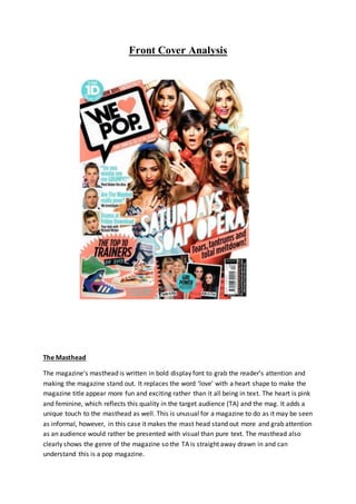
  • 1. Front Cover Analysis The Masthead The magazine's masthead is written in bold display font to grab the reader’s attention and making the magazine stand out. It replaces the word ‘love’ with a heart shape to make the magazine title appear more fun and exciting rather than it all being in text. The heart is pink and feminine, which reflects this quality in the target audience (TA) and the mag. It adds a unique touch to the masthead as well. This is unusual for a magazine to do as it may be seen as informal, however, in this case it makes the mast head stand out more and grab attention as an audience would rather be presented with visual than pure text. The masthead also clearly shows the genre of the magazine so the TA is straight away drawn in and can understand this is a pop magazine.
  • 2. It is written in black font to make it look demanding and to make it stand out from all the other bright colours which surround the magazine so we can clearly see this is the masthead. The ‘W’ is written in italics giving it an animated and cartoon look, reminding us of a comic. This reminds us of the younger target audience who would like this touch of fun/action packed decoration. It makes us feel excited for what the magazine will bring, and like a comic, want to read more. The fact that all issues of ‘We Love Pop’ feature this font, shows how each issue will bring the same amount of fun and gossip which their target audience can’t get enough of. This comic-like look is again portrayed through the masthead sitting inside a black, bold speech bubble. This makes us think the magazine is speaking to it’s target audience, reminding the reader that they are a friend to them, who they can relate and rely on. A speech bubble is also used for a text message conversation, representing the chatty and conversational approach of the magazine, The Image The image dominates the entire front cover and fills the page. It is centred so we can see who the main artist is and what the main sell line is. On this particular magazine, the artist featured is a popular girl pop group; The Saturdays, they are shown with their typical star image. The Saturdays would appeal as a band due to their fun, young, bubbly personalities, which would link to the similar youthful personalities of the target audience. Furthermore, they are all female, emphasising female dominance and power, the TA would like this as they are all young females aspiring to grow up to be like them. They are dressed in bright, fun and vibrant colours such as oranges and pastel colours. This gives them an exciting look, these colours are also typical pop colours. Rochelle is shown wearing a pastel orange/pink collared blouse. The colour emphasises her happy, bubbly and vibrant personality, it also complements her skin tone making her appear healthy, young and beautiful. Mollie wears a light blue sleeveless blouse, which covers her chest yet, the colour highlights her sweetness and girly-girl personality, yet the revealing of her arms shows her confident side. Frankie is centered wearing a fiery orange dress with flowered detail around the neck. The detail shows her attention for detail and style, highlighting how she takes pride in her appearance. It also portrays her femininity as we associate flowers with females. Vanessa wears a low cut strappy top, with a colourful zig zag pattern and a light blue skater skirt. As her top is low cut, tight and revealing, it highlights her confidence and how she is a strong, independent female who can stand up for herself. The skater skirt however, shows she has a girly, innocent side to her as the flare of it represents her femininity. It also makes her look sweet and cute, highlighting her youth. Una wears an orange fitted dress, the fit of the dress again highlights her confidence in her body image and how she can stand proudly showing off her body.
  • 3. Notice how all of the colours of the girls costume link and match. This portrays their companionship and unity as a band and how they share similarities within the band. However, the different styles of costume highlight their individuality and how each of them bring a unique aspect to their music. They are positioned carefully in the frame so that none of their faces are blocked by one another. This highlights how none of the girls in the band fight for the spotlight and how they all support each other. With Frankie centred and the other girls placed around her, it gives an image of a flower, with Frankie being the middle of it and the other girls being the petals. This is also shown through the use of colours in their costume and props. This reminds us of their femininity and girly personality of them. The use of props here gives even more excitement for the target audience of ‘We Love Pop’ as it adds more colour and more to look at. Frankie is shown holding a retro, orange telephone with a shocked facial expression. Linking to the main sell line of it being a ‘soap opera’ as it looks as if there will be lots of drama. The fact her mascara is running down her face emphasises this further and makes the image look even more interesting, making the reader want to read the article on this. Mollie holds a candy pink lipstick to her mouth, she is shown drawing it all over her face giving a humorous and light hearted feel. It also makes her appear dainty and stupid as she does not apply the lipstick properly, linking to the common stereotype of the ‘dumb blonde’. Una wears several rollers in her hair and holds a glass of rose wine. Making her appear she is going on a night out and ready to party. This highlights her fun personality and willingness to go and have a good time with her friends. Notice how each of the props used are typical feminine items which are usually associated with females. Again, reminding us of the demanding female power running through the image. Use Of Colour: Colour has been used throughout the front cover to ensure the bubbly, jam-packed fun brand identity of ‘We Love Pop’ is represented thoroughly. Colours such as light orange and turquoise are pastel like colours, yet give a fresh and eye catching view. Highlighting how the magazine wants to make an impression on its target audience. It also gives a comic book look to the magazine, which would appeal to the TA as it makes it appear jam-packed with gossip and interest. Although these colours are used, they are balanced with neutral black and white colours for some of the text, this is to create professionalismand make the magazine appear professional and readable.
  • 4. The fashion Section There is a fashion section, (which is a convention of pop magazines) shown in the bottom left corner with the headline ‘The Top Ten Trainers’ the use of alliteration gives it a chatty and catchy tone. So the reader is able to look and remember this. Part of the sel line states; ‘Go on treat your feet!’ direct address is used to give the magazine a friendly feel as if it is talking to them, intriguing the reader making them want to read more. It also rhymes, making the slogan become catchy and slightly humorous. A young teenage audience would like this as it creates a softer tone and makes it more memorable. Furthermore, the presentation of the trainers gives a visual as to what they want them to treat themselves to, giving the audience guidance as to what the perfect trainers are and which ones they should ‘treat’ themselves too. The trainers are presented inside a luminous, star puff. This links to the animated theme as the exaggerated star shape makes the trainers appear more dominant, eye catching and exciting, the TA would want to buy these trainers. By presenting the trainers visually on the front cover of the magazine, it gives hints as to the types of trainers which will feature inside. Just from looking at the front cover the TA can look and talk about the trainers with their friends, picking out which one there favourite is. Unlike usual pop magazines there is no skyline. But, positioned along the top of the magazine in a strip of bright colour states ‘Girls Fashion! Boys uncensored!’ some of this is cut off by a puff saying ‘12 page 1D pull-out spesh’ . This shows how the magazine often includes this and the target audience are able to understand what it says, highlighting their loyal audience and the popularity of the magazine. The mode of address used is chatty and conversational. It highlights the target audience and its attention to ‘girls fashion’, showing how the magazine is able to understand their target audiences interests. The fact it says ‘boys uncensored’ is another interest of the target audience, as they would be interested in boys and would want to find out about them more. The word ‘uncensored’ makes the information inside the magazine sound secret and even more exclusive. Allowing the audience to feel excited about what their about to read. The exclamation marks add to the conversational tone of the magazine, highlighting how it is shouting out to their target audience with tips and gossip about what they really want to know and read about. The Left Hand Third The left hand third is conventionally where we usually see the main headlines, besides the main sell line. All of the sell lines are in line with each other, therefore this front cover magazine convention is met. The reader is presented with an image and beside it is a headline which relates to the image. The first image is of Justin Bieber who is a pop artist he is young and has hundreds of thousands of young, teenage girl fans. This is therefore not
  • 5. shocking to see him feature on the cover of a ‘We heart pop’ magazine, where they aim to attract young teenage girls as there TA. In the image he has a shocked facial expression with his mouth open. Next to the image is the headline ‘Do you want to see me GRUMPY?’ as if Justin Bieber is saying it himself, this would be effective to the target audience as it reminds us again of the conversational tone, allowing his fans and the target audience to feel closer to him. It would also be interesting to read about Bieber being a ‘diva’ as we would not expect this of him as he is a male artist, it would be exciting to see him have a diva alter ego to his personality. The image links well with the sell line as his facial expression suggests the audience do not want to see him grumpy. There is use of direct address here as well as the word ‘you’ is mentioned. Making the audience feel as if Bieber is talking to them directly. The fact it is in speech marks also suggests the idea he is speaking to them and asking them the question directly. The word ‘GRUMPY’ is capitalised to grab attention and create intrigue. This would interest the audience and make them wonder what has made him grumpy, making them buy the magazine to read more! Underneath this sell line is a small caption which says ‘Meet Bieber the diva’ the rhyme of this sentence is catchy and fun, adding to the style of the magazine which is a fun and vibrant feel. Next, is an image of The Wanted’s star Max. The image of him also links to the caption as it states ‘Are The Wanted really poor?’ his confused facial expression goes well with this as he is he too looks shocked by this like the reader would be. It again, creates interest and makes the reader feel like he is speaking to them. The caption underneath says ‘We investigate’ the word ‘We’ is used to make the reader feel they are part of the magazine community as the magazine is investigating, but literally, the reader will to. Finally, the last sell line is ‘Drama at Download’. It uses alliteration to make it seemcatchy and fun to allow the reader to look and remember it quickly. Underneath is a caption saying ‘Your date with Richard Wister, he is another teen, who young girls may look up to and like. Direct address is used again here, to make the reader feel like it is her date with him as she is being spoken to directly. The word ‘date’ makes the target audience feel they can get persona with Richard Wister and feel they are actually going o a romantic date with him, finding out more about him. They would appeal to this as it is something they can gossip about with their friends. The use of attractive males is used to attract teen girls who may find them attractive and would want to read about them. This would increase the sales of the magazine. Each sell line in the left hand third is written in a bright, sky blue colour to add to the colourful theme of the magazine and to make it look fun and exciting, it is also the same blue which has been used in both of the puffs to make it look professional and neat. Yet, it
  • 6. has also been used to make it stand out and grab attention. As the caption underneath is written in a smaller font and in black to show it is not as important as the sell line which features above it. The Puff There are two puffs which feature on this magazine cover which is unusual and there is normally only one which would feature on the top left or top right. Puffs are usually featured in pop magazines as pop magazines are aimed at a younger target audience, who would be more interested in a visual approach to a magazine rather than pure text. Puffs give a punch of colour and are able to capture the target audience with the use of abstract shapes or high impacting colours. In this case, the puff in the top left is a sky blue colour, like the other puff and it is also the same colour as the three sell lines which feature in the left hand third. This has been created to give the magazine a professional look. The writing is written in white to make it stand out and create contrast with the blue, but still makes it look professional. It contains the words ’12-page 1D pull out spesh’ , this would attract One Direction fans as there would be unlimited amount of gossip and pictures all about One Direction. They are also a hugely popular pop band therefore, it is important they feature on the cover as they relate to the genre the magazine specialises in. The abbreviation of One Direction to 1D, would attract their top fans as they would be familiar with this. It also makes the reader feel the magazine understands them like a friend would. The abbreviation to 1D makes it seem like the mag know One Direction well enough to give them a type of ‘nickname’. This will make the audience admire and want to buy this mag as it seems to have such a close relationship with the stars and access to their secrets, therefore. It has also shortened the word special into ‘spesh’ this gives a chatty tone to the magazine which is important as many young teens would speak to their friends using shortened words like this. It also suits the style of the magazine. The ‘1D’ is written in a larger and bolder font than the rest of the writing so that it stands out and grabs attention. The second puff is the same circular shape as the other one to create a tidy link and to make it look professional, it is also the same colour. Yet rather than the text being white it is black. This allows it to still stand out yet, it has been written in a different colour to show the puffs are both about different things. Inside the puff it says ‘Girl Power Posters’. This links to the TA as the target audience of this magazine is young females; therefore they would like the idea of girl power and feel as if they can relate to this, which is one of Blumler and Katz five benefits, this one being identifying with others. Also, the fact ‘Girl Power’ is written in bold makes it stand out more than the word ‘posters’ to grab all the girls attention and make them read on. It is as if the magazine is talking directly to its TA. The fact ‘Girl Power’ is written in bold could also make girl’s look and feel powerful and strong. This breaks stereotypes as to women seeing to be weaker than men.
  • 7. Behind the puff are two images containing female pop artists such as Taylor Swift, Rita Ora, Katy Perry and Cher Lloyd. The images have been made to look like posters as they have a white border around the edge, so they link to the text. The fact they are all pop artists link to the genre of the magazine which is a convention of front covers. Also, they are all young female artists, this would attract the TA as they would look up to these celebrities and would want to be like them, therefore, the idea that inside the magazine contains posters of their idols would increase sales. Each of the artists appears looking directly into the camera, which is an example of direct address another common convention of music magazines. This makes the reader feel they are being looked at directly luring them in. They appear happy and smiling which is typical for pop music magazines to feature these types of images as it goes well with the happy and young feel allowing it to suit the style and genre of the magazine. They are featured in pairs, highlighting the idea of friendships within the music industry. This idea of friendship is shown through their use of body language, Taylor Swift and Rita Ora are shown hugging close together, the TA would like this as it would remind them of their personal friendships, allowing them to feel like the pair. This goes along with the ‘girl power’ idea alongside the images inside a puff. It encourages female success, power and unity, hopefully aspiring the TA to make many female friends and to highlight female similarities. Furthermore, as the girls are referred to by their Christian names, it makes the TA feel as if we know them, therefore we do not need to call them by their full names. This highlights their fame also, as we are able to understand who they are just from their first names. Again, linking to the idea of friendship and unity with ur fellow females. Lastly, we are presented with the barcode in the bottom right corner. It is a convention for the barcode to normally feature here as it is the least important thing on the front cover, therefore, it is placed here as it is where the human eye goes to last. The idea is so that the reader and audience who are looking to buy a music magazine are so excited and lured in by all the magazine has to offer, the last thing presented to them should be the price. This means they have already read everything on the front cover and would be excited to read more. This is why the barcode is placed here. Overall, the layout conventions of pop magazines are met in this front cover example. The masthead is in it’s signature place, in the top left hand corner in its signature font. The image fills the entire frame to ensure the target audience have lots to look at and so that colour is powered throughout. The left hand third is where featured sell lines sit, which again follows conventions as this is where the most of the information is placed. The pug is placed in the bottom right corner, which again is a common convention. The main sell line is featured in the centre of the frame, in the largest font, this is important as the target audience would need to be drawn to this.
  • 8. The main sell line is written in a different font compared to other font used on the front cover. This is to make sure it stands out from the rest of the information and to draw the attention of the target audience to this. It has been given a 3D effect, as it has been outlined in orange. This makes the main sell line come out of the page making it appear more exciting and interesting.