2. Introduction to the magazine
The music genre is pop. Although ‘Shout’
magazine isn’t just music based, it does
include elements of pop music and pop
culture.
The publisher of ‘Shout’ Magazine is D.C
Thompson & Co. Ltd
The target audience is girls aged 11-14 years
old with interests in pop music, the latest
fashion, beauty trends, celeb gossip and true
life stories.
3. Articles
The articles are on
celebrities, fashion, real
life stories and problems.
These articles are typically
expected when targeting a
young teenage audience.
The article ‘(Oh,
Nana) What’s my
name?’ links to the
music genre as it is
one of Rihanna’s
song’s and she sings
pop music .
4. Language
The language used is
informal and chatty which is
typical of a teenage
magazine. The language is
appropriate for the target
audience as it appears ‘cool’.
The use of words such as
‘swag’ show that Shout
magazine is targeting young
girls.
‘Talk is tweet’ also shows
the audience which is being
targeted as it is mainly
teenagers that use twitter.
5. Page numbers
There are 74 page numbers
in Shout magazine. The
last page focuses on what
is going to appear in the
next issue. This shows that
there is a lot of content
within the magazine and so
shows that is worth the
money that is charged for
it. Some of the pages are
found on the images which
makes it easier for the
reader to find the article.
6. Fonts
The fonts used are rounded
and are appropriate for the
genre of pop and target
audience as they aren’t
‘edgy’ or ‘rocky’. They
appear to be feminine
fonts. The category title
fonts are bold compared to
the article headings and
the text accommodating
them however the font still
appears to be rounded to
go with the magazine
genre.
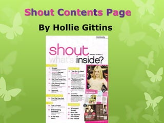
7. Images
The images used on the
contents page of ‘Shout’
are accompanied by page
numbers so that the
reader can easily find the
page. They include small
images of double page
spread articles so that the
reader can see what is on
that page as well as
images of artists featured
in the magazine. The shot
of the celebrity is a
medium shot so that facial
expression and body
language can be seen.
8. Colour palette
The colour palette consists of pink connoting femininity
which links to the target audience being girls. This
colour is frequently used on the contents page. Black
connotes boldness which stands out against the more
bright colours while yellow connotes fun, happiness,
warmth and energy. White is also used which connotes
purity. The colour palette is quite basic using 4 colours
which is what the majority of pop music magazine’s
uses. Yellow is used to highlight headings while pink is
used for page numbers and to highlight ‘shout’ and the
name of the celebrity the main article is on ‘Zac Efron’.
By using simple colours it gives the idea that the
magazine cares more about content then colour.
9. Layout
The layout of Shout’s content page
appears to be neatly laid out with the
articles categorised and only 3 images
down the right side of the magazine
featuring page numbers on them. The
masthead and date are at the top of the
contents page and are clear and easy to
read which is appropriate for the target
audience who are teenagers as they
can find it easy to understand.
10. Brand identity and House
style
The brand identity is shown
through the masthead which
is Shout magazines signature
and can be found on the
contents page as well as the
front cover. It is used on
every issue of the magazine
so it is easily recognised by
its buyer’s.
The house style of the
magazine is shown by the
rounded and safe informal
fonts as well as the use of
bright and bold colours that
are eye catching such as the
pink against the white
background.