
Recommended
More Related Content
What's hot
What's hot (19)
Viewers also liked
Viewers also liked (17)
Similar to Font Analysis
Similar to Font Analysis (20)
Recently uploaded
Recently uploaded (20)
Font Analysis
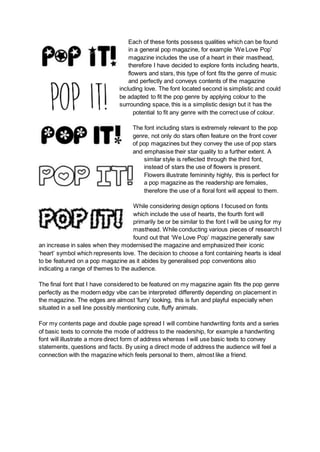
- 1. Each of these fonts possess qualities which can be found in a general pop magazine, for example ‘We Love Pop’ magazine includes the use of a heart in their masthead, therefore I have decided to explore fonts including hearts, flowers and stars, this type of font fits the genre of music and perfectly and conveys contents of the magazine including love. The font located second is simplistic and could be adapted to fit the pop genre by applying colour to the surrounding space, this is a simplistic design but it has the potential to fit any genre with the correct use of colour. The font including stars is extremely relevant to the pop genre, not only do stars often feature on the front cover of pop magazines but they convey the use of pop stars and emphasise their star quality to a further extent. A similar style is reflected through the third font, instead of stars the use of flowers is present. Flowers illustrate femininity highly, this is perfect for a pop magazine as the readership are females, therefore the use of a floral font will appeal to them. While considering design options I focused on fonts which include the use of hearts, the fourth font will primarily be or be similar to the font I will be using for my masthead. While conducting various pieces of research I found out that ‘We Love Pop’ magazine generally saw an increase in sales when they modernised the magazine and emphasized their iconic ‘heart’ symbol which represents love. The decision to choose a font containing hearts is ideal to be featured on a pop magazine as it abides by generalised pop conventions also indicating a range of themes to the audience. The final font that I have considered to be featured on my magazine again fits the pop genre perfectly as the modern edgy vibe can be interpreted differently depending on placement in the magazine. The edges are almost ‘furry’ looking, this is fun and playful especially when situated in a sell line possibly mentioning cute, fluffy animals. For my contents page and double page spread I will combine handwriting fonts and a series of basic texts to connote the mode of address to the readership, for example a handwriting font will illustrate a more direct form of address whereas I will use basic texts to convey statements, questions and facts. By using a direct mode of address the audience will feel a connection with the magazine which feels personal to them, almost like a friend.
- 2. Here are a selection of fonts which I will consider using for all other selections of text besides the masthead and sell lines. Each of them are similar in various ways and developed links can be made between the six fonts which will combine and work within my contents page and double page spread. After the process of creating my front cover I decided to combine a mixture of bold fonts with a range of childish fonts that make the magazine look and feel as if it fits perfectly in the pop genre. Visually from the front cover you can see that the masthead and main sell line predominantly stands out, this is mainly due to the font and colour choice. The main sell line has to make a statement, meaning both the font and colour should stand out to a good extent.