Introduction to ArtificiaI Intelligence in Higher Education
Looking At Film Posters
1. Film Title
Tag Line
A List
Actress
Release
Date
Credits
Website
Main
Image
Production
Company
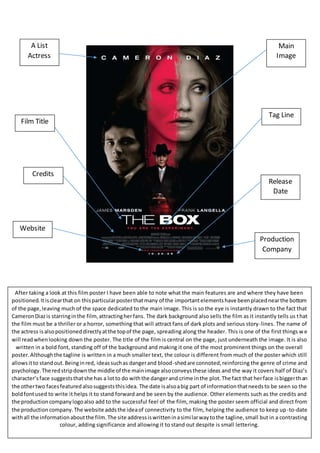
After taking a look at this film poster I have been able to note what the main features are and where they have been
positioned. It is clear that on this particular poster that many of the important elements have been placed near the bottom
of the page, leaving much of the space dedicated to the main image. This is so the eye is instantly drawn to the fact that
Cameron Diaz is starring in the film, attracting her fans. The dark background also sells the film as it instantly tells us that
the film must be a thriller or a horror, something that will attract fans of dark plots and serious story-lines. The name of
the actress is also positioned directly at the top of the page, spreading along the header. This is one of the first things we
will read when looking down the poster. The title of the film is central on the page, just underneath the image. It is also
written in a bold font, standing off of the background and making it one of the most prominent things on the overall
poster. Although the tagline is written in a much smaller text, the colour is different from much of the poster which still
allows it to stand out. Being in red, ideas such as danger and blood-shed are connoted, reinforcing the genre of crime and
psychology. The red strip down the middle of the main image also conveys these ideas and the way it covers half of Diaz’s
character’s face suggests that she has a lot to do with the danger and crime in the plot. The fact that her face is bigger th an
the other two faces featured also suggests this idea. The date is also a big part of information that needs to be seen so the
bold font used to write it helps it to stand forward and be seen by the audience. Other elements such as the credits and
the production company logo also add to the successful feel of the film, making the poster seem official and direct from
the production company. The website adds the idea of connectivity to the film, helping the audience to keep up -to-date
with all the information about the film. The site address is written in a similar way to the tagline, small but in a contrasting
colour, adding significance and allowing it to stand out despite is small lettering.