
Recommended
More Related Content
What's hot
What's hot (20)
Similar to Codes and conventions of film posters and magazines
Similar to Codes and conventions of film posters and magazines (20)
Recently uploaded
Recently uploaded (20)
Codes and conventions of film posters and magazines
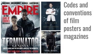
- 1. Codes and conventions of film posters and magazines
- 2. Film Posters
- 3. The titles that are positioned on the posters are the 2nd most noticeable thing the observer sees. They are placed most commonly in the bottom area, middle and sometimes top. This is due to the creator wanting the image to be the prime aim so you know the genre of the film. The font of the title can also determine the genre and style of movie for example dunkirk has san serif bold writing showing it is a heavy action movie. Colour scheme plays a role in the font as well. It is often a plain light colour so it sticks out from the dark background. You will often to see a dark background as action and scifi are the most popular genres at the moment so that colour scheme links to them. Film Title
- 4. There is always a centre image as the audience focuses on that and is most likely to remember it. Blockbusters with famous cast will often have the main feature using the star's face as the logo. In all of these three posters the main character is centred directly in the middle, perfect for us to focus on. The position or post they create is often a reflection of their characters persona allowing the viewer an insight on how series the film is comedy wise, this also determines the genre. Close-ups of the image normally can suggest there is a more personal side to the movie as long shots show's other cast and agendas giving it the possibility it is ever action or sci-fi due to it not focusing on one character. For example, Guardians of the Galaxy vol.2 is about universal destruction so includes characters (villains and heros) props and scenery, showing it is an expensive blockbuster film. Image The same colour scheme is used throughout the advertisement of the movie. Posters tend to have a dark background which is mainly black or blue depending on their genre. Often now we are starting to see more use of neon colors come into play a sen in all three posters. This is a very bright attractive colour and we are seeing a trend which links to the 80s. The font is often in white as it's the brightest of the colours so more noticeable against the large images.
- 5. The Billing Block is featured on the bottom of the poster and is in the smallest text compared to the rest of the fonts. It features all the information on actors and directors followed by producers and screenplay writers. The font is unevenly sized as the names are a larger font highlighting their importance. Underneath will be the release date or ‘Coming soon’ as well as the production company's logo. This advertises to the viewer the quality type of movie as larger companies will spend more money on the movie as they have a larger budget. Now cinema is moving forward the type of cinema it is viewed in is changing as well. On posters we are beginning to see informing underneath the Billing block saying if it is released in 2D, 3D, Real D 3D, Imax 3D and 4DX. Fonts And Billing Block
- 7. In all of the magazine titles here the main characters featured on the front runs over the top. This gives more of a focus on the films main characters, such as captain America on the right. In some cases the name of the magazine is altered to fit the film that they are covering. This is usually only for big releases, such as the hobbit in the bottom right, the text on the front page has a gold effect and colour, as to match the ring in the film. In 2 of 3 of the empire covers, a puff is included on the front cover. This is to showcase other information about other films to make people more interested in the magazine. Not everyone would be interested in the hobbit, so a puff is used to mention the dark knight rises. Wolverines name is used right at the top of this magazine cover in bold for a reason, the name wolverine is so well known that this helps to sell copies of the magazine, the use of this star power from character names/ actor names is something commonly found on magazine covers.
- 8. Here the text is fitting to the film that is featured, the classic style to it give a gritty feel that is similar to the film. Furthermore the colour scheme of the text is white or red, which is symbolic of blood and bone, this gives a more gory effect on the film before you've even read about it. This nitty gritty feel the cover creates is also added to by the ‘blood smudge’ effects underneath. In this cover the colours used also match the film, the cover uses a large amount of white in the text and bordering, fitting the films cold, snowy setting. Also a puff is also included in this magazine cover to show people who might be thinking of buying the magazine that it also has other exciting content, not just the feature film. This is a very common convention that i have seen Yet again the main featured character is brought forward over the ‘Sight & Sound’ title, this is something i have seen a lot in film magazines and it's definitely a trending convention for these types of magazines. It gives the character more of a 3d effect, and gives more depth to the image. Also i noticed that in most of the magazine covers i looked at the backgrounds are de-saturated or darker colours. The reason for this is to make the most memorable parts of the cover to stand out most; the main featured character and the title for the magazine.
- 9. Comparison
- 10. There are many similar advertisement tricks the distributor has used to create a brand through the poster and magazine. For example, the colour scheme is the same as shown in rogue one where it is blue, white and grey. Also the facial expression used by the main character in both the poster and magazine are the same, as well as the clothes she has on & hairstyle. This consistency is vital in creating a strong brand image for Rogue One. The title for the film is also the first font you see then followed by the star main characters. This is the most memorable way the movie will stick into the audience's head as this repetition is very effective. Comparison of film posters and magazines The differences in these two however are quite clear; there is many more characters in view in the poster as it isn't focusing on just the main character like the magazine is. This shows more of what is going on in the film and in turn gives a better overall idea about what might go on in the film. Lastly in the poster there is a sinister, barely recognisable ‘darth vader’ in the top left corner, a character that is known to be bad news. This is included in the poster to create a hype around the film as Darth vader has his own star power almost.