
Recommended
More Related Content
What's hot
What's hot (19)
Similar to When looking at dark night rises
Similar to When looking at dark night rises (20)
Recently uploaded
Recently uploaded (20)
When looking at dark night rises
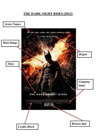
- 1. THE DARK NIGHT RISES (2012) Actors Names Titles Credits Block Release date Company name Slogan Main Image
- 2. When looking at Dark Night Rises, its more Action then Thriller but there are a lot of footages that is shown in the film that would make you think otherwise. The Dark Night Rises is a sequel from the latest version of batman which was called The Dark Nigh. The sequel is about… Despite his tarnished reputation after the events of The Dark Knight, in which he took the rap for Dent's crimes, Batman feels compelled to intervene to assist the city and its police force which is struggling to cope with Bane's plans to destroy the city. In the poster there’s only one Character which is Batman, they have put him in the middle of the poster which symbolises importance as he is one of the main characters but the most important. He is captured in a low angle shot that indicates that he’s quite powerful by himself and tends to be considered as the powerful lone wolf; taking in all the shadows that are in his face and everywhere else you can tell that his quite a secretive man that likes that dark given that even though most of the image is in darkness his suit is still defined and you can see most of the small details that are on it. This is also another way for the producers to tell the audience that he’s a powerful man as the suit is designed to structure his muscles and define/ add any small details that is on his body making him look like a strong being. When looking at the background is filled with buildings that looks like are falling from a big explosion that happens just on top of Batman head, the explosion happens in the form of the Batman sign with this it looks like the explosion is spreading and destroying the building. This gives off the impression that in this sequel Batman is going to explode with something other than darkness; a source of light with make him more powerful than what he is and it might just destroy the things around him whether its good or bad. When looking at the font, it’s pretty basic in terms of the whole poster but it still catches your eyes although it’s not that big or as exaggerated as anything else on the poster. All the lettering is in white Arial, bold in capital letters. This emphasises the title of the film and the slogan; and makes it stand out from the dark background.