Presiding Officer Training module 2024 lok sabha elections
Film poster Analysis
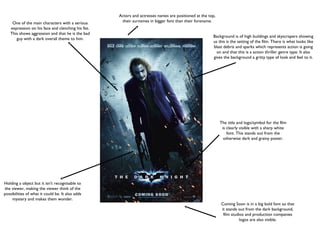
1. One of the main characters with a serious
expression on his face and clenching his fist.
This shows aggression and that he is the bad
guy with a dark overall theme to him.
Holding a object but it isn't recognisable to
the viewer, making the viewer think of the
possibilities of what it could be. It also adds
mystery and makes them wonder.
Background is of high buildings and skyscrapers showing
us this is the setting of the film. There is what looks like
blast debris and sparks which represents action is going
on and that this is a action thriller genre type. It also
gives the background a gritty type of look and feel to it.
The title and logo/symbol for the film
is clearly visible with a sharp white
font. This stands out from the
otherwise dark and grainy poster.
Coming Soon is in a big bold font so that
it stands out from the dark background,
film studios and production companies
logos are also visible.
Actors and actresses names are positioned at the top,
their surnames in bigger font than their forename.
2. Credits are positioned at the bottom of the page in white to
pop out from the dark blue and black background.
The title of the film is centered at the bottom of
the page with a white colour which is the only
time this colour is used on the poster making it
stand out. It also have a textured look to it and
this could be to reflect the story line or
characters within the film itself.
The face is surrounded by various pictures and
shots of people and objects in a blue tint. This is to
show that all these are events in the film and in his
past and supports the strap line that the truth is
complicated as these pictures are randomised and
don't make sense at first viewing.
The main character is positioned in the
centre of the page to show significance. The
pictures around him overlap onto his face and
can be seen with closer inspection. This tells
the viewer that there may be more than
meets the eye with this character and will
have to pay close attention.
Actors names are the same sized font
throughout and are in the same colour
as the strap line which shows a
consistency within the colour scheme.