
Recommended
More Related Content
What's hot
What's hot (20)
Viewers also liked
Viewers also liked (15)
Similar to Posters
Similar to Posters (20)
Recently uploaded
Recently uploaded (20)
Posters
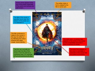
- 1. Actors name appear at the top of the poster especially if the actors and actress are well known. The written style or font is related to the film in some sort. The main actor or actress that appears in the centre of the poster as this immediately becomes a point of interest for viewer. The actor that appears on the cover is normally in character of the movie that the poster is promoting The title of the movie is typically found near the bottom of the poster as it is intended to. The title continues to relate to the movie in the way its written or by following the colour scheme this helps create brand identity. Tag line can normally be found near the title of the movie. It can be used as a marketing area. For example #TheImprobabilitieAreEndles s
- 2. Main character appearing central to the poster. Other relate character also appear on the poster as these characters are normally part of the story. Font style is the same as any previous films. This helps with the film branding as views could possible recognise the font. The title appears at the bottom of the poster as it keeps it out of the way A tag line is normally featured on the poster in small font so it doesn’t get in the way of the main features. The tag line always has a reference to the film which in some cases is used on social media platforms as a marketing point Release date appears on the poster but is not in as large text as the title would appear.
- 3. Main character is central of the poster. The picture is related to the title of the film which helps keeping the poster simple and works well as it makes the film easier to remember The title appears to be starched and tinted with dirty at bottom. This is a constant feature on horror posters as changing the title style slightly helps it fit the genre better. Even in horror films the title will still appear near the bottom. When the director or actors are not as well known. It is normal to see “from the creators of” followed by a popular film which people would have seen Billing block rarely appears but in some cases they are still present on film posters
- 4. The main image in the poster relates to the title of the film. The picture is not something that takes a while to understand its simplistic. The style of title is written in an horror child like way. This is a repeated pattern we see in horror films. The titles are presented in a way Tagline here is the title of the film and is presented as a hash tag which can be used on social media when discussing the film. Newer films will use this on posters as social media is a strong place to market films. Popular people involved in the film will be mentioned as selling point as others may have seen previous films
- 5. The title of the film here is shown at the top. Which differs from other film titles. The style the title is written is the same that is used in the NASA logo this shows the connected. The main characters appear on the front of the poster. Straight away we know who is in the film. Also dressed in character. This poster has kept the poster quite text free which meant that the release date was changed to numbers however it is still present as this is information people viewing the poster need to know. Tag line
- 6. The style of the title is written in a playful manner which matches the minds of the characters but more importantly the genre Most of the characters area here not very large as the big names are at the top. The names of the big stars appear at the top of the poster as they can attract people to watch. Main character appears separate from the rest of the cast gives a vague idea of the film