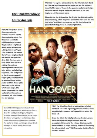
1. TAG LINE: The tag line is in capitals, like the title, to help it stand out. The text itself helps to set the scene and lets the audience know the film is set in Vegas. It also gives the audience an insight into what the film may be about and the nature of the film, helping to set the mise en scene.Above the tag line it states that the director has directed another popular comedy, which may make people that have seen the film ‘Old School’ and liked it so come and see this film, helping the poster to fulfil its purpose of advertising the film.The Hangover Movie <br />1304925706755PICTURE: The picture shows three men, who the audience assumes are the three main characters. The three men seem to be middle aged and look as if they have had a night out, which would relate to the setting which is Las Vegas. They look dirty, the man on the left has a long beard and the man on the right has a dirty shirt. The men have a baby which does not fit in, making the audience wanting to find out why the baby is there and what has happened. The background of the picture shows gold bright lights, which seems to be a colour theme for the poster and film. These lights also relate to the setting which is Las Vegas. The poster helps to set the scene well and lets the audience know that it is a fun film set in a fun location.Overall I think the poster works as it does what it is suppose to do; advertise the film. It does this well by including a fun tag line including previous films directed by the same director, a funny picture and a release date that stands out and appeals to its audience. The poster is simple and straight forward, but manages to not be boring and still be interesting.TITLE: The title of the film is in bold capitals to help it stand out. The text is a glowing gold colour which I think is used to help represent Las Vegas which is where the film is set.Below the title is the list of producers, directors, actors and other important people involved with the production of the movie. The release date is shown in white bold font to help it show up. Instead of just saying the release date it says ‘FEEL IT’, showing that the film is laid back and fun.Poster Analysis<br />