
Recommended
More Related Content
What's hot
What's hot (18)
Viewers also liked
Viewers also liked (14)
Similar to Sac 1 part a
Similar to Sac 1 part a (20)
Recently uploaded
Recently uploaded (20)
Sac 1 part a
- 1. SAC 1 Part B Written test Feedback This presentation provides a detailed analysis of all 4 images. 1 DECV Visual Communication Design 2013 General SAC feedback: Read the question carefully. Many of you lost simple marks because you didn’t read all of the question. For example you may have identified audience well in the first question, but didn’t justify how you came to this conclusion (the second part of the question). When it comes to methods of production only discuss the methods used in the final piece not in the whole design process (ie. from research through to idead generation, development and refinement, etc.) Vector based images (those that are flat toned, simple shapes, and can be scaled upwards at any size without image quality loss are created in Illustrator Raster based images (and text sometimes- i.e. that are tonal and complex, usually photographic) are created in Photoshop Layout of image and text in a format, i.e. a 2D magazine spread, a poster, a book cover are created in InDesign. Architectural/interior/environmental/product working drawings (ie elevations and plans, that are given to builders and engineers to build manufacture are usually created in AutoCAD Presentation drawings of 3D spaces are often created in Sketchup Package nets (the 2D layout of a ‘flat’ package) are produced in Illustrator
- 2. 1. Audience Those interested in cleaner energy and energy efficiency in the home. The audience would be home owners or renters. This is obvious because of the product being a lightbulb and the packaging communicating its smart energy credentials. 2. Purpose To inform the audience about the product contained within the package. 3. Design ELEMENTS Shape: There is a small circle in the centre of the front panel. This circle contains the logo ‘GE’ which is the name of the company that has produced this light globe and the reason for this is to promote the company. Typography: A simple sans serif typeface has been chosen. The letterforms are elongated and fine which conveys an elegance. This might help to convey he ‘3’ of the 13 has geometric corners which may suggest the geometric forms of a room. Form: The rectangular form snugly follows the forms of the lightbulb. The lightbulb is simply packaged so that all emphasis is on the ‘smart’ globe and not on the surface design. It would be a contradict to the purpose of the product to have an overdesigned package. 4. Design PRINCIPLES Contrast: Shape, the circle containing the logo contrast with the rectangular panel of the package format. There is colour contrast. Black on light brown. Figure/Ground: The dark figure elements sit on the lighter brown colour of the ground. The natural ground has been left to suggest the raw untouched material cardboard. Paper bleaching is much harsher on the environment. This reinforces the message of renewable energy. 5. 3 M’s Methods: 3D modelling – construction, die cut then folded to shape. The package netting digitally produced in Illustrator. The typography added in this software. Exported for commercial printing. Media: ink, dye Materials: Medium weight raw or ‘uncoated’ cardboard. 2 Visual Example 1 DECV Visual Communication Design 2013
- 3. 1. Audience Those interested in renewable energy and Greenpeace in general. These would typically be younger, urbanised, well educated people. We can tell this by the name ‘Greenpeace’ which is a company that is determined to inspire the population to act on environmental issues. 2. Purpose To incite the audience to consider renewable energy. To inspire thought, to inspire action. 3. Design ELEMENTS Colour: green symbolises earth and ‘green’ ethical industry while the muted brown tones symbolise the ‘dirty’ energy industry. Shape: The shapes around the circle represent different aspects of clean and dirty industry, i.e. factories, coal fired stations, vs. forests, renewable energy. The shapes are positioned within a larger circular shape which has been used to symbolise the earth. so 4. Design PRINCIPLES Contrast: The colour contrast between green and brown emphasises the difference between the two energy industries. Figure/Ground: The poster is ground dominant with predominant white space intended to pull focus towards the figure element, which is the symbolic earth and energy resources. Balance: Symmetrical balance is important in the poster because it reinforces a stable composition important in conveying the earth shape and the horizontally juxtaposed vector images surrounding it. These are also balanced in a horizontal axis. Grace T made a very observant statement about asymmetry “While the overall piece is very balanced and symmetrical to the eye if your look at the placement of the ‘bad’ images and the ‘good’, the bad appear to be getting pulled down to the right, through the use of asymmetrical placement of the contrasting images. This is effective in that it is showing the problem that is needed of ‘turning the world around” 5. 3 M’s Methods: As the shapes are sharp and flat toned, Illustrator would more than likely have been used. The text and images could have then been laid out using InDesign. The final printed commercially using offset printing. Media: Dye, ink for the printed poster. Materials: Posters are typically printed on light or medium glossy stock. 3 Visual Example 2 DECV Visual Communication Design 2013
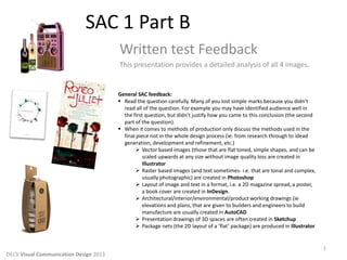
- 4. 1. Audience Theatre goers in general, also parents, family members of Bethany College (the schools ‘brand’ is at the bottom of the poster). Lovers of Shakespeare. We are told from the typography at the top that this is Romeo and Juliet. The dagger and roses suggest the key themes romance and drama, so those interested in this type of highly charged emotional theatre would be interested. 2. Purpose To promote and advertise the play. 3. Design ELEMENTS Shape: The organic illustrative quality of the roses and dagger convey the themes of love and death in the performance. Typography: The style is hand-drawn, this again makes for a personal and expressive quality, which again links to the emotional content of the story. Tone: A graphic textural tonal quality has been applied to the roses and dagger to suggest the 3D qualities of the object. Line: The contour lines of the roses and dagger are fluid and expressive suggesting the emotionally charged content of the story. 4. Design PRINCIPLES Contrast: From Tayla T “The contrast of the knife against the roses is something else I noticed. The harsh blade although in the same art style feels very contrasted against the soft sweet roses.” Figure/Ground: The poster is figure dominant to draw our attention to the images and the symbolic meaning of the rose (for love) and the dagger (for death) the main themes of the story expresses and symbolised. Pattern and Scale: The foreground has been copied and scaled up then placed as a light background. This has been done to enhance the importance of the images of the rose and dagger and convey the symbolic meaning of these objects. 5. 3 M’s Methods: The illustration and texture on the ground, could be hand drawn, then scanned into Photoshop for clean up. The text and images could have then been laid out using InDesign. The final printed on a desktop printer or commercial offset printing. Media: Pencil, fineliner for the original drawing. Dye, ink for the printed poster. Materials: Posters are typically printed on light or medium glossy stock. 4 Visual Example 3 DECV Visual Communication Design 2013
- 5. 1. Audience Younger people who would enjoy the novelty factor of this wine. The radio and retro graphics suggest party, dancing and socialising. This is not a wine for serious wine collectors or more conservative types. The pink colour suggests a female audience is being targeted. 2. Purpose To entice the audience to buy the product. To excite them about the wine through the novelty factor. 3. Design ELEMENTS Shape: There are a range of circles and rectangles all with rounded edges to convey the buttons and dials of a radio. Line: There are repeated lines within the shape on the bottom third of the package. This represents the speaker interface of the radio. Form: The packages rectangular form is in the shape of a radio with the handle serving a functional purpose. There are two green dials which have been attached to the front which provide an even more authentic radio design. Colour: the predominant pink coloured radio may have been used to specifically target young women. This particular hue, along with the combination of pastel green and yellow is a retro colour scheme. 4. Design PRINCIPLES Pattern: The repeated line in the bottom third of the radio symbolically represent a speaker. This pattern is repeated in the thin vertical strip running from the top of the wine label, creating a consistent visual link between product label and package design. Figure/Ground: The pink ground suggests the radio. With the figure elements of shapes making the buttons and dials. 5. 3 M’s Methods: 3D modelling – construction, die cut then folded to shape. The package netting digitally produced in Illustrator. The typography added in this software. Exported for commercial printing. Media: ink, dye Materials: Medium weight raw or ‘uncoated’ cardboard. 5 Visual Example 4 DECV Visual Communication Design 2013