
Recommended
More Related Content
What's hot
What's hot (20)
Similar to How Florence brings light to the dark album art
Similar to How Florence brings light to the dark album art (20)
More from miles blakey
Recently uploaded
Recently uploaded (20)
How Florence brings light to the dark album art
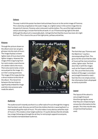
- 1. Colours The way inwhichthe posterhas beenlaidoutdrawsfocuson to the centre image of Florence. Thisis done byusingblackon the outerimage,to a lightercolourinthe centre image thento the pointof interest,Florence,whoisdressedinwhiteclothes.The use of the lightanddark coloursalsobringsa sinisterfeel tothe artwork.It’s as if Florence bringslighttothe dark. Althoughthe albumartis reasonablydark,Istill getthe feel thatthe musichasmore of a light feel toit.Thisis due to the use of the lightpinks,yellowsandwhites. Font The font that says‘Florence and the Machines’ isquite a stereotypicallygirl font.This givesme the sense thatthe style of musicwill be more aimedtoa softer,lighterstyle.The font alsolinksinwiththe images such as the flowersandbirds etc.The use of the fontat the bottomof the page is verybasic and straightforwardto read,I feel like thisistosimplyconvey the informationthatisdisplayed as easilyaspossible Pictures Throughthe picture shownon the albumcoverwe can geta glimpse intothe style of music. The image displaysaslower lighterstyle of musicdue tothe lighterimagery.Howeverthe image of the lungshung from herneck createsa weirdsense of a darkerside to the music. There alsoseemstobe a more sensual partto the image.It’s as if she’scravingsomeone. The image of the lungsalsohas a directrelationtothe title of the album.Thisliteral link betweenthe twohelpsto significantlyembedthe image and title intosomeone who readsthe advert. Layout The layoutof the advertis verystraightforward therefore givingthe sense that theyare simplytryingto conveythe informationtothe people.Thislinksintothe very simple fontthathasbeen used. Audience The audience will instantlyseethatitisa softerstyle of musicthroughthe imagery that has beenused.Alsoyoucantell fromthe clothesthatshe iswearingthatit’sa stereotypicallygirlierstyle of music.Thisalsomakesitveryobviouswhatthe style of musicis.Thiscreatesa clear targetaudience.It’squite obviousthatshe already has a large followingasthroughthe ad they’re nottryingto appeal toeveryone, but insteadanarroweddownaudience.
- 2. Font The white fontcausesthe title topop outof the background.Thisinstantlycatchesthe reader’s eye causingthemtoread on.The style of the fontthat isusedfor ‘WhenSeptemberends’has obviousrock/grunge feel toit.Thisgeneratesacleartargetaudience thatisinterestedinthis style of music.The fontthat has beenputfurtherdownthe page isthe same as the ‘Greeday’ font.Thisshowscontinuationthroughoutthe advert,andhelpsthe readertobetterremember the brand. The fontusedfor ‘wake me upwhenSeptemberends’isverymuchlinkedtothe style of musicthe bandplay.Greendayare knownfor rock music.Thisisclearlyshowninthe fontas it seemstobe splatteredontothe page seeminglyuncaringly. Layout The layoutof the advertis verystraightforward.This seemstobe a commontrend for albumadverts.Itseems that makingthe ad easierto readis a more important feature thanmakingitlook cool or edgy.The information for the magazine designerand publisheretc.hasbeenplaced insmall writinginthe bottom rightof the page.Thisis so not to draw attentionawayfrom the mainalbumart. This is because the publisherisnota huge sellingpoint,therefore doesn’trequire ahuge amountof attention.The way the informationhasbeen spreadout makesitveryeasy to read.Thiswouldappeal especiallytoyoungerreaders whocan’t be bothered readingtoofar intosomething and wantinformationhanded to them. Pictures The main image hasa clear rock feel toit. You can see that the leadsingerhaseye makeupon. Thisis a clearlinkto the darker style of musicthat isrock. It’s alsonot a normal trendfor men to weareye makeup,thisfurther linkstothe rebelliousside of rock music.Thiswill appeal to manypeople bothyoungandold wholike thisunrulystyle of music.The albumadverthas also beenmade tolookolderthanit actuallyis.Thisaddsto the edgy feel of the magazine andcan widenthe targetaudience who are attractedto thisedgyfeel of the ad. Colours The coloursin the coverare verydark and masculine.For example the black,greyandredthat have beenused relate toa dark style of musicsuchas rock. Thislinksinto the stereotypical ideaof rack as the darkercolourslink intothe heaviertype of music.Italsohas a limitedcolour pallet.This addstothe simplicityof the advertmakingit easiertodigest. Audience The audience forthis will probablybe menbetween the ages of 16-20. This isdue to the style of musicand layoutof the advert.In has a masculine feeltoit, therefore willmainlyaimatthe genderandage group
- 3. Picture The main image hasa sort of mosaiceffectto it.This addsan edgyfeel thatwouldappeal to the youngergeneration.Thisstylealsolinks intoabstract paintingsof a similarnature.Asa resultpeople maynotonlybe drawninby the bandbut alsoby the nature of the album artwork,therefore causingthemtobuythe album. Colours The way the colours have beenlaidouton the page is very appealingtoa viewer.Itstartsoff as a dark purple,then fadesintoa lightpink.Itgoesintoa soliddarkred, followed by more soliddarkcolours.Thisdrawsthe readerdownthe page,therefore allowingthe readertodigestthe information inorder.This alsopreventsthe readerfrombeingdrawnto randomplacesaboutthe page,butinsteadallowsthemto readthe informationinorder. Font The font that hasbeenusedis verysimple anddoesn’treally draw much attentiontoitself. I thinkithas keptthissimplistic nature as the cover has usedthe coloursto draw the readerinand allowthemtowork theirway downthe page.A differentcolour has alsobeenusedforthe album name ‘Day and Age’.Thishas beendone togive itmore prominence onthe page and make it stickout to the reader. The font forthe bandname ‘the killers’isverynoticeable.This bringsina cleartargetaudience whonotice the band andits logo. Layout The page has beenlaidoutto allow the colourgradienttolead youdownthe page.Thisgivesa verynatural feel tothe layoutof the page.The style of the page is alsoverysymmetrical and appealingtolookat,thisdraws people intoreadon further.The layoutalsocreatesfocal points that catch people’seye.For example the whitewritingsticks out verywell. Audience The advertgivesoff a sense of a lighterstyle of musicdue tothe type of colours that have beenused. Thiswill create atargetaudience of the youngergeneration bothmale and female butalsothe oldergenerationdue tothe laidbackfeel the postergivesoff.The postergivesoff aneutral feel toit.Thiscreatesa verywide target audience asitcoversthe majorityof people andappealstothe masses