
Recommended
More Related Content
What's hot
What's hot (18)
Viewers also liked
Viewers also liked (20)
Similar to Contents Page Analysis
Similar to Contents Page Analysis (20)
Recently uploaded
Recently uploaded (20)
Contents Page Analysis
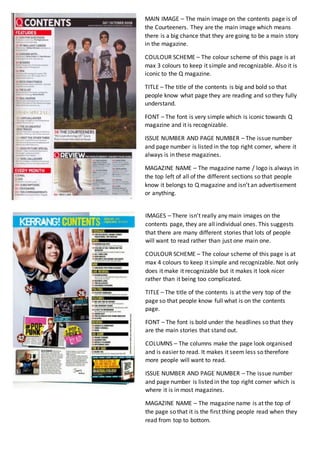
- 1. MAIN IMAGE – The main image on the contents page is of the Courteeners. They are the main image which means there is a big chance that they are going to be a main story in the magazine. COULOUR SCHEME – The colour scheme of this page is at max 3 colours to keep it simple and recognizable. Also it is iconic to the Q magazine. TITLE – The title of the contents is big and bold so that people know what page they are reading and so they fully understand. FONT – The font is very simple which is iconic towards Q magazine and it is recognizable. ISSUE NUMBER AND PAGE NUMBER – The issue number and page number is listed in the top right corner, where it always is in these magazines. MAGAZINE NAME – The magazine name / logo is always in the top left of all of the different sections so that people know it belongs to Q magazine and isn’t an advertisement or anything. IMAGES – There isn’t really any main images on the contents page, they are all individual ones. This suggests that there are many different stories that lots of people will want to read rather than just one main one. COULOUR SCHEME – The colour scheme of this page is at max 4 colours to keep it simple and recognizable. Not only does it make it recognizable but it makes it look nicer rather than it being too complicated. TITLE – The title of the contents is at the very top of the page so that people know full what is on the contents page. FONT – The font is bold under the headlines so that they are the main stories that stand out. COLUMNS – The columns make the page look organised and is easier to read. It makes it seem less so therefore more people will want to read. ISSUE NUMBER AND PAGE NUMBER – The issue number and page number is listed in the top right corner which is where it is in most magazines. MAGAZINE NAME – The magazine name is at the top of the page so that it is the first thing people read when they read from top to bottom.