
Recommended
More Related Content
What's hot
What's hot (17)
Similar to Magazine cover analysis disclosure
Similar to Magazine cover analysis disclosure (20)
Magazine cover analysis disclosure
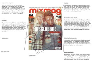
- 1. Target Audience and genre- Taking into account the sans serif style, colloquial language used in the masthead (‘mag’) and main image, it would suggest that it is targeting a young audience between 15 and 30. Ignoring the banner at the top of the magazine, the main image, and masthead and cover lines suggests that the genre is dance music. ‘IBIZA 2013’ has connotations of clubs and DJ’s also supporting the genre and the main artist that is featuring in the magazine. Main Image- The main image features Disclosure, music artists favouring the dance genre, in the background which has had influence on the house style for the magazine. The image is casual but involves direct address with the audience, which draws the viewer attention towards the front cover. It looks as if the image is hiding behind the cover lines and model credit but it is highlighted as important where it over laps the mast head. Model credit- Main Cover Line- Masthead- The Masthead on this magazine is big, bold and quite modern, using a sans serif font. This would attract the audience’s field of view towards the masthead; also highlighting the main image which overlaps it. This would suggest that Mixmag is a well-known magazine and so the font is instantly recognisable to the view, having no need to display it clearly. The Gutenberg Design Principle- The Gutenberg principle is a layout that all magazines follow to highlight certain areas that they want people to see. The areas include Primary optical area; which is the top left corner; weak fallow area; bottom left corner; strong fallow area; top right hand corner; terminal area; bottom left corner. Mixmag follows the Gutenberg principle as you instantly look at IBIZA 2013 (main cover line) then you see the model credit (DISCLOSURE) then a cover line in the terminal are (PLUS). This happens due to reading gravity, where you naturally reading from left to right. Colours/Typefaces/House style- The colours are warm and humid, which suggest it is a seasonal magazine (summer). The house style is red, black and white which work together harmoniously with the background (main image). The font is quite alternative and modern; therefore there is a sans serif typeface used on this magazine. Coverlines-- Banners/Flashes/badges- Banners/flashes and badges are either across the page (banner), a splash of colour (flash) or a circle or rectangle (badge). They are used to highlight a certain text e.g. EXCLUSIVE. On this magazine there is a banner across the top above the masthead which advertises small articles , or titles within the magazine.