
Recommended
More Related Content
What's hot
What's hot (18)
Viewers also liked
Viewers also liked (20)
Similar to Double page spread analyse
Similar to Double page spread analyse (20)
Recently uploaded
Recently uploaded (20)
Double page spread analyse
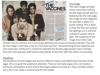
- 1. The Image- The main image normally covers more then half the double page spread which is bleeding into the next page, the image for this magazine for example is taken in a studio setting. This is done so that the they can control the lighting as it is artificial instead of usually natural light. The subject(s) of the image most often look directly into the camera, this is to convey attitude and a sense of personal identity. The shot for the image is normally a mid or a mid close up shot. The positioning of the subject(s) are also important, if they are in a band for example the double page spread I have inserted, then the most popular/ well known artist stands at the front with the others surrounding. Headlines- The headlines are the largest text and are different colours and effects then the rest of the page, this is to grab the audiences attention. They are normally vague, this is to create a particular atmosphere and to entice the target audience to read on. They normally contain puns, this is to create a comical view for the reader.
- 2. Stand First- This is the short introduction positioned normally under the headline. This is usually vague but gives more information than the headline, the stand first acts like a teaser for the audience and entices them to read on. This is normally just a sentence long which is straight to the point. Drop caps- This the first letter of a paragraph which will be in a bigger font than the main body of text and will usually be in a different colour, this is to help and show the audience where to start reading and to help it stand out. Inserts- These are normally in a text box, for example this double page spread has an insert in the middle of the main body. This example is in red to help it stand out for audiences. The insert normally contains facts, quotes or competitions. These quotes would normally be from the band/ artist or an outside source.