
Recommended
More Related Content
What's hot
What's hot (19)
Viewers also liked
Viewers also liked (20)
Similar to Double Page Spread Analysis
Similar to Double Page Spread Analysis (20)
Recently uploaded
Recently uploaded (20)
Double Page Spread Analysis
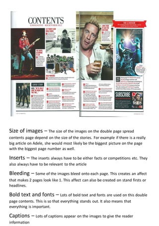
- 1. Size of images – The size of the images on the double page spread contents page depend on the size of the stories. For example if there is a really big article on Adele, she would most likely be the biggest picture on the page with the biggest page number as well. Inserts – The inserts always have to be either facts or competitions etc. They also always have to be relevant to the article Bleeding – Some of the images bleed onto each page. This creates an affect that makes 2 pages look like 1. This affect can also be created on stand firsts or headlines. Bold text and fonts – Lots of bold text and fonts are used on this double page contents. This is so that everything stands out. It also means that everything is important. Captions – Lots of captions appear on the images to give the reader information
- 2. Colour scheme – The colour scheme on most double page spreads is usually no more than 3-4 colours. The reason for this is that it keeps it nice and simple and in some ways recognisable. In this case it is whites, blacks, greys and pinks. Main image – The main image is usually on a page on its own so that it stands out more than the text. The main image in a music magazine is usually someone with and instrument or someone just standing still. They are looking straight down the camera to create a personal relationship with the audience. Body – The body is where all of the text is and it is called that as it is the main part. The body is usually written in columns so that it looks good and looks organised. Also it makes it easier to read and makes it seem shorter so that the audience will be persuaded to read more of it. Background – The background on double page spreads is usually bold and not very complicated so all the focus is back on the main image.