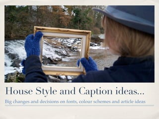
1. House Style and Caption ideas...
Big changes and decisions on fonts, colour schemes and article ideas
2. Changes... There have been some changes to
how my front cover will look...
✤ I am hoping to re-shoot the front cover image or
manipulate my existing image to make it work better for a
more clean-cut and striking front cover.
✤ My masthead has also been changed as I feel my original
masthead was too fussy, didn’t stand-out enough to
capture my audience and it was hard to read from a
distance which is very important.
3. Changes... There have been some changes to
how my front cover will look...
✤ My new masthead is more simple, while still incorporating the font
chosen by my poll, making the M in Maverick stand out as my icon.
✤ I have also decided to make a logo for my magazine which can be
used throughout the magazine helping form a brand identity. This
will be placed in the dead-space in my masthead.
4. House Style - Fonts
✤ I have chosen fonts to use throughout the magazine.
✤ The font I have chosen is Andale Mono which looks like this...
✤ THIS IS ANDALE MONO.
✤ I think this font reflects perfectly my target audience. It is different to
standard fonts which is important as I want Maverick to feel
individual like it’s readers.
✤ It is also similar to a type-writer style, which creates a retro feel, but is
also simple enough to be readable and modern.
✤ It is unique so that it becomes part of Maverick’s brand identity.
5. House Style - Colours
✤ The colour scheme is based in what my questionnaire results were (see
above).
✤ For my front cover red, black and white will form the basis of my colour
scheme. This is because not only are these the colours of my masthead, but
also as red, black and white are used a lot when representing the
alternative rock genre. They are simple and crisp, while also standing out
to my target audience as they are part f the conventions they are
consciously or subconsciously looking for.
✤ Green and purple will also feature throughout the magazine, but they
have to be a particular shade, so as to appeal to both genders. These are
the shades I am considering...
6. Front Page For now I will use
past drafts of my
front cover to
illustrate my
article and cover-
line ideas...
✤ Cover line 1 will be an
“exclusive” bubble,
standing out from the
regular captions and
will relate to a big A 12-PAGE
band, like Vampire EXCLUSIVE
Weekend or Florence VAMPIRE WEEKEND
and The Machine to AND
attract more readers as FLORENCE & THE
my image will not be of MACHINE
a well-known artist. AS WE GO
BEHIND THE SCENES
ON THEIR NEW TOURS
7. Front Page
✤ Cover lines 2 & 3 will be
interesting articles or interview
with bands that my target
audience are interested in.
✤ Ideas are below...
MONKEYING AROUND
EXCLUSIVE INTERVIEW WITH
THE ARTIC MONKEYS
BOOZE, GIGS & SEX
MUSE
WHAT DO THEY GET
UP TO ON TOUR?
8. Front Page
✤ There will be a strip down the bottom of the cover with a list of
bands included in the magazine.
✤ I’ve done a mock-up of what it will look like below...