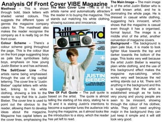
1. Image – The main image
Analysis Of Front Cover VIBE Magazine The Mainartist Justin Bieber who is
The Main Cover Line –This is of the is of the
Masthead – This is shown a well known artist, and he is
through bold, black letters with artists name and automatically attracters dominating the whole page. He is
shaded varied colours. This the reader in to buying the magazine. This dressed in casual white clothing,
suggests the different types of stands out matching his white clothing, suggesting he’s innocent, which
genres the magazine company showing success and innocence. shows that the magazine is casual
caters for. The masthead also even though it has a organised,
makes the reader recognise the formal layout. The image is a
company as it is really big on the middle shot of the artist, another
front cover. convention of magazine covers.
Colour Scheme – There’s a Background - The background is
colour scheme going throughout plain pale blue, it is made to look
the page. This is the colour blue lighter blue towards the top and
on the front page suggesting boys darker towards the bottom of the
as pale blue symbolises baby page. This looks very well because
boys, emphasis on how young the artist Justin Bieber is wearing
Justin Bieber is and has achieved. plain white clothing, and the use of
The Sell/Cover Line –The this background effect makes the
artists name being emphasised magazine eye-catching. which
through the use of big capital works very well because the red
lettering. The cover line is “Justin writing stands out a lot. There isn't
Bieber” capital letters with white anything in the background and this
text, linking to his white is suggesting that the artist is
clothing, showing a link to the Use Of Pull Quote – The pull quote is established enough as he looks
reader to say that this is Justin based on the artist. The quote is almost very young and young people are
Bieber. The cover line is used to telling the starting of his story, stating he is seen to be innocent, showing
point out the obvious to the 16 and it is stating Justin's intentions to through the colour of his clothes;
reader, allowing them to develop become a superstar lures the audience into white. They don't need anything
ideas about the magazine. buying the magazine, as it almost looks like major in the background they can
Magazine has capital letters as the introduction to a story, which the reader just keep it simple and it will still
the cover lines, emphasising the has yet left to read. look very good.
2. The Masthead –This is
black which stands out from
Analysis Of Front Cover VIBE Magazine
Sell /Cover Lines – The sell lines
the background. The page are the artists that are going to be
has a mix of grey, white and inside of the magazine, and this is
black. Allowing text to stand used so that without looking inside of
out. The normal masthead the magazine the audience knows
logo for all of the what is going to be inside of it. It also
magazines, representing features information about articles to
their company to say that interest the reader.
they always remain the
same and also shows that The Main Image – This is a
they have created layout dominating image of Taylor
and design around the Swift, revolving the magazine about
design of the masthead. her and her stories within the
magazine to interest the reader. The
Colour Scheme – The
main image has been placed whilst
colour scheme blends in with
the rule of thirds have been
the masthead, revolving
considered, as there are allocated
around the colour and
areas for the text and masthead.
design. The colour scheme
is black, grey and white Barcode/website – There is a
presenting the magazine to barcode on the front cover and by
be modern and professional. doing this it shows that it is an actual
Background – Contains the magazine, indicating the price and
colour scheme, including showing payment can be made.. It
grey, white and black. Using also has the website of the magazine
different tones in the so that the audience know of other
background to confuse the ways that they can see the magazine.
audience and to make the Use Of Pull Quote – The pull quote matches the image as it is about the artist that
main focus on the artist. The is on the front cover and what is happening in her life. It states her status within the
colours get darker towards country as “Teen Queen” as teenagers like her as an artist. Also the pull quote
the bottom of the magazine persuades the reader to carry on reading because of the phrases “Tales Her Music
and lighter towards the top.