1. David Eshun
Layout conventions
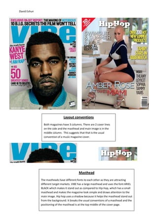
Both magazines have 3 columns. There are 2 cover lines
on the side and the masthead and main image is in the
middle column. This suggests that that is the usual
convention of a music magazine cover.
Masthead
The mastheads have different fonts to each other as they are attracting
different target markets. VIBE has a large masthead and uses the font ARIEL
BLACK which makes it stand out as compared to Hip-hop, which has a small
masthead and makes the magazine look simple and draws attention to the
main image. Hip hop uses a shadow because it helps the masthead stand out
from the background. It breaks the usual conventions of a masthead and the
positioning of the masthead is at the top middle of the cover page.
2. David Eshun
Cover lines
Both cover lines have 3 different
colours and different fonts. The
variance in cover lines makes the
magazine look more interesting
because it gives the effect that
there is more on the page.
Main Image
Both magazines use the main image to
sell their magazine. The models
featured are famous and idolised. The
images take up most of the space as it
makes it the first thing that draws
attention and it sells. VIBE uses similar
colours on the main image as the
masthead and background. This relates
the magazine to the image. The main
image of VIBE has a blurred out
shadow. This makes it stand out to the
audience. They do this because the
model is famous and may help boost
sales.