
Recommended
More Related Content
What's hot
What's hot (20)
Similar to Coldplay
Similar to Coldplay (20)
Recently uploaded
Recently uploaded (20)
Coldplay
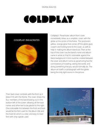
- 1. DIGIPAK ANALYSIS Coldplay’s ‘Parachutes’ album front cover immediately strikes as a simplistic cover with the globe at the centre of the frame. The prominent yellow, orange glow that comes off the globe gives a warm and inviting tone to the cover, as well as help in making the album stand out. Then at the top of the cover has the band’s name and album name in white so that it’s noticeable against the black background. A link could be created between the cover and album name as parachuting has the connotations of traveling, seeing the world, and doing something that you would normally do. The album art itself is a photograph with the globe being the only light source in the picture. Their back cover contrasts with the front as it doesn’t fit with the theme. The cover shows the four members of the band looking out in the bottom left of the screen allowing all the track names and other text to be placed to the right. One noticeable link between the front and back would be the font used for the album title and the track list which is a clear and easy to read font with only capitals used.