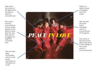
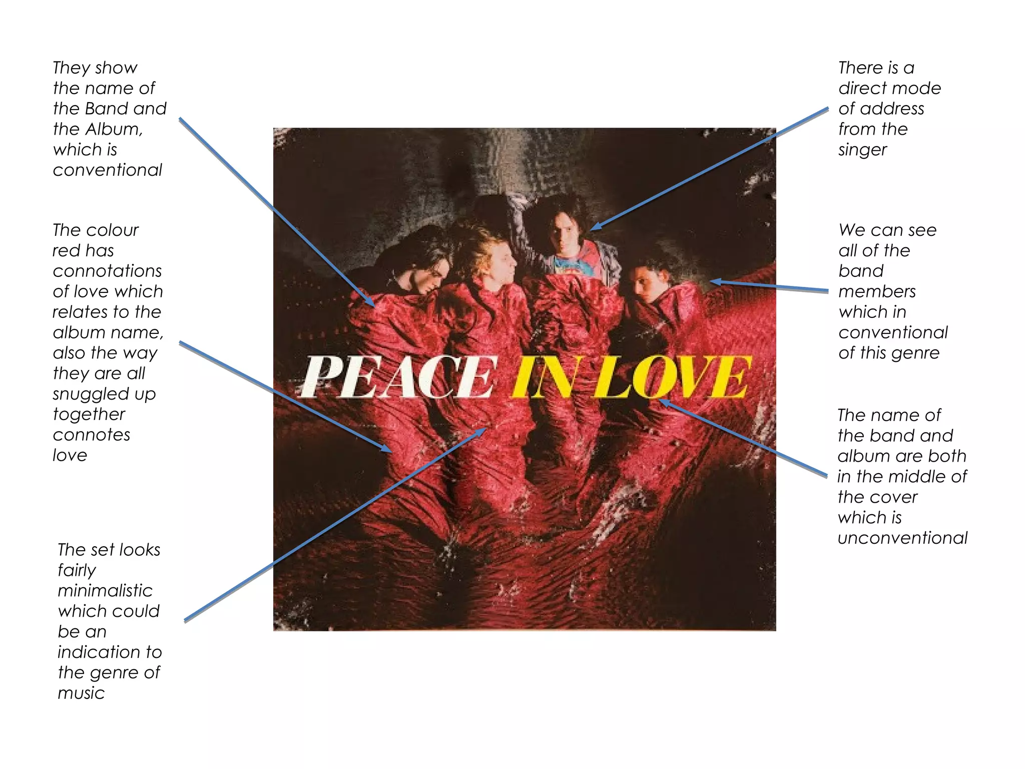
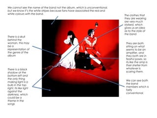
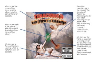
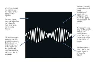
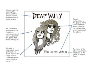
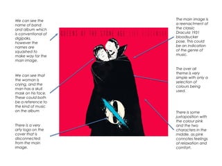
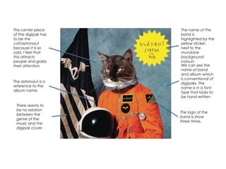
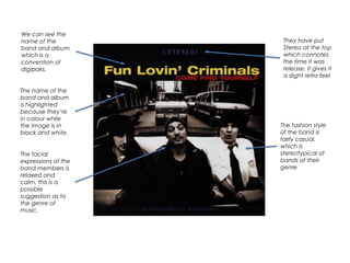
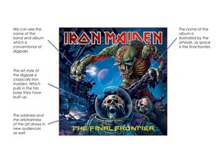
We can see the name of the band and album on most covers, as is conventional for the genre. The artwork and designs commonly provide clues to the style of music, with themes, symbols and poses that relate to the album title or genre. Unconventionally, some covers omit these details to attract attention in other ways, such as through very simple or odd designs.