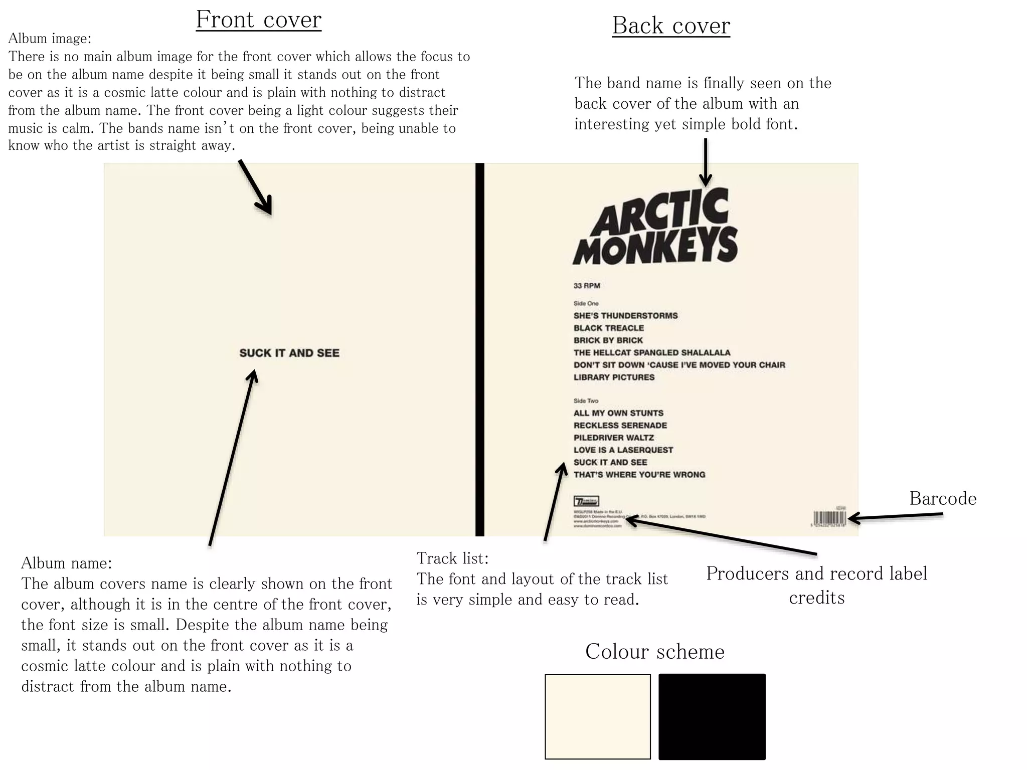
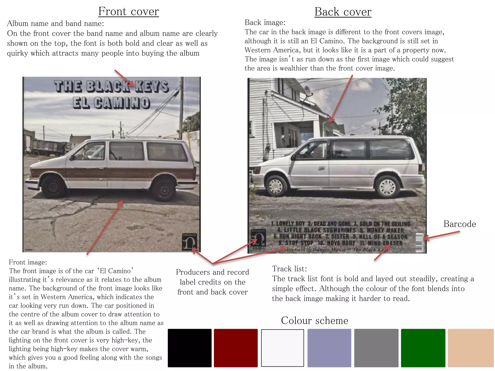
Front cover Back cover 
Album image: 
There is no main album image for the front cover which allows the focus to 
be on the album name despite it being small it stands out on the front 
cover as it is a cosmic latte colour and is plain with nothing to distract 
from the album name. The front cover being a light colour suggests their 
music is calm. The bands name isn’t on the front cover, being unable to 
know who the artist is straight away. 
Album name: 
The album covers name is clearly shown on the front 
cover, although it is in the centre of the front cover, 
the font size is small. Despite the album name being 
small, it stands out on the front cover as it is a 
cosmic latte colour and is plain with nothing to 
distract from the album name. 
The band name is finally seen on the 
back cover of the album with an 
interesting yet simple bold font. 
Track list: 
The font and layout of the track list 
is very simple and easy to read. 
Barcode 
Producers and record label 
credits 
Colour scheme
Front cover Back cover 
Album name and band name: 
On the front cover the band name and album name are clearly 
shown on the top, the font is both bold and clear as well as 
quirky which attracts many people into buying the album 
Front image: 
The front image is of the car ‘El Camino’ 
illustrating it’s relevance as it relates to the album 
name. The background of the front image looks like 
it’s set in Western America, which indicates the 
car looking very run down. The car positioned in 
the centre of the album cover to draw attention to 
it as well as drawing attention to the album name as 
the car brand is what the album is called. The 
lighting on the front cover is very high-key, the 
lighting being high-key makes the cover warm, 
which gives you a good feeling along with the songs 
in the album. 
Back image: 
The car in the back image is different to the front covers image, 
although it is still an El Camino. The background is still set in 
Western America, but it looks like it is a part of a property now. 
The image isn’t as run down as the first image which could suggest 
the area is wealthier than the front cover image. 
Producers and record 
label credits on the 
front and back cover 
Barcode 
Track list: 
The track list font is bold and layed out steadily, creating a 
simple effect. Although the colour of the font blends into 
the back image making it harder to read. 
Colour scheme

Digipak analysis

  • 1.
    Front cover Backcover Album image: There is no main album image for the front cover which allows the focus to be on the album name despite it being small it stands out on the front cover as it is a cosmic latte colour and is plain with nothing to distract from the album name. The front cover being a light colour suggests their music is calm. The bands name isn’t on the front cover, being unable to know who the artist is straight away. Album name: The album covers name is clearly shown on the front cover, although it is in the centre of the front cover, the font size is small. Despite the album name being small, it stands out on the front cover as it is a cosmic latte colour and is plain with nothing to distract from the album name. The band name is finally seen on the back cover of the album with an interesting yet simple bold font. Track list: The font and layout of the track list is very simple and easy to read. Barcode Producers and record label credits Colour scheme
  • 2.
    Front cover Backcover Album name and band name: On the front cover the band name and album name are clearly shown on the top, the font is both bold and clear as well as quirky which attracts many people into buying the album Front image: The front image is of the car ‘El Camino’ illustrating it’s relevance as it relates to the album name. The background of the front image looks like it’s set in Western America, which indicates the car looking very run down. The car positioned in the centre of the album cover to draw attention to it as well as drawing attention to the album name as the car brand is what the album is called. The lighting on the front cover is very high-key, the lighting being high-key makes the cover warm, which gives you a good feeling along with the songs in the album. Back image: The car in the back image is different to the front covers image, although it is still an El Camino. The background is still set in Western America, but it looks like it is a part of a property now. The image isn’t as run down as the first image which could suggest the area is wealthier than the front cover image. Producers and record label credits on the front and back cover Barcode Track list: The track list font is bold and layed out steadily, creating a simple effect. Although the colour of the font blends into the back image making it harder to read. Colour scheme