
Recommended
More Related Content
Similar to Snow patrol
Recently uploaded
Recently uploaded (20)
Snow patrol
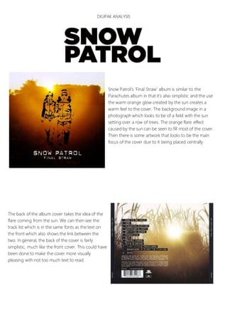
- 1. DIGIPAK ANALYSIS Snow Patrol’s ‘Final Straw’ album is similar to the Parachutes album in that it’s also simplistic and the use the warm orange glow created by the sun creates a warm feel to the cover. The background image in a photograph which looks to be of a field with the sun setting over a row of trees. The orange flare effect caused by the sun can be seen to fill most of the cover. Then there is some artwork that looks to be the main focus of the cover due to it being placed centrally. The back of the album cover takes the idea of the flare coming from the sun. We can then see the track list which is in the same fonts as the text on the front which also shows the link between the two. In general, the back of the cover is fairly simplistic, much like the front cover. This could have been done to make the cover more visually pleasing with not too much text to read.