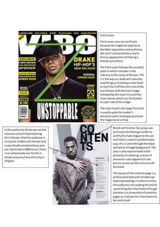
1. Front cover.
Front coverusessanserif style
because the magazine appealsto
the Male populationandaudience.
San serif ispresentedasamanly
fontas opposedtoserif beinga
female sortof font.
The front coverfollowsthe usuallyZ
patternwhichisknowninthe
industryasthe route of the eye.The
Z is the wayour bodywill naturally
readthingsso creatinga mast head
to start the Z off thenthe restof the
eye followswiththe mainimage
followedbythe coverline andthe
coverstorieswhichcan be located
to each side of the image.
The mast headis the largerfontand
isusedto grab the reader’s
attentionwhenlookingtopurchase
the magazine at a shop.
Brand verification- Byusingasan
serif style of letteringinorderto
certifythe male magazine the san
serif style isusedina professional
way,thisis seenthroughthe black
and white vintage background.The
classis alsorepresentedinthis
photoby hisclothing,asense of
romance is alsoapparentinthe
picture as we see the inclusionoff
the hand.
The layoutof the contentspage isa
professionallookandincludeseye
catchingheadingsinorderto entice
the audience intoreadingthe article
.presentingthe informationthrough
columnsisa conventionof contents
pagesas it allowsthe informationto
be easilyread.
In thisparticulararticle we see the
inclusionof serif stylelettering
thisindicatesthatthe audience is
a mixture of Male and Female and
isspecificallyaimedatthose who
are interestedinR&Bmusic,there
isno aimedaudience forthisit
allowsanyone of anyethnicityor
religion.
2. San serif fontisusedinthisarticle as itappealstothe youngermale audiencein
orderto grab theirattentionthisisdue tothe modernfontstyle.The layoutis
presentedasmasculine thisisshownasbeingorderedneatlyincolumns.The
large image onthe leftpage isto immediatelyattractthe reader’sattentiontothe
article writtenonthe page to the right.The yellowandblackhouse style is
continuedthroughoutthe article there fornotonlymakingaprofessional looking
piece butalsocreating eye catchingand easyto readmaterial.The dropcap is
usedinthe start of an article inorderto grab the reader’sattentionitisused
because itstandsout fromthe otherlettersmeaningwhenthe readerturnsthe
page theirbrainwill immediatelybe drawntothe beginningof the article leaving
there brainintriguedwantingmore meaningtheywill readonthroughthe restof
the article.The camera angle usedinthisimage showsaclose up thisisusedin
orderto focusdirectlyonthe facial expressions.
The inclusionof smoke inthe picture isusedasimageryas the audience maystart
to thinksaidpersonlivesaratherrebelliouslife.Thisimage thatthe audience
create in theirheadleavesthemintriguedwantingmore informationwhichsells
themthe story writtenonthe opposite page.The theme of beingrebelliouslinks
to the conventionsof the genre of musicandappealstothe audience asit may
relate totheirrebelliouslife.