General Principles of Intellectual Property: Concepts of Intellectual Proper...
Media homework
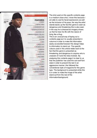
1. The shot used on this specific contents page
is a medium close shot, i know this because i
am able to see his facial expressions as well
as the inclusion of his pose, the way the artist
stands backs up the fact the genre is seen as
dangerous and threatening this is also seen
in the way he is dressed as imagery shows
us that he lives his life with the nature of
living like a thug.
This is an unusual way of laying out a
contents page as it is usually presented in
columns in order to make the information
easily accessible however this design helps
to information to stand out. The specific
colours used in this article relate back to the
fact that the genre is presented as
threatening and dangerous to anyone who is
unaware of it and the risks involved. By
analysing this contents page it is clear to us
that the publisher has used the san serif font
style in order to present the text in an
aggressive manner, this followed the
conventional style of magazine for this genre
type. The background is presented white this
is in order to make the image of the artist
stand out from the rest of the
information/background.