
Recommended
More Related Content
What's hot
What's hot (18)
Similar to Magazine deconstruction
Similar to Magazine deconstruction (20)
More from Molecule222
Recently uploaded
Recently uploaded (20)
Magazine deconstruction
- 2. Spark magazine • I have decided to deconstruct Spark Sunderland because it is one of my most inspiring regional magazines. Even though I prefer the aesthetics of magazines such as The Crack and INDIE, I feel that Spark has the content of culture that is extremely relevant to my own magazine. It covers a range of sub-genres that I think are appropriate and portrays them in ways that are creative and unique, another aspect I strive to include. Hopefully, by deconstructing Spark I will get a better understanding of what content is needed for a regional culture magazine and how I will specifically appeal to locals. The masthead is in a bubbly font which could be seen as attractive to young audiences, which paired with the fun colours and the sell lines all about prom this also shows the young target audience. The main image is framed in the centre which draws attention to it but is not too big so there is room for all the sell lines around them all.
- 3. Spark Contents • Layout: Personally, I feel the right hand side of the front cover is very cluttered in comparison to the left. I will use a more list like cover line structure which will most likely appear at the bottom of the page so that the image isn't too crowded. I do like the image of the front cover in the top right that pulls the issue together but I do not like the different colours down the left for the contents. My magazine I will continue my colour scheme onto the contents to pull the magazine together.
- 4. Spark double page spread • Personally I don't like the typography used on this page as I think it just looks like a regular newspaper and offers no creativity. I feel the layout of this page is very simple and restrained due to the young target audience. I also think Spark have included irrelevant features that take up a lot of room but don't add any attraction to the page. By challenging this I want to have a layout that is much more creative and appropriate for my older audience. I want to emphasize the contemporary and quirky style of my magazine but at the same time keep the article professional without it looking too boring. I dislike how dark the colour scheme is as I feel Spark's particular audience would appeal more to bright and outgoing colours to reflect their personalities. I will have my double page spread more colourful to appeal to my target audience.
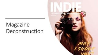
- 5. Indie Magazine • The bold font of the mast head makes it stand out against the dark background this is effective to establish the product effectively. The models bright hair also helps frame the magazine effective. I like the short depth of field which ensures the model is in focus and standing out I like that effect and would like to use this technique on my magazine.
- 6. Indie Contents • The contents is not traditional as the main image is taking up the full page but spliced by the contents sentences this is unusual but effective. I really like the way the page is aligned and different conventions are layered over one another. The white border really directs the readers eye line towards the centre of the page where the most important information is. I want to use editing and layering in a similar way to direct my audience's eye line and make my page look clean and professional. I think INDIE is a more visual than factual magazine and I think this really shows through their creativity. I would like to use a creative framing od my contents page in this way.
- 7. Indie double page spread • The lack of writing on the double page spread suggests there is a young audience as young audiences don’t like reading as much so this is a convention of young readers, the photograph taking up a full page could also suggest young audience as it could be convenient if young audiences want to use the photograph as a poster. The muted tones are something I do not like as it is not as attractive to the eye, I intend using colourful images and subheadings to attract my readers.
- 8. Reflection • As this is a contemporary and independent fashion magazine, the purpose of the text is much different to my magazine. However, my deconstruction of INDIE has been very inspiring in terms of looking at colour schemes, models, typography and creativeness. Not only have I deconstructed the front cover, contents page and double page spread, I have successfully picked out specific features I can take inspiration from and that will appeal to my audience. I have also identified features I do not want to keep as it does not work perfectly with my audience. I chose to deconstruct INDIE as although it isn't a regional magazine, it's unique style has stemmed my idea to create a quirky and contemporary culture magazine.