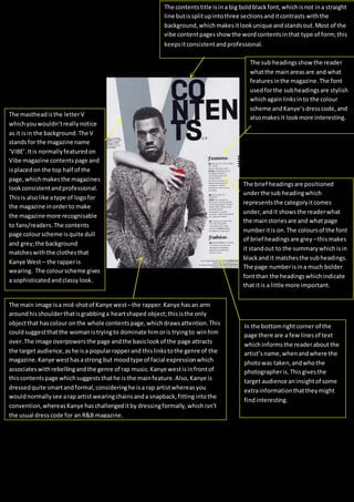
1. The mastheadisthe letterV
whichyouwouldn’treallynotice
as it isin the background.The V
standsfor the magazine name
‘VIBE’.Itis normallyfeaturedon
Vibe magazine contentspage and
isplacedon the top half of the
page,whichmakesthe magazines
lookconsistentandprofessional.
Thisis alsolike atype of logofor
the magazine inorderto make
the magazine more recognisable
to fans/readers.The contents
page colourscheme isquite dull
and grey;the background
matcheswiththe clothesthat
Kanye West– the rapperis
wearing. The colourscheme gives
a sophisticatedandclassylook.
The main image isa mid-shotof Kanye west –the rapper.Kanye has an arm
aroundhisshoulderthatisgrabbinga heartshaped object;thisisthe only
objectthat hascolour onthe whole contentspage,whichdrawsattention.This
couldsuggestthatthe womanistryingto dominate himoris tryingto winhim
over.The image overpowersthe page andthe basiclookof the page attracts
the target audience,ashe isa popularrapperand thislinkstothe genre of the
magazine.Kanye westhasastrong but moodtype of facial expressionwhich
associateswithrebellingandthe genre of rap music.Kanye westisinfrontof
thiscontentspage whichsuggeststhathe is the mainfeature.Also,Kanye is
dressedquite smartandformal,consideringhe isa rap artistwhereasyou
wouldnormallysee arap artistwearingchainsanda snapback,fittingintothe
convention,whereasKanye haschallengeditby dressingformally,which isn’t
the usual dresscode for an R&B magazine.
The contentstitle isin a big boldblackfont,whichisnot ina straight
line butissplitupintothree sectionsanditcontrasts withthe
background,whichmakesitlookunique andstandsout.Most of the
vibe contentpagesshow the wordcontentsinthat type of form;this
keepsitconsistentandprofessional.
The sub headingsshowthe reader
whatthe mainareasare and what
featuresinthe magazine.The font
usedforthe subheadingsare stylish
whichagainlinksinto the colour
scheme andKanye’sdresscode,and
alsomakesit lookmore interesting.
The brief headingsare positioned
underthe sub headingwhich
representsthe categoryitcomes
under,andit showsthe readerwhat
the mainstoriesare and what page
numberitis on.The coloursof the font
of brief headingsare grey –thismakes
it standout to the summarywhichisin
blackand it matchesthe subheadings.
The page numberisina much bolder
fontthan the headingswhichindicate
that itis a little more important.
In the bottomrightcorner of the
page there are a few linesof text
whichinformsthe readeraboutthe
artist’sname,whenandwhere the
photowas taken,andwhothe
photographeris.Thisgivesthe
target audience aninsightof some
extrainformationthattheymight
findinteresting.