1. House Style
The house style is very plain and simple and only
uses colours like white, black and a little bit of
red. This suggests that the article isn’t about
anything big arebold because otherwisethey
would have used colours like blue, green, pink or
yellow. These colours would be more eye-
catching and attract more attention.
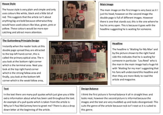
MainImage
The main image on the firstimage is very basic as it I
justhis head, however on the second image the
double page is full of different images. However
there is one that stands out, this is the one wherehe
has his arms open. This is because it goes with the
headline suggesting he is waiting for someone.
The Guttenberg PrincipleDesign
Instantly when the reader looks at this
double page spread they are attracted
to the top left hand corner, this is
called the primary optical area. The n
you look at the bottom right corner
which is the terminal area. Next you
look at the top right hand corner
which is the strong fallow area and
finally, you look at the bottom left
corner which is the weak fallow area,
Headline
The headline is ‘Waiting for My Man’ and
by the picture shown to the right hand
side this indicates that he is waiting for
someone in particular. ‘Lou Reed’ who is
the man in the main image had a huge hit
with ‘Waiting for my man’ suggesting that
his fans will understand this headline and
then they are more likely to read the
article and magazine.
Text
In the text there are many pull quotes which just give you a little
extra information about whathas been said throughoutthe text.
An example of a pull quote which is taken fromthe article is:
Why isn’t Paul McCartney here to greet me? There is also a drop
down letter at the beginning of the article.
DesignBalance
I think the first picture is formalbalance it all in straightlines and
looks neat, however the second picture is informalbecause the
images and the text are very muddled up and looks disorganised. This
suits the genre of the article becauserock isn’t neat so it is suited to
this genre.