SlideShare a Scribd company logo
1 of 9
Tagline
Puff
COLOURS
Red, White & Cream
Main Article
Main Cover image
Barcode
Masthead
Price, Strapline
Articles
The house style of this front cover is The Masthead is
always in the same place on their magazines. The
barcode could also be in the same place on every front
cover from that magazine. They could also use a mid
shot on the front covers. On the bottom right they have
used the sign ‘&’ instead of using the word ‘and’ which
makes it stand out more from the page and more
noticeable. There is a quote on the bottom left of the
page which is making you think that he is being horrible
about another member which intrigues you to want to
read more
The main colours that the magazine have stuck to are
Red, Gold & White by using the colour gold it is as if
they are saying that the cover has a higher level of
sophistication than other magazines in the past. The
colours they have used can make certain aspects of the
page stand out such as ‘THE MOST OVERRATED BANDS
EVER!’ is in bold red writing which makes it more
noticeable and it is drawing you towards it.
The fonts are not all the same apart from the main
article heading and the Tagline. The rest is in a different
font and in smaller size text.
There is only one tag line on this front cover which is at
the top of the page and says ‘ARTIC MONKEYS LIVE IN
NY’
There is also only one puff which is in a white circle at
the top right hand side of the page and within the circle
it says ‘WIN! SIGNED LTD EDITION STONE ROSES
ARTWORK P12’
As well as there only being one tagline and only one
puff there is also only one strap line.
I think that the magazine company has chosen to have
only one of each of these aspects is because they
wanted the keep the front cover simple and also so that
they could have more room for articles.
Main focused article
Other articles that aren’t
as main as the other
featured articles
Featured articles
Little bit about them and
an image
Header
Date
• The House style for the contents page is pretty
much the same as the front cover as it has stuck
to being in three columns although to two
images at the bottom don’t fully fit into the
columns the basic principle is there. On every
page there will be the same header for the
contents page so by just browsing past it you
know what it is without taking a full look of the
page. On every page I would say that the
numbers on the images will be using the same
place the numbers are in now on the bottom
right of each individual image and they would
most likely use the same font for all of the
writing on the page because on each image the
writing style is different giving it a sense of
individuality. It is more than likely that the
smaller box at the bottom with the header ‘Plus’
will be the same and on each article because that
box is telling you about the other articles that are
on the magazine.
• The photographs are set out so that the main
focus of the reader goes towards the middle
article on Glastonbury festival as that is the main
article in the middle of the contents page. The
rest of the images are set around the outside of
that image in a part rectangle or ‘U’ shape.
• The contents page ‘sells’ what is inside the
magazine because the images are attractive and
relevant to the article and by and image being
alongside the article brief it intrigues you more
into reading the article so therefore making
people want to buy the magazine.
• There isn’t really any colour on the contents
page apart from the images themselves so the
magazine company are trying to keep the
contents page basic and not too complicated.
• The header of this page is bold and at the top of
the page so that it is noticed as soon as you look
at the page. It is in a different font to the rest of
the page and it is also in the font that you could
associate with a newspaper because of the style
of text.
Article in four columns
Header
Main image and who
the article is about
Page number and
magazine name
(Part of the house style)
• The house style of this double page spread is four columns on the left hand page and it would be the same layout on the
right hand page but there isn’t any writing it is just an image. I would take a guess that on every double page spread in the
magazine there will be a large header so that it stands out and there could also be a large image because if you have the
space of a double page spread and can’t fill it with writing then you might as well fill it with a large image of the person the
article is about. On every page there will be the writing in the far bottom corners which is the page number and the name of
the magazine so that if the front cover is ripped off then you will still be about to decipher which magazine it is.
• They have positioned the photograph on the right hand side of the page because it goes with the way she is leaning and so
that you are not focusing on the image when you turn the page you have the writing on the next page which is what you will
look at first and then you will go on to look at the image. They have pretty much filled the page with Lilly Allen as her head is
toughing the top of the page and her waist is near to the bottom with her arms going off to each side the only plain space
there is, is the space behind her and behind the text.
• The magazine has used colour on this page by highlighting the main parts that they want you to notice even though there is
only two parts of the page highlighted in red which is the name ‘LILLY ALLEN’ and the name of the person who has written
the article.
• The Header text is in an unusual style, it is not a style that you would associate with a ‘good girl’ but what you would
generally associate with a ‘rebel’ the idea of it being associated with a rebel could be linked in with how they have dressed
Lilly and how they have done her hair and make-up.
Comparison
Both magazines have their
masthead at the top of the
page because it is the most
logical place to have it.
They also both have a
tagline above their mast
head so in relation to the
masthead and the tagline
these two magazines very
similar even though they
have a very different focus
They both have a main image in the back but the difference is that the NME magazine is very dark and the TOP
OF THE POPS magazine is very bright so you can see from this that they are aimed at not only at two different
genres of music but also that they could be aimed at the two different genders because you wouldn’t expect a
boy to go for the top of the pops magazine just as you wouldn’t expect a girl to go for this particular NME
magazine but that doesn’t mean that the magazine cannot be read by that gender it just means that they have a
different focus.
On the NME magazine there are several different articles and they are all shown with text and no images
whereas the TOP OF THE POPS magazine only has a few articles and they are shown with images and only a
very small amount of text which could also show that the two magazines are aimed at two different ages
because of the amount of writing on the NME magazine you would expect it to be aimed at an older more
intellectual person whereas the TOP OF THE POPS magazine has very little writing so It could be seen as being
aimed at someone who prefers to look at images rather than reading.
Comparison
Both magazines have their
header at the top of the
page, they have very
different font but they put
across the same message
because they both use the
word ‘inside’ so you can
clearly tell that it is a
contents page because it is
telling you what is ‘inside’
the magazine.
They both have quite a lot of writing on them but I would say that the NME contents page has more writing on it
because there are less article focuses and more info on each whereas the TOP OF THE POPS contents page has
the name of every article for every page in the magazine and a little bit of writing for each so not a lot of
thought or detail has gone into it. The TOP OF THE POPS contents page is a lot more colourful and draws your
attention in more than the NME because the only colour NME has on its contents page is the images unlike the
TOP OF THE POPS because it has one colour for the page numbers that each article is on which is pink. It
highlights some of the articles in yellow and it also has three images including the front cover image so this
makes it more attractive and intrigues you into reading it. The TOP OF THE POPS is definitely aimed at a more
girly audience because of the amount of pink on the page and the clothes they are showing you that are things
for you to buy. You would think it a bit weird if a boy suddenly began to walk round in pink martens and a top
saying ‘cute’.
• The first thing you notice when you look at these two double page spreads is that both
of the headers are quotes from what who the article is about has said. The only
difference with this is that on the NME double page spread the header is much longer
and they have taken the time to put it in a completely different style to everything on
the page so it stands out and on the TOP OF THE POPS double page spread it is in a very
similar font to everything else on the page and what makes it stand out is the fact that it
has been put in a larger text size and also that it has been put between two very large
pink quotation marks. They both have a completely different layout because the NME
article is set out like a professional article that follows on after the next column and the
TOP OF THE POPS article is set out in text boxes dotted around the two pages and each
text box has a question that TOP OF THE POPS have asked and beneath it is the answer
that Leona responded with. Once again you can tell that they are aimed at two different
groups of people because the first article is aimed at people who are into punk/rock and
the second article is for people that are girly or interested in knowing useless facts about
celebs.

More Related Content

What's hot

Research into codes and conventions
Research into codes and conventionsResearch into codes and conventions
Research into codes and conventionsKatherynclare
 
Analysis of Contents Pages
Analysis of Contents PagesAnalysis of Contents Pages
Analysis of Contents PagesJoannenmbec08
 
Contents Page and Double Page Spread
Contents Page and Double Page SpreadContents Page and Double Page Spread
Contents Page and Double Page SpreadMystifyingproductions
 
Analysis of Music Magazine Contents Page
Analysis of Music Magazine Contents PageAnalysis of Music Magazine Contents Page
Analysis of Music Magazine Contents Pagechaggarg1
 
Analysing double pages finally
Analysing double pages finallyAnalysing double pages finally
Analysing double pages finallylaylakeegan
 
Analysis of cover, contents page + double page spread
Analysis of cover, contents page + double page spread Analysis of cover, contents page + double page spread
Analysis of cover, contents page + double page spread EDavoile13
 
As media 2u
As media 2uAs media 2u
As media 2u07tjames
 
Analysing music magazines
Analysing music magazinesAnalysing music magazines
Analysing music magazines07tjames
 
Music magazine Analysis
Music magazine Analysis Music magazine Analysis
Music magazine Analysis izzyrowland
 
AS MEDIA COURSEWORK EVALUATION
AS MEDIA COURSEWORK EVALUATIONAS MEDIA COURSEWORK EVALUATION
AS MEDIA COURSEWORK EVALUATIONAbigailFirth
 
Analysis of other double page spreads
Analysis of other double page spreadsAnalysis of other double page spreads
Analysis of other double page spreadslucyl0u
 
Codes and conventions of a music magazine
Codes and conventions of a music magazineCodes and conventions of a music magazine
Codes and conventions of a music magazineedwardncfc1
 
Contents page analysis
Contents page analysisContents page analysis
Contents page analysisshaniajay
 
Magazine double spread analysis muskaaaannnnnnnn media work
Magazine double spread analysis muskaaaannnnnnnn media workMagazine double spread analysis muskaaaannnnnnnn media work
Magazine double spread analysis muskaaaannnnnnnn media workbaninadeem
 
Music magazine analysis
Music magazine analysisMusic magazine analysis
Music magazine analysisDariusslide
 
Content page analysis by muskaan final
Content page analysis by muskaan finalContent page analysis by muskaan final
Content page analysis by muskaan finalbaninadeem
 
Cover page analysis(muskaan n aveed)
Cover page analysis(muskaan n aveed)Cover page analysis(muskaan n aveed)
Cover page analysis(muskaan n aveed)baninadeem
 

What's hot (20)

Research into codes and conventions
Research into codes and conventionsResearch into codes and conventions
Research into codes and conventions
 
Analysis of Contents Pages
Analysis of Contents PagesAnalysis of Contents Pages
Analysis of Contents Pages
 
Contents Page and Double Page Spread
Contents Page and Double Page SpreadContents Page and Double Page Spread
Contents Page and Double Page Spread
 
Analysis of Music Magazine Contents Page
Analysis of Music Magazine Contents PageAnalysis of Music Magazine Contents Page
Analysis of Music Magazine Contents Page
 
Analysing double pages finally
Analysing double pages finallyAnalysing double pages finally
Analysing double pages finally
 
Q1
Q1 Q1
Q1
 
Contents pages
Contents pagesContents pages
Contents pages
 
Analysis of cover, contents page + double page spread
Analysis of cover, contents page + double page spread Analysis of cover, contents page + double page spread
Analysis of cover, contents page + double page spread
 
As media 2u
As media 2uAs media 2u
As media 2u
 
Analysing music magazines
Analysing music magazinesAnalysing music magazines
Analysing music magazines
 
Presentation2
Presentation2Presentation2
Presentation2
 
Music magazine Analysis
Music magazine Analysis Music magazine Analysis
Music magazine Analysis
 
AS MEDIA COURSEWORK EVALUATION
AS MEDIA COURSEWORK EVALUATIONAS MEDIA COURSEWORK EVALUATION
AS MEDIA COURSEWORK EVALUATION
 
Analysis of other double page spreads
Analysis of other double page spreadsAnalysis of other double page spreads
Analysis of other double page spreads
 
Codes and conventions of a music magazine
Codes and conventions of a music magazineCodes and conventions of a music magazine
Codes and conventions of a music magazine
 
Contents page analysis
Contents page analysisContents page analysis
Contents page analysis
 
Magazine double spread analysis muskaaaannnnnnnn media work
Magazine double spread analysis muskaaaannnnnnnn media workMagazine double spread analysis muskaaaannnnnnnn media work
Magazine double spread analysis muskaaaannnnnnnn media work
 
Music magazine analysis
Music magazine analysisMusic magazine analysis
Music magazine analysis
 
Content page analysis by muskaan final
Content page analysis by muskaan finalContent page analysis by muskaan final
Content page analysis by muskaan final
 
Cover page analysis(muskaan n aveed)
Cover page analysis(muskaan n aveed)Cover page analysis(muskaan n aveed)
Cover page analysis(muskaan n aveed)
 

Similar to Front cover, contents page & double page spread

Analysing magazine contents pages
Analysing magazine contents pagesAnalysing magazine contents pages
Analysing magazine contents pagessarah123ashcroft
 
Analysis of professional music magazine double page spread
Analysis of professional music magazine double page spreadAnalysis of professional music magazine double page spread
Analysis of professional music magazine double page spreadKatielewis98
 
Analysis of double page spreads
Analysis of double page spreadsAnalysis of double page spreads
Analysis of double page spreadsKateconstable
 
Magazine contents page deconstructions
Magazine contents page deconstructionsMagazine contents page deconstructions
Magazine contents page deconstructionsljones1897
 
Music magazine analysis
Music magazine analysisMusic magazine analysis
Music magazine analysisEloise Clark
 
Music magazine analysis
Music magazine analysisMusic magazine analysis
Music magazine analysisEloise Clark
 
My evaluation question 1
My evaluation question 1 My evaluation question 1
My evaluation question 1 Emilia Angove
 
Magazine contents page analysis
Magazine contents page analysisMagazine contents page analysis
Magazine contents page analysisjordanjenkins98
 
Music Magazine Analysis
Music Magazine AnalysisMusic Magazine Analysis
Music Magazine Analysisliamsacko
 
Question 1 edit
Question 1 editQuestion 1 edit
Question 1 editSeandoel97
 
Double page spread analysis
Double page spread analysisDouble page spread analysis
Double page spread analysisSaraMcgranaghan
 
Double pg spread analysis
Double pg spread analysisDouble pg spread analysis
Double pg spread analysisSaraMcgranaghan
 
Contents Page Analysis
Contents Page AnalysisContents Page Analysis
Contents Page Analysisbanesybaby
 
Production Research
Production ResearchProduction Research
Production Researchhayleylou11
 
Analysis of magazines (1)
Analysis of magazines (1)Analysis of magazines (1)
Analysis of magazines (1)sherieallen
 
Magazine deconstructions
Magazine deconstructionsMagazine deconstructions
Magazine deconstructionsHenryP16
 
Magazine cover review
Magazine cover review Magazine cover review
Magazine cover review 09lakeland
 
Forms and conventions
Forms and conventionsForms and conventions
Forms and conventionskelseybell7
 
TOC analysis
TOC analysisTOC analysis
TOC analysisLaraMedia
 

Similar to Front cover, contents page & double page spread (20)

Analysing magazine contents pages
Analysing magazine contents pagesAnalysing magazine contents pages
Analysing magazine contents pages
 
Analysis of professional music magazine double page spread
Analysis of professional music magazine double page spreadAnalysis of professional music magazine double page spread
Analysis of professional music magazine double page spread
 
Analysis of double page spreads
Analysis of double page spreadsAnalysis of double page spreads
Analysis of double page spreads
 
Magazine contents page deconstructions
Magazine contents page deconstructionsMagazine contents page deconstructions
Magazine contents page deconstructions
 
Music magazine analysis
Music magazine analysisMusic magazine analysis
Music magazine analysis
 
Music magazine analysis
Music magazine analysisMusic magazine analysis
Music magazine analysis
 
My evaluation question 1
My evaluation question 1 My evaluation question 1
My evaluation question 1
 
Magazine contents page analysis
Magazine contents page analysisMagazine contents page analysis
Magazine contents page analysis
 
Music Magazine Analysis
Music Magazine AnalysisMusic Magazine Analysis
Music Magazine Analysis
 
Question 1 edit
Question 1 editQuestion 1 edit
Question 1 edit
 
Double page spread analysis
Double page spread analysisDouble page spread analysis
Double page spread analysis
 
Double pg spread analysis
Double pg spread analysisDouble pg spread analysis
Double pg spread analysis
 
7
77
7
 
Contents Page Analysis
Contents Page AnalysisContents Page Analysis
Contents Page Analysis
 
Production Research
Production ResearchProduction Research
Production Research
 
Analysis of magazines (1)
Analysis of magazines (1)Analysis of magazines (1)
Analysis of magazines (1)
 
Magazine deconstructions
Magazine deconstructionsMagazine deconstructions
Magazine deconstructions
 
Magazine cover review
Magazine cover review Magazine cover review
Magazine cover review
 
Forms and conventions
Forms and conventionsForms and conventions
Forms and conventions
 
TOC analysis
TOC analysisTOC analysis
TOC analysis
 

Front cover, contents page & double page spread

  • 1. Tagline Puff COLOURS Red, White & Cream Main Article Main Cover image Barcode Masthead Price, Strapline Articles
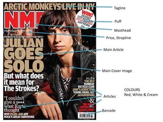
  • 2. The house style of this front cover is The Masthead is always in the same place on their magazines. The barcode could also be in the same place on every front cover from that magazine. They could also use a mid shot on the front covers. On the bottom right they have used the sign ‘&’ instead of using the word ‘and’ which makes it stand out more from the page and more noticeable. There is a quote on the bottom left of the page which is making you think that he is being horrible about another member which intrigues you to want to read more The main colours that the magazine have stuck to are Red, Gold & White by using the colour gold it is as if they are saying that the cover has a higher level of sophistication than other magazines in the past. The colours they have used can make certain aspects of the page stand out such as ‘THE MOST OVERRATED BANDS EVER!’ is in bold red writing which makes it more noticeable and it is drawing you towards it. The fonts are not all the same apart from the main article heading and the Tagline. The rest is in a different font and in smaller size text. There is only one tag line on this front cover which is at the top of the page and says ‘ARTIC MONKEYS LIVE IN NY’ There is also only one puff which is in a white circle at the top right hand side of the page and within the circle it says ‘WIN! SIGNED LTD EDITION STONE ROSES ARTWORK P12’ As well as there only being one tagline and only one puff there is also only one strap line. I think that the magazine company has chosen to have only one of each of these aspects is because they wanted the keep the front cover simple and also so that they could have more room for articles.
  • 3. Main focused article Other articles that aren’t as main as the other featured articles Featured articles Little bit about them and an image Header Date
  • 4. • The House style for the contents page is pretty much the same as the front cover as it has stuck to being in three columns although to two images at the bottom don’t fully fit into the columns the basic principle is there. On every page there will be the same header for the contents page so by just browsing past it you know what it is without taking a full look of the page. On every page I would say that the numbers on the images will be using the same place the numbers are in now on the bottom right of each individual image and they would most likely use the same font for all of the writing on the page because on each image the writing style is different giving it a sense of individuality. It is more than likely that the smaller box at the bottom with the header ‘Plus’ will be the same and on each article because that box is telling you about the other articles that are on the magazine. • The photographs are set out so that the main focus of the reader goes towards the middle article on Glastonbury festival as that is the main article in the middle of the contents page. The rest of the images are set around the outside of that image in a part rectangle or ‘U’ shape. • The contents page ‘sells’ what is inside the magazine because the images are attractive and relevant to the article and by and image being alongside the article brief it intrigues you more into reading the article so therefore making people want to buy the magazine. • There isn’t really any colour on the contents page apart from the images themselves so the magazine company are trying to keep the contents page basic and not too complicated. • The header of this page is bold and at the top of the page so that it is noticed as soon as you look at the page. It is in a different font to the rest of the page and it is also in the font that you could associate with a newspaper because of the style of text.
  • 5. Article in four columns Header Main image and who the article is about Page number and magazine name (Part of the house style)
  • 6. • The house style of this double page spread is four columns on the left hand page and it would be the same layout on the right hand page but there isn’t any writing it is just an image. I would take a guess that on every double page spread in the magazine there will be a large header so that it stands out and there could also be a large image because if you have the space of a double page spread and can’t fill it with writing then you might as well fill it with a large image of the person the article is about. On every page there will be the writing in the far bottom corners which is the page number and the name of the magazine so that if the front cover is ripped off then you will still be about to decipher which magazine it is. • They have positioned the photograph on the right hand side of the page because it goes with the way she is leaning and so that you are not focusing on the image when you turn the page you have the writing on the next page which is what you will look at first and then you will go on to look at the image. They have pretty much filled the page with Lilly Allen as her head is toughing the top of the page and her waist is near to the bottom with her arms going off to each side the only plain space there is, is the space behind her and behind the text. • The magazine has used colour on this page by highlighting the main parts that they want you to notice even though there is only two parts of the page highlighted in red which is the name ‘LILLY ALLEN’ and the name of the person who has written the article. • The Header text is in an unusual style, it is not a style that you would associate with a ‘good girl’ but what you would generally associate with a ‘rebel’ the idea of it being associated with a rebel could be linked in with how they have dressed Lilly and how they have done her hair and make-up.
  • 7. Comparison Both magazines have their masthead at the top of the page because it is the most logical place to have it. They also both have a tagline above their mast head so in relation to the masthead and the tagline these two magazines very similar even though they have a very different focus They both have a main image in the back but the difference is that the NME magazine is very dark and the TOP OF THE POPS magazine is very bright so you can see from this that they are aimed at not only at two different genres of music but also that they could be aimed at the two different genders because you wouldn’t expect a boy to go for the top of the pops magazine just as you wouldn’t expect a girl to go for this particular NME magazine but that doesn’t mean that the magazine cannot be read by that gender it just means that they have a different focus. On the NME magazine there are several different articles and they are all shown with text and no images whereas the TOP OF THE POPS magazine only has a few articles and they are shown with images and only a very small amount of text which could also show that the two magazines are aimed at two different ages because of the amount of writing on the NME magazine you would expect it to be aimed at an older more intellectual person whereas the TOP OF THE POPS magazine has very little writing so It could be seen as being aimed at someone who prefers to look at images rather than reading.
  • 8. Comparison Both magazines have their header at the top of the page, they have very different font but they put across the same message because they both use the word ‘inside’ so you can clearly tell that it is a contents page because it is telling you what is ‘inside’ the magazine. They both have quite a lot of writing on them but I would say that the NME contents page has more writing on it because there are less article focuses and more info on each whereas the TOP OF THE POPS contents page has the name of every article for every page in the magazine and a little bit of writing for each so not a lot of thought or detail has gone into it. The TOP OF THE POPS contents page is a lot more colourful and draws your attention in more than the NME because the only colour NME has on its contents page is the images unlike the TOP OF THE POPS because it has one colour for the page numbers that each article is on which is pink. It highlights some of the articles in yellow and it also has three images including the front cover image so this makes it more attractive and intrigues you into reading it. The TOP OF THE POPS is definitely aimed at a more girly audience because of the amount of pink on the page and the clothes they are showing you that are things for you to buy. You would think it a bit weird if a boy suddenly began to walk round in pink martens and a top saying ‘cute’.
  • 9. • The first thing you notice when you look at these two double page spreads is that both of the headers are quotes from what who the article is about has said. The only difference with this is that on the NME double page spread the header is much longer and they have taken the time to put it in a completely different style to everything on the page so it stands out and on the TOP OF THE POPS double page spread it is in a very similar font to everything else on the page and what makes it stand out is the fact that it has been put in a larger text size and also that it has been put between two very large pink quotation marks. They both have a completely different layout because the NME article is set out like a professional article that follows on after the next column and the TOP OF THE POPS article is set out in text boxes dotted around the two pages and each text box has a question that TOP OF THE POPS have asked and beneath it is the answer that Leona responded with. Once again you can tell that they are aimed at two different groups of people because the first article is aimed at people who are into punk/rock and the second article is for people that are girly or interested in knowing useless facts about celebs.