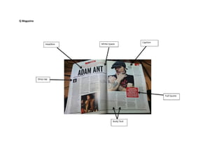
2. House Style- The house style reflects the theme of the rest of the
magazine. This article is clearly from a Q magazine. This is clearly highlighted through the use of the colours of red, white and black. The layout of the
double page spread is a typical layout for an older target audience. The layout is very sophisticated and not all over the place which reflects the genre and
the audience.
Headline- The headline in this double page spread is the first thing that the reader notices. The is part of h headline is in red which adds to the house style.
The artists name is clearly shown in bold and black font to make it stand out against the white background. The headline takes up at least a quarter of the
page to emphasis it’s importance.
Design Balance- The headline takes up about a quarter of the first page so the reader’s notice it immediately. The columns of text are laid out in our
columns on each page. On the page to the right there is an image of the artist, Adam Ant. This is put there so if people who do not know him know what he
looks like. Underneath and overlapping the photo is a quote from Adam Ant. This has a red background and with white font which is how the name of the
magazine is presented. This is done to catch the reader’s attention as it stands out against the white background.
3. Text- The purpose of this piece is to entertain the reader. The audience is older audience such as people over the age of 20. This article is about Adam Ant
and his career as an artist. The language I this piece clearly highlights that it is mid formal as it uses words like ‘train’s’ and ‘I’m’ these words ae used from
Adam Ant talking at the interview. The rest of the text is very formal which reflects on the older audience. The tenor of this article is conversational.
Main image- The main image in this article is of Adam Ant. It takes up most of the right page. The look on his face is stern and serious which reflects the
way he is dealing with his career. On the top right hand corner of the image there is a small quote from Adam Ant that reflects the photo as it says ‘this is
the best way I know of making a living, and doing it with grace’.
Gutenberg Design Principle- The top left hand corner of the page is the first place where the read looks which is known as the primary optical area. On this
page this is where the headline is displayed so the reader knows straight away what the article on his double page spread is about. The next ahead that the
reads eyes will go to is the bottom right hand corner of the double page spread which is known as the terminal area. This means the readers eyes will go
directly to the quote in the red box with the white writing. The next area the readers eyes will go to is the top right hand corner of the double page spread
which is known as the strong fallow area. On this double page spread the image of Adam Ant is in the strong fallow area. This makes the reader aware of
who Adam Ant is and what he looks like. The last area that the reader’s eyes will go to is the bottom left hand corner of the double page spread this is
known as the weak fallow area. In the weak fallow area of this double page spread there is another image of Adam Ant with a small quote which says
‘Nobody can prepare you for that’. It also says that this image was taken in 1981.
NME Magazine
4. House Style- The house style of this magazine is the use of the colours black and white this matches the theme of the magazine as this magazine is NME
and the main colours used throughout this magazine are red, black and white. The layout of the page is not straight which adds to the young target
audience as there is writing and quotes everywhere.
Headline- The headline of this double page spread is 'China Crisis' this is an alliteration. The headline is in black, bold, big writing to make it stand out and to
make the reader look here first to inform them what this article is about. The headline is placed over the photo with a white background to make it stand ot
against the image.
Design Balance- The text in this double page spread is set out in five columns across both pages. The text is not fully in line with each other which makes
the page look full and not sophisticated which reflects the younger audience. The image takes up half of the first page and a small bit of the second page so
the reader's attention will immediately by drawn towards the photo of Brandon Flowers sat on the Great Wall of China. The quoted text is placed randomly
around the page and is against a yellow background which catches the reader's eye and draws some attention to it. The small column on the right hand side
of the page is another interview for someone else this is highlighted as the colour pink is used to emphasis it is a different topic.
Text- A piece of phonology is used ‘Battle Born’ Semantic field of Music-Tour, artists of the band, fans- Rhetorical questions- makes the readers feel more
involved. Acronym- LOL- stands for laugh out loud. (Reflects youngish target- older people would not understand this audience.) The content of this piece is
about The Killers interview of their first show in China after being away for ten years. The tenor of the piece is conversational with the use of mid formal
language such as ‘isn’t’ Informal language used in this piece such as ‘shitload’, ‘totally fucked’- this language reflects the audience of 20+ as a teenage
magazine would not have as much foul language in it and older people would not appreciate a magazine with swearing in it. Has a mix of simple, compound
and complex sentences- reflects the audience
Main Image- The main image on this double page spread takes up the majority of the page. This makes the reader''s eyes be drawn to it straight away. The
image highlights what the whole article is about. On top of the image is the headline which also explains what the article is about. The image being so big
reflects the genre of the magazine as it does not dominate with text which clearly means it is for a younger audience as younger people prefer to look at
pictures more than read.
Gutenberg Design Principle- The first place that the reader will look is the top left hand corner which is known as the Primary Optical Area. In this double
page spread the first place that the reader will be drawn to is the image of Brandon Flowers on the Great Wall of China. This immediately informs the
reader what this article is about. Also, in this area the reader will see the Headline of 'China Crisis' to also inform the reader of the content of the article.
The next area the reader will be drawn to is the bottom right hand corner which is known as the Terminal Area. In the terminal area of this double page
spread the reader will be drawn to the second image of the article of Brandon Flowers preforming a show in China. The third place the reader's attention
5. will be drawn to is the top right hand corner which is known as the strong fallow area. In this double page spread the readers attention will be drawn to the
other small article that is displayed in pink down the right side of the page. This informs the reader that they can also be interested in the smaller article.
The last place the reader's attention will be drawn to is the bottom left hand corner which is known as the weak fallow area. In this double page spread the
reader's attention will be drawn to the start of the article this highlights that the reader will begins to read the article.
Compare and Contrast Q magazine's double page spread has a much more formal and sophisticated look and feel to it as everything is set out equally and
there is no text placed randomly around the page. This clearly highlights that the target audience of this magazine is older people such as 20+. However,
NME magazine has a more informal balance layout as the text is not equally spread around the page and there are quotes written randomly around the
page. This adds to the young target audience. Also in Q magazine the tenor of the piece is much more formal and does not used that many slang words
which reflects on the audience whereas in NME the tenor is very conversational and it is very informal as it has a lot of swearing it it and this reflects on the
younger target audience as older people do not want to read an article that has a lot of swearing in it as older people are more mature. The similarities of
these two double page spreads is that both the headlines stand out, they both use the same colour scheme of red, black and white and they both have a
photo that takes up most of one of the pages.
6. will be drawn to is the top right hand corner which is known as the strong fallow area. In this double page spread the readers attention will be drawn to the
other small article that is displayed in pink down the right side of the page. This informs the reader that they can also be interested in the smaller article.
The last place the reader's attention will be drawn to is the bottom left hand corner which is known as the weak fallow area. In this double page spread the
reader's attention will be drawn to the start of the article this highlights that the reader will begins to read the article.
Compare and Contrast Q magazine's double page spread has a much more formal and sophisticated look and feel to it as everything is set out equally and
there is no text placed randomly around the page. This clearly highlights that the target audience of this magazine is older people such as 20+. However,
NME magazine has a more informal balance layout as the text is not equally spread around the page and there are quotes written randomly around the
page. This adds to the young target audience. Also in Q magazine the tenor of the piece is much more formal and does not used that many slang words
which reflects on the audience whereas in NME the tenor is very conversational and it is very informal as it has a lot of swearing it it and this reflects on the
younger target audience as older people do not want to read an article that has a lot of swearing in it as older people are more mature. The similarities of
these two double page spreads is that both the headlines stand out, they both use the same colour scheme of red, black and white and they both have a
photo that takes up most of one of the pages.