APM Welcome, APM North West Network Conference, Synergies Across Sectors
2 contents page media
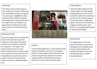
1. HouseStyle
The colours in the contents page are
very varied and it contains a widerange,
this could indicate the type of magazine
it is, classic pop. Ithighlights its classic
with the whites and blacks however it
then emphasises on the pop side with all
the brightcolours. At firstglance the
page looks more attractive for males
because there are only male artists on
there.
Gutenberg Principle
The primary optical area is in the top left
hand corner wherethe name of the
magazine is ‘Classic pop’, this makes it
very easy for the reader to know who
the magazineis. The reader is then
drawn to the terminal area in the
bottom right hand corner. Next you look
at the top right hand corner which is the
strong fallow area and the last partthe
reader is drawn to is the bottom left
hand corner which is called weak fallow
area.
Target Audience
I think the target audience for this
contents page is for older people/
middle aged becausethe artist are
mostly fromolder times and they are
not that current. However because
of the bright colours middle aged
people may also be attracted to this
magazine contents page. I don’t
think it’s for younger people because
it I bold and extravagant.
Imagery
In the contents page there is a lot of pictures of old
bands for example Duran Duran, this is going to
attract an older audience becausethey were well
known a long time ago, however if you want a
younger audience it would be bestto havea
picture of a currentartist so it attracts them.
Design balance
The design balance is informal
because the pictures at the top of
the page are very muddled up and
look out of place however the
writing at the bottom is very neat
and tidy indicating it could be
formally balanced.