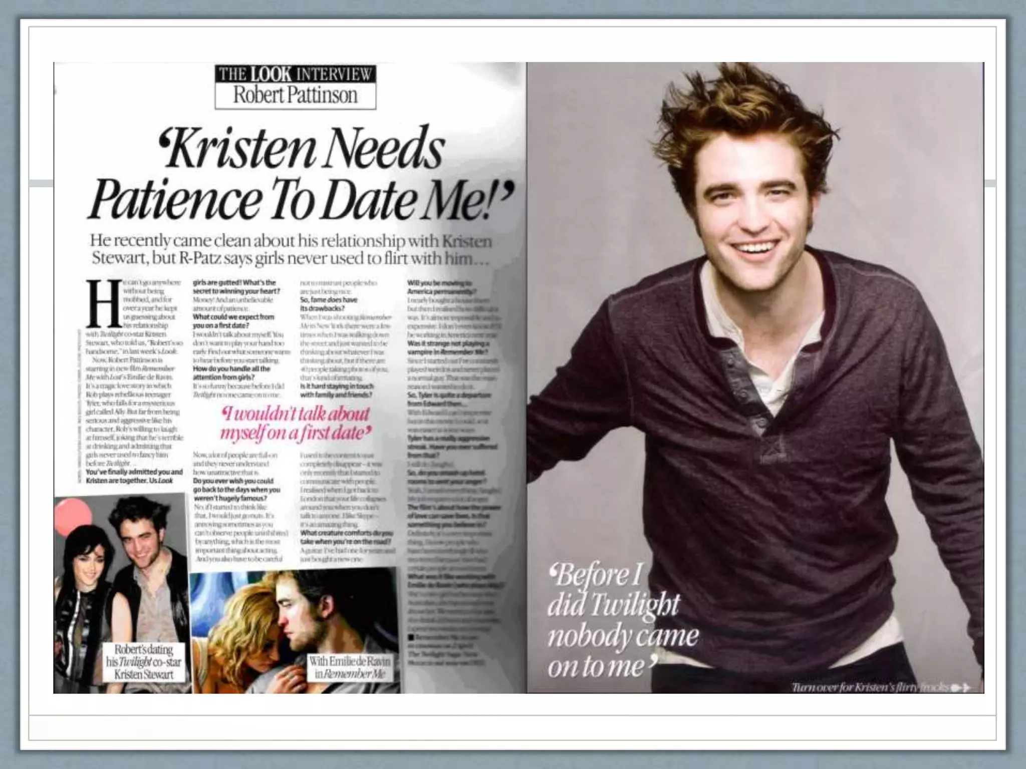
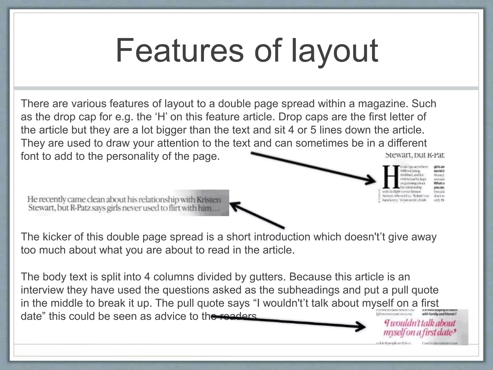
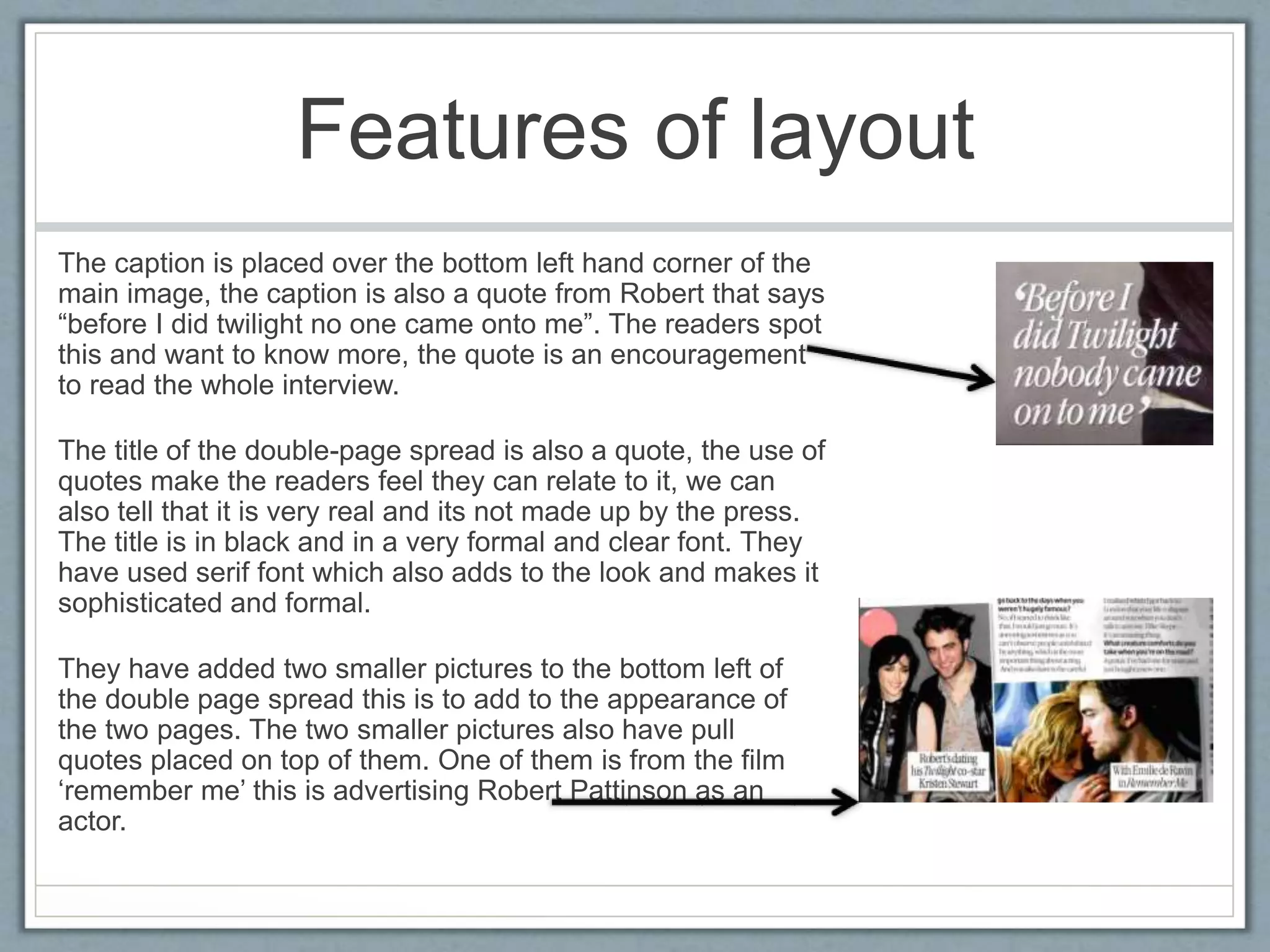
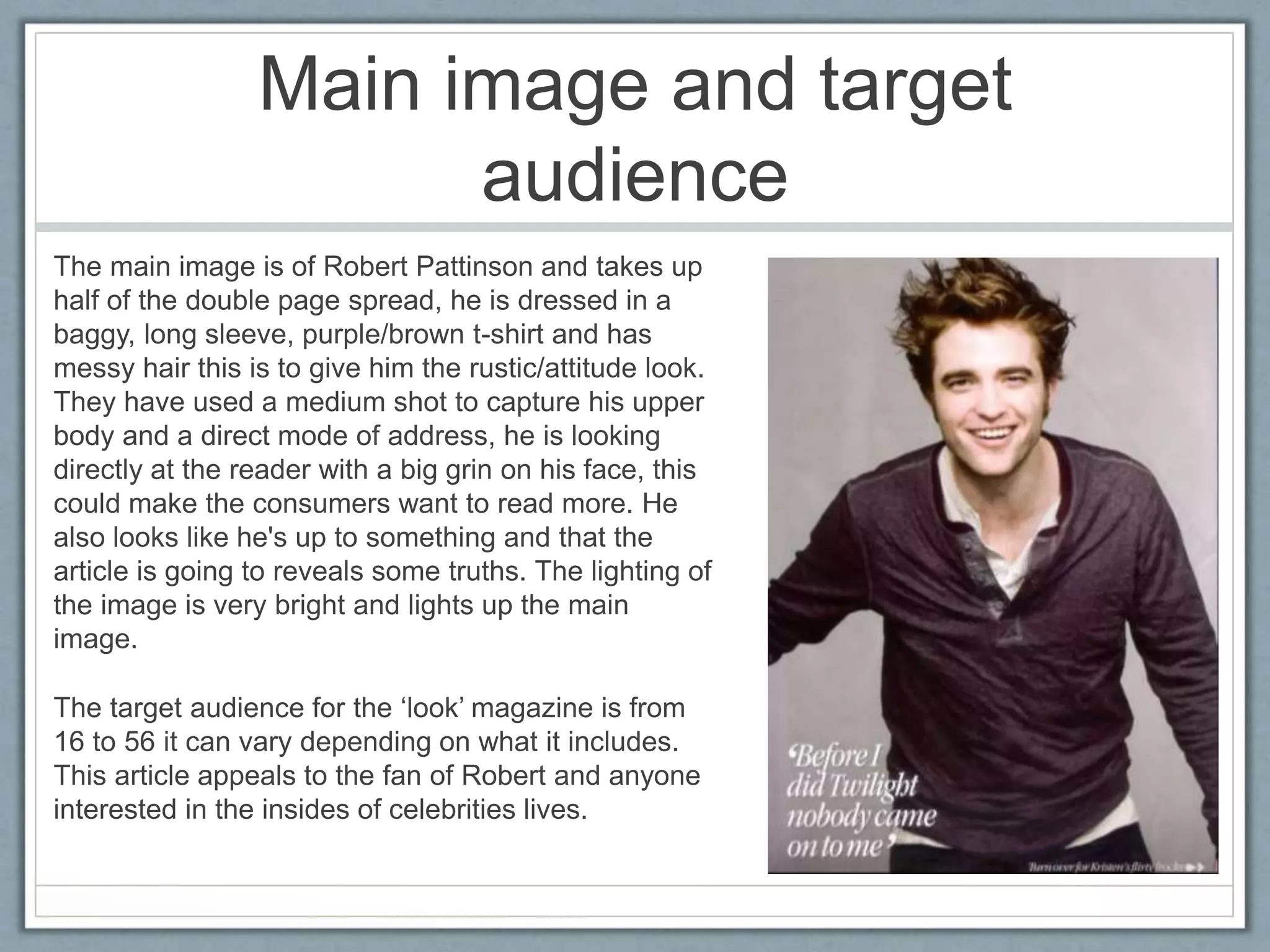
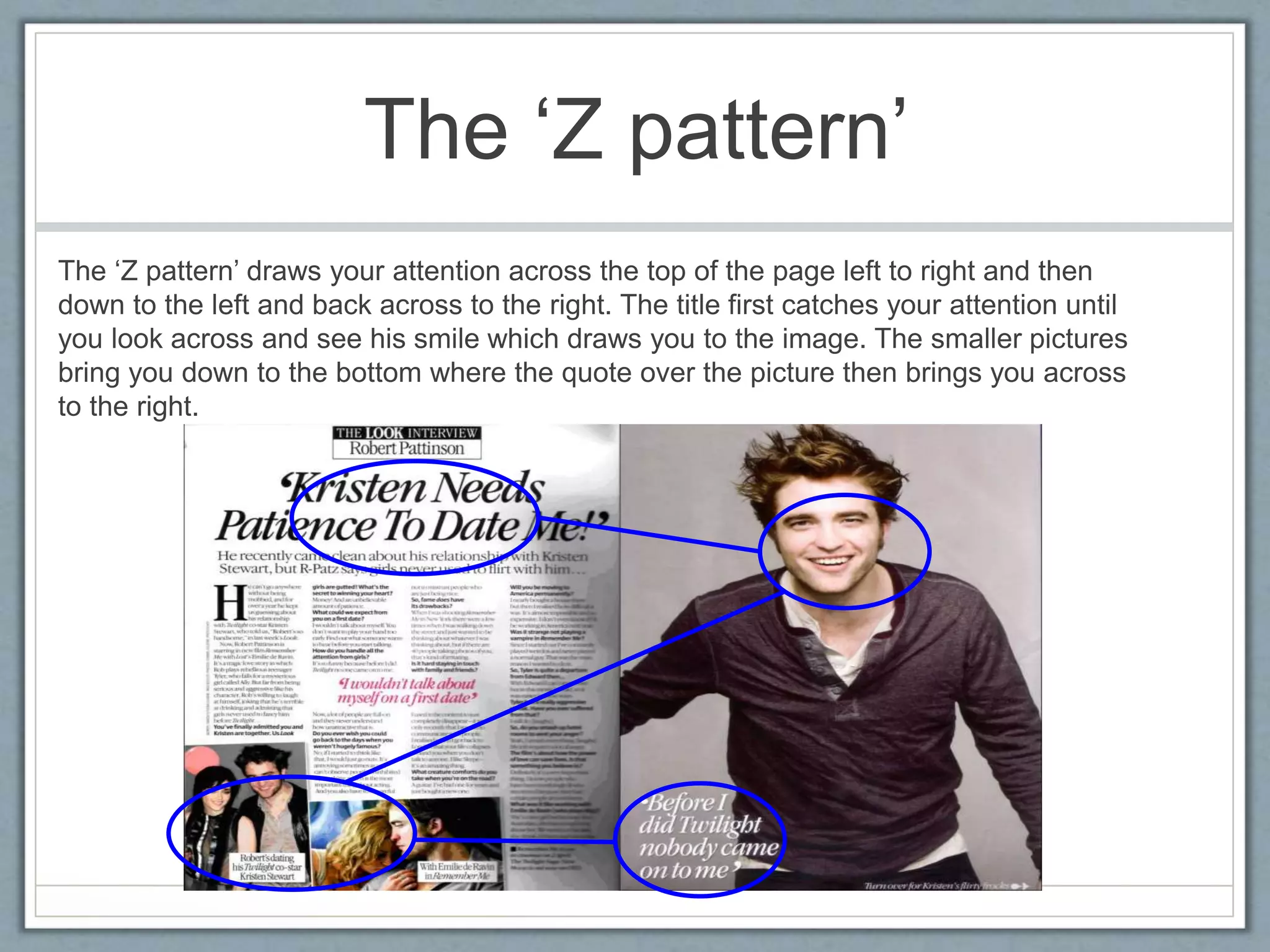
Textual analysis of 
double page spread 
Robert Pattinson interview in ‘LOOK’ magazine.
Features of layout 
There are various features of layout to a double page spread within a magazine. Such 
as the drop cap for e.g. the ‘H’ on this feature article. Drop caps are the first letter of 
the article but they are a lot bigger than the text and sit 4 or 5 lines down the article. 
They are used to draw your attention to the text and can sometimes be in a different 
font to add to the personality of the page. 
The kicker of this double page spread is a short introduction which doesn't’t give away 
too much about what you are about to read in the article. 
The body text is split into 4 columns divided by gutters. Because this article is an 
interview they have used the questions asked as the subheadings and put a pull quote 
in the middle to break it up. The pull quote says “I wouldn't’t talk about myself on a first 
date” this could be seen as advice to the readers.
Features of layout 
The caption is placed over the bottom left hand corner of the 
main image, the caption is also a quote from Robert that says 
“before I did twilight no one came onto me”. The readers spot 
this and want to know more, the quote is an encouragement 
to read the whole interview. 
The title of the double-page spread is also a quote, the use of 
quotes make the readers feel they can relate to it, we can 
also tell that it is very real and its not made up by the press. 
The title is in black and in a very formal and clear font. They 
have used serif font which also adds to the look and makes it 
sophisticated and formal. 
They have added two smaller pictures to the bottom left of 
the double page spread this is to add to the appearance of 
the two pages. The two smaller pictures also have pull 
quotes placed on top of them. One of them is from the film 
‘remember me’ this is advertising Robert Pattinson as an 
actor.
Main image and target 
audience 
The main image is of Robert Pattinson and takes up 
half of the double page spread, he is dressed in a 
baggy, long sleeve, purple/brown t-shirt and has 
messy hair this is to give him the rustic/attitude look. 
They have used a medium shot to capture his upper 
body and a direct mode of address, he is looking 
directly at the reader with a big grin on his face, this 
could make the consumers want to read more. He 
also looks like he's up to something and that the 
article is going to reveals some truths. The lighting of 
the image is very bright and lights up the main 
image. 
The target audience for the ‘look’ magazine is from 
16 to 56 it can vary depending on what it includes. 
This article appeals to the fan of Robert and anyone 
interested in the insides of celebrities lives.
The ‘Z pattern’ 
The ‘Z pattern’ draws your attention across the top of the page left to right and then 
down to the left and back across to the right. The title first catches your attention until 
you look across and see his smile which draws you to the image. The smaller pictures 
bring you down to the bottom where the quote over the picture then brings you across 
to the right.

Textual Analysis of a double page spread

  • 1.
    Textual analysis of double page spread Robert Pattinson interview in ‘LOOK’ magazine.
  • 3.
    Features of layout There are various features of layout to a double page spread within a magazine. Such as the drop cap for e.g. the ‘H’ on this feature article. Drop caps are the first letter of the article but they are a lot bigger than the text and sit 4 or 5 lines down the article. They are used to draw your attention to the text and can sometimes be in a different font to add to the personality of the page. The kicker of this double page spread is a short introduction which doesn't’t give away too much about what you are about to read in the article. The body text is split into 4 columns divided by gutters. Because this article is an interview they have used the questions asked as the subheadings and put a pull quote in the middle to break it up. The pull quote says “I wouldn't’t talk about myself on a first date” this could be seen as advice to the readers.
  • 4.
    Features of layout The caption is placed over the bottom left hand corner of the main image, the caption is also a quote from Robert that says “before I did twilight no one came onto me”. The readers spot this and want to know more, the quote is an encouragement to read the whole interview. The title of the double-page spread is also a quote, the use of quotes make the readers feel they can relate to it, we can also tell that it is very real and its not made up by the press. The title is in black and in a very formal and clear font. They have used serif font which also adds to the look and makes it sophisticated and formal. They have added two smaller pictures to the bottom left of the double page spread this is to add to the appearance of the two pages. The two smaller pictures also have pull quotes placed on top of them. One of them is from the film ‘remember me’ this is advertising Robert Pattinson as an actor.
  • 5.
    Main image andtarget audience The main image is of Robert Pattinson and takes up half of the double page spread, he is dressed in a baggy, long sleeve, purple/brown t-shirt and has messy hair this is to give him the rustic/attitude look. They have used a medium shot to capture his upper body and a direct mode of address, he is looking directly at the reader with a big grin on his face, this could make the consumers want to read more. He also looks like he's up to something and that the article is going to reveals some truths. The lighting of the image is very bright and lights up the main image. The target audience for the ‘look’ magazine is from 16 to 56 it can vary depending on what it includes. This article appeals to the fan of Robert and anyone interested in the insides of celebrities lives.
  • 6.
    The ‘Z pattern’ The ‘Z pattern’ draws your attention across the top of the page left to right and then down to the left and back across to the right. The title first catches your attention until you look across and see his smile which draws you to the image. The smaller pictures bring you down to the bottom where the quote over the picture then brings you across to the right.